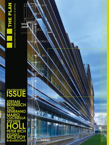
The Plan - Architecture and Technologies in Detail
Elmpark Green Urban Quarter
Bucholz Mcevoy Architects
Dublin, Ireland
Architecture.
Located in south Dublin, Elmpark, designed by architect firm Bucholz McEvoy, is a high-density, low-energy, mixed-use development. Covering around 70,000 sq m, it is framed by mountains, sea and an adjacent urban area.
The six, 8-storey buildings making up the new neighbourhood are set at right angles to a north-south communication route. Their carefully studied orientation allows full exploitation of direct sunlight and natural ventilation, which along with state of the art envelopes and plants allows primary energy reductions of some 60%. Two of the buildings are residential, three occupied by offices, while the last houses a day hospital and hotel.
The project is completed with a swimming pool, recreational area and housing for senior citizens.
Set amid luxuriant vegetation, all buildings stand on stilts. This frees up the ground level for an intricate network of pedestrian walkways and cycle paths, often running along watercourses, providing a healthy natural environment for work and outdoor living throughout the day.
Three on-site energy generators linked to heat pumps provide all the energy requirements of the whole area. Wood-pellet boilers provide hot water. Energy use has been rationalised and regulated. During the day, the plant gives precedence to the office buildings while at night it services the residential units. No energy is wasted since any excess goes to heating the swimming pool.
The steel and recycled glu-laminated timber structural frame has a glazed ventilated façade. Scale models were used to calculate how best to induce stack-effect natural air circulation and so eliminate assisted mechanical ventilation, with consequent energy savings.
The supporting pillars or stilts were also carefully studied to ensure natural lighting and ventilation to the underground garages lying below the buildings.
Carefully chosen technology, the right energy programme and good design have solved issues arising on account of the sheer size and extension of the project. The result is a new, user-friendly neighbourhood offering excellent quality-of-life standards.
Horizontal Skyscreaper
Steven Holl Architects
Shenzhen, China
Architecture
Mapungubwe Interpretation Centre
Peter Rich Architects
Limpopo, South Africa
Architecture
Designed by Peter Rich Architects, the Mapungubwe Interpretation Centre is the physical and symbolic entrance to the Mapungubwe National Park located in north-east South Africa near the borders with Zimbabwe and Botswana at the confluence of the Shashi and Limpopo rivers.
In past centuries a major trading hub and cultural melting pot on the vast, undulating savannah, the site is a unique archaeological, cultural and natural location. The modulated architecture of the Mapungubwe Interpretation Centre reflects this long history while asserting its contemporary relevance.
Traditional building techniques have made use of locally produced brick, stone from local quarries and wooden secondary sun-shading structures. More contemporary features include the overall project design, the way the timbrel-vault forces have been distributed, the particular concrete mix, and the use of metal uprights and glazed lights with a web of organic decorative motifs.
The result is a strong architectural experience yet one that fits seamlessly into its earthy landscape. The timbrel vaults (made of layers of slender bricks on a bed of rapid-set concrete) of the various pavilions rise from the land like natural elements. The slightly sloping ground makes them look even more like natural outcrops. The sloping terrain is an integral part of the architectural design providing a serious of viewpoints along the paved route set between dry-stone walls and from the terraced seating carved out of the hillside.
The stone cladding of the roofs and most of the walls echoes the colours of the surrounding savannah. It provides a materiality that somehow reinforces the conceptual programme of the whole complex.
Light plays a key role: filtering through the glazing on the sidewalls of the domed volumes, streaming dramatically down from the centre oculus into the spacious interior of the main timbrel-vaulted pavilion, and creating dappled patterns as it filters through the natural timber slats of metal framed pergolas.
This geometrically composite architecture combines vaulted spaces, the regular patterns of closely set stone cladding, the opus incertum aspect of roofs and some flooring, and the smooth, regular finish of the brick-lined interior walls. References to vernacular and traditional african architecture blend here perfectly with contemporary design and materials.
Unilever Headquarters
Behnisch Architects
Hamburg, Germany
Architecture
Unilever’s new Hamburg headquarters stands prominently on the cruise ship terminal on the banks of the Elbe between the old city centre and the new HafenCity, Hamburg’s massive port regeneration scheme whose visionary approach comprises the aim to reduce CO2 emissions. The synergy created between developer Hochtief, user Unilever and Behnisch Architekten meant that right from the drawing board the joint objective was architecture that would combine functional excellence, environmental sustainability and low energy consumption. The whole project revolves around a central atrium, a largely glazed covered interior court flooded with natural daylight. The court is enlivened by a medley of activities – café, restaurant, and a spa. It is also the strategic access point to the upper floor offices occupied by the company’s 1200 employees in open-space environments partitioned by modular, yet customized furnishing systems. Large terraces give sweeping views across the Elbe or overlook the inner court where shops sell company products. The architectural programme has eschewed the long-corridor-type interior plan and instead makes use of easy-access ramps, stairs and lifts to take people to the Meeting Points distributed on the various floors. Here wood tables, sofas and armchairs create a relaxed atmosphere encouraging informal, friendly gatherings. As well as impeccably meeting its functional brief, the building also complies with sustainable architecture principles. All areas have been designed to capture the maximum amount of natural light and create a comfort-zone microclimate. Each floor has manually operable heating radiators as well as external sun-screening to protect occupants from direct sunlight. Active and passive systems have been installed throughout the building. To avoid the inlet of diesel fumes from ships at the nearby terminals, natural ventilation in rooms with windows is combined with a mechanical compressed-air circulation system in which incoming air is conveyed and filtered in underground pipes. Vents near the huge central skylight expel saturated air at roof level, retaining the air’s heat, however, by means of heat exchangers. On the exterior, a tubular steel structure supports a transparent Etfe film windscreen. While allowing the passage of air, the screen protects all operable openings on the façade from wind and bad weather. LED illumination, designed together with Nimbus Design, allows some 70% energy saving compared to normal lighting. The use of eco-friendly building materials minimized the building’s footprint during construction, as it will for the length of its useful life and on decommissioning. A wastewater recycling plant is a further environmental plus. The initial investment made for such state-of-the-art technologies will reduce energy consumption to as little as 100 KW/h of primary energy per square metre a year. This includes heating, cooling and lighting. The building has received the HafenCity Ecolabel in gold thanks to its very low primary energy requirement.
3M Italia Headquarters
MCA - Mario Cucinella Architects
Milan, Italy
Architecture
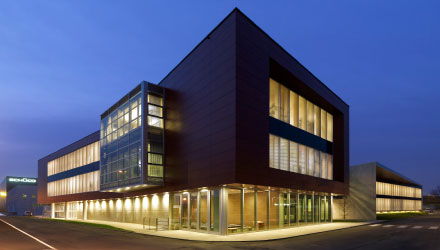
The new headquarters of the company 3M is located in the Malaspina Business Park in east Milan. The building is a component of a master plan drawn up in 2005 by the firm Mario Cucinella Architects (MCA) as part of the wider Malaspina Urban Project. Covering some 700,000 sq m, the whole area comprises residential, services and office buildings set amidst 80,000 sq m of landscaped greenery.
Underpinning the brief for the new headquarters - a 10,600 sq m terraced structure stepping down from the 5th to the 3rd floors - was the requirement to reduce energy consumption, consequently mitigating green house gas emissions without jeopardising thermohygrometric, illumination, acoustic and visual occupant comfort. The balance between active and passive systems, a building envelope that is an integral part of the plant and services system, the use of renewables and natural vegetation to help maintain the building’s microclimate are just a few examples of the measures taken to ensure comfort zone conditions yet contain annual energy costs and harmful emissions.
The building has received a Class A CENED rating.
The high thermal performance glazed façades on the east and west elevations are further protected by a sun-shading system comprising a series of different-length box-shaped aluminium profiles. This horizontal screen gives the building a high-tech yet evanescent appearance.
On the more exposed south side, a series of shaded terraces provide an effective protective barrier against extremes of heat or cold. They also form a welcome, shaded outdoor area for occupants even during the hottest months. Two internal courts with climbing plants further contribute to creating a comfortable microclimate, helping to keep interior work areas at optimal temperature and humidity.
Cold-beam air conditioning guarantees excellent comfort zone temperatures. The system is lodged in false ceilings thereby ensuring interior layout flexibility. Photovoltaics integrated into the roof use solar energy to ensure further energy savings.
Contrà Leopardi
Piergiorgio Semerano
Treviso, Italy
Architecture
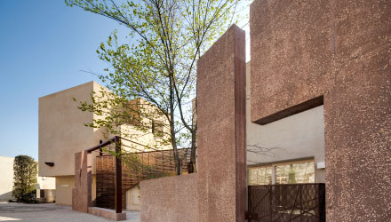
Taking historic urban models and revising them in the light of new technology to deliver new residential developments with the depth, complexity and quality of the urban fabric we treasure: this was the objective underpinning the Contrà Leopardi project, a new housing estate at Olmi on the outskirts of Treviso, in north-east Italy.
Built by main contractor CEV on the perimeter of the little town, the new development faces onto farmland. To avoid the trap of being yet another anonymous cluster of new houses, Studio Semerano architects focused not only on the architecture of the individual buildings - using materials and technologies to ensure occupant comfort and energy savings - but also on the programme as a whole.
The aim: to make a valid addition to the town, a quarter in which to live, grow up and socialize. The sense of a compact neighbourhood is given by the consistent urban scheme. This is offset by several unique architectures that deliberately interrupt the spatial continuum creating different surfaces and an interesting interplay of light and shadow. Pedestrian-friendly, the neighbourhood’s communication routes are never straight. Bends and turns offer captivating views of the surroundings. The programme comprises 15 residential blocks for a total of 36 dwelling units, which has received the Ecolabel in Class B. Most are distributed over two storeys.
Each has either a garden or terrace. These outdoor areas offer the same privacy as the enclosed gardens lying behind the canal walls of nearby Venice. They are places where the family can eat, play, take the sun or grow vegetables. Great care has also been taken to ensure every house has a view: either of porticos, one of the little squares, walls, trees, architectural features or the countryside beyond. In addition, the blocks have been oriented to receive optimal natural lighting and sunlight.
Materials were chosen with neighbourhood identity and environmental requirements in mind. Nigra Padoana, a natural hydraulic lime-plaster, formulated following an historical mix, was used throughout. Used down the ages in the Veneto region, lime-plaster has been applied to the brickwork of houses and gardens to create a uniform setting against which to place open-work wood and iron structures that served as sun protection or for climbing plants.
Similarly traditional are the types of trees planted in the public areas. They create small shaded squares while climbing plants become walls of greenery.
Schueco Italia Headquarters
B+B associati
Padova, Italy
Zoom
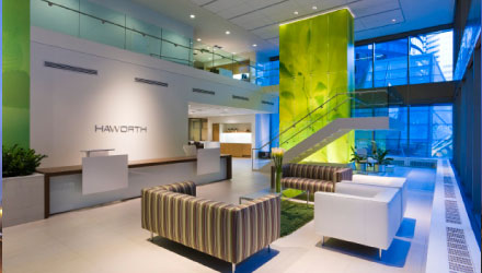
Haworth and sustainability: a 360° approach
Focus


