Подобрать по характеристикам

Издательства

Цена (370 - 19800 грн)

Цена
грн ok

Дизайн

Дизайн

Вы выбрали:
Сортировка:
наличие
цена
алфавит
Lauren Wager
ID: 15111
Издательство: Hoaki

The second volume by best-selling author Lauren Wager features a fresh new approach to colour combinations with entirely new palettes, organized by season.

What colour is summer? Is it cool and translucent swimming pool aquamarine, dazzling red like watermelon flesh, or the pale pink interior of a seashell? If these colours define summer, what colour is autumn? How about winter? And spring? In Palette Perfect, vol 2, designer, best-selling author and content creator Lauren Wager explores the multiple possibilities of seasonal colour applications, leading the reader through an inspirational presentation of image pairings and colour combinations.

This volume -- both a practical guide and inspirational book for designers, illustrators, architects, and crafters, as well as non-professionals, home decoration and fashion lovers -- provides examples of well-thought-out colour application within the worlds of contemporary art, fashion, interiors, photography and graphic design. It is a carefully gathered collection of colour palettes and stunning images with a touch of the unexpected, utterly successful in its aim.

This book demonstrates the value of observation and how the practice of seeking beauty can lead to fruitful creation and inspiration.

About the Author:

Lauren Wager is a young graphic designer living in Columbus, Ohio. She is the mastermind behind the exquisite blog Colour-Collective (https://www.color-collective.com), in which she gathers beautiful fashion, design, interiors, nature and still-life-related photographs and turns them into colour palettes, in a unique display of talent and aesthetic sensitivity. She works as a freelance web and graphic designer for a variety of media such as Bath and Bodyworks. Her site has been seen on top blogs such as Design*Sponge, Refinery29, Apartment Therapy, Design for Mankind, Smashing Magazine and The Huffington Post. Lauren's blog has also been featured in five issues of Lucky Magazine, and Joy Cho's first book, Blog, Inc.

Товар отсутствует
cообщить о поступлении
Adams Morioka
ID: 4069
Издательство: Rockport

Since color is such a important part of graphic design, designers need the most up to date as well as the most fundamental, information on the subject to have the tools needed to use color effectively. From the meanings behind colors to working with color in presentations, this book provides readers with the vital information needed to apply color creatively and effectively to their design work. Readers also receive guidance on talking with clients about color and selling color ideas. The science behind color theory is also explained in easily understood language, and case studies are included to show the effects some color choices had on both their clients and consumers.

_______

Посмотреть новое издание книги Color Design Workbook: New, Revised Edition: A Real World Guide to Using Color in Graphic Design

Товар отсутствует
cообщить о поступлении
Roberto Bottura
ID: 5546
Издательство: Links

This book is a collection of the fi nest examples of the synergy generated by graphics and the use of color in architecture. The selection of projects demonstrates how graphics and color can reinforce the strength of volumes and spaces. The spatial application of color is clearly explained by the creators of the projects themselves through texts and photographs. This is an essential book for delving deeper into the specifi c uses of color in architecture and its application to different typologies. Work from some of today’s fi nest contemporary architects make this an excellent source of inspiration for lovers of color-focused architecture.

Товар отсутствует
cообщить о поступлении
Terry Marks, MINE, Origin, Tina Sutton
ID: 7432
Издательство: Rockport

A Complete Color Reference for Designers of All Types, 25th Anniversary Edition

A selection of content from the entire Color Harmony library offers readers the most comprehensive reference book on the usage of color available today. Included are swatches and material for designers and all types of artists looking for inspiration and guidance to ensure the right color choices for every project.
 
Terry Marks (Seattle, WA) is the author of Mr. Crumbly Dreams a Tiger and Rules for Success.
Christopher Simmons of MINE is an instructor in identity design at California College of the Arts and at Academy of Art University in San Francisco.
Jim Mousner, of Origin Design, has had work featured in publications such as Print, HOW, and Émigré, and been published in many books.
Tina Sutton speaks on “The Psychology of Color” at many school, businesses, and museums. She writes a weekly column for the Boston Globe Magazine.

Товар отсутствует
cообщить о поступлении
Terry Marks
ID: 7869
Издательство: Rockport

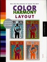
To illustrate how colors influence the message, this essential handbook starts with 10 layouts and applies more than 80 different color combinations to each, resulting in a vast collection of dynamic variations.
Includes an interactive CD that allows users to choose layouts from the book, experiment with colors, and print them for reference. This tool illustrates the powerful role colors play in layout design.

Selecting the right colors for any design project, whether personal or commercial, can make all the difference in whether a project communicates effectively to the designated audience. For most people, choosing the right colors is not an easy process. With this comprehensive collection, anyone can make effective and powerful choices for their design and client.
"Color Harmony: Layout" opens with case studies of 10 featured designs; each study explains what the work was trying to achieve and why the particular palette was chosen. The book then follows with 21 chapters, headed by adjectives such as elegant, professional, or classic, that feature the palettes which best reflect the adjective. The chapters also include 10 designated layout designs in 4 different color combinations from that palette. The result: more than 800 color studies illustrating how varying color combinations can dynamically alter a given design and the message it communicates. "Color Harmony: Layout" is an insightful demonstration of the power of color and its ability to convey a message, as well as a time-saving handbook that all designers will turn to again and again.

Товар отсутствует
cообщить о поступлении
Cristopher Simmons, Tim Belonax, Kate Earhart
ID: 7871
Издательство: Rockport

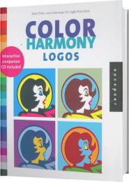
Selecting the right color palette for any design project, whether personal or commercial, can make all the difference in getting it right. But choosing the right colors for a logo, and ultimately the identity, is essential because it will define all the collateral materials that will follow. Unfortunately, for most people choosing colors is not an easy process, but with a little bit of science and a color advice, anyone can make a strong choice.

Color Harmony: Logos opens with a discussion on how to choose color(s) for logos and follows with a number of case studies on logos where color is a dominate factor such as those for H & R Block, Kodak, and Coca-Cola.

Then, it takes the 26 adjectives from one of the series' predecessors, Complete Color Harmony, and shows one logo for each adjective in 60 different color combinations. The result: 1,560 logo variations that illustrate how colors are used.

In all, the book is a powerful demonstration of the power of color and its ability to impact a message.

Comes with bonus CD ROM!

Товар отсутствует
cообщить о поступлении
Terry Marks
ID: 2030
Издательство: Page One
Selecting the right color palette for any design project, whether personal or commercial, can make all the difference in getting it right. Colors set the tone for visual communication and are essential elements in effective information navigation. Unfortunately however, for most people, even many trained designers, choosing color is not an easy process, but with a little bit of science and a color advice, anyone can make the right choice.

Color Harmony: Layout takes 23 descriptive adjectives and shows 10 different layouts (letterhead, poster, book jacket, brochure, newsletter etc.) in three color combinations for each adjective. The result is 1,035 color/layout variations illustrating how colors are used to great effect in design. Opening with a discussion on how to choose color(s) for layouts, this book features 2 one-page case studies of various layouts whose color is the driving factor illustrating for readers how color can be used thoughtfully and effectively.
Товар отсутствует
cообщить о поступлении
ID: 2029
Издательство: Page One

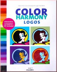
Color Harmony:Logos opens wiyg a discussion on how to choose color for logos,
then follows with 26chapters based on common identity artributes. Each chapter xplores over 40 different effective color combinations.
The result-more than 1000logo variations illustrating how color can dynamically alter a given design.
This book is an insightful demonstration of the power of color to alter the context of a message.
It is an essential handbook for any designer who has ever wrestled with  the complex issues of color selection.
Also included with the book is an interactive CD containing a selection of the featured logos.
the CD lets users experiment with color and print the results for reference.
This dynamic tool will provide a better understanding of the critical role color plays logo design.

Товар отсутствует
cообщить о поступлении
Jim Krause
ID: 7483
Издательство: David and Charles
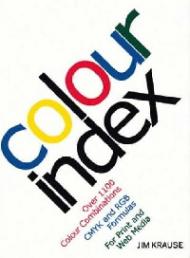
Every designer needs a little inspiration now and then - particularly when it comes to colour. Color Index is fuel for creativity. It provides more than one thousand colour combinations and formulas to help creative professionals thing through design dilemmas and create effective graphics for both print and the web. From progressive colours to natural tones. Color Index makes choosing hues for any job easier. Anyone can start working with colour in exciting ways to create original, eye-catching designs that pop off the page.
Товар отсутствует
cообщить о поступлении
ID: 2366
Издательство: Daab
700 pages of color inspiration! This book illustrates the endless possibilities of color and presents a wide spectrum of color combinations for use in interior, exterior and product design. Recent projects by international architects and designers underline the creative potential of color design put into practice.
Товар отсутствует
cообщить о поступлении
ID: 6194
Издательство: Frechmann Kolon

The use of color, in any artistic disciplnine, is one of the most cmplex paskss, as it not only serves a decorativepurpose; it is also used to convey an intention and certai aesthetic effects. In addition, there are psychological factor, considering that a color, and even shades of a color, can trigger certain feelings and this can have a decisive impact on how a person perceives a space or object.

Товар отсутствует
cообщить о поступлении
John Drew, Sarah Meyer
ID: 3731
Издательство: RotoVision

1000 photos/illustrations

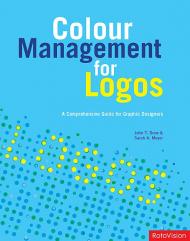
Dealing with every major colour system for both print and Web, "Color Management for Logos" provides readers with a solid understanding of all aspects of logo design. Featuring over 1000 examples of professional logo designs, the book aims to cover both theoretical and practical design considerations. These range from issues of impact and legibility through to emotional responses to colour and technical considerations, making it a comprehensive guide to all aspects of logo design. Case studies and practical guidelines also serve to provide further creative inspiration. Because of its sheer quality and depth, "Color Management for Logos" provides a unique body of information for designers, branding professionals and students alike.

Товар отсутствует
cообщить о поступлении
John Drew, Sarah Meyer
ID: 3732
Издательство: RotoVision

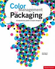
Color Management for Packaging covers both theoretical and practical packaging design considerations. Every aspect of colour for packaging is explored, including issues of standout, impact, legibility, appetite ratings, emotional responses to colour, prepress requirements, technical considerations, and issues of ageing and display. 

Not only is this a great ideas reference book, but it is also a hardworking manual that gives designers the broad colour knowledge with which to create more successful packaging designs. It shows how to work within budgetary constraints, create the right feel for a product, and create packaging designs that work with a number of different colour palettes to accommodate separate product ranges. 

A consolidated resource, Color Management for Packaging arms designers with a thorough understanding of how to communicate with and manage colour in all aspects of packaging design, and offers creative solutions for designing inspiring packaging in line with print and design budgets.

________________

Посмотреть книгу Color Management for Packaging на русском языке - Управление цветом в упаковке

Товар отсутствует
cообщить о поступлении
Jim Mousner
ID: 9074
Издательство: Rockport

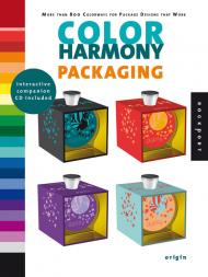
Selecting the right color palette for any design project, whether personal or commercial, can make all the difference in getting it right. But choosing the right colors for packages in retail environment competing with thousands of other products, it is especially important to hit the right color note. Unfortunately, for most people choosing colors is not an easy process, but with a little bit of science and some color advice, anyone can make a strong choice.

This book will take the 23 adjectives from The Complete Color Harmony and show 10 different packages in a variety of categories in 3 color combinations each for every adjective. The result is 1,035 color/layout variations illustrating how colors are used to great effect in design.

Пролистать книгу Colour Harmony: Packaging - More than 800 Colorways for Package Designs that Work на Google Books

Товар отсутствует
cообщить о поступлении
Jim Krause
ID: 7482
Издательство: David and Charles
This new companion to the best-selling, "Colour Index" offers even more colours and fresh new combinations of colours, making it easier than ever to create harmonious palettes for any project. It contains hundreds of different colour combinations, each with an accurate formula for print and web use. You`ll easily find the best colours for your piece with chapters organised by dominant hue, and with unique expansion palettes - sets of four related hues arranged from dark to light - that allow you to explore even more colour combinations for limitless possibilities. Designers, illustrators, photographers and fine artists alike will find this book an indispensable tool when it comes to finding colour-related ideas and solutions.
Товар отсутствует
cообщить о поступлении
Издательства
A B C D E F G H I G K L M N O P Q R S T U V W X Y Z 0-9
А Б В Г Д Е Ё Ж З И Й К Л М Н О П Р С Т У Ф Х Ц Ч Ш Щ Ы Э Ю Я