Подобрать по характеристикам

Колористика

Колористика

Вы выбрали:
Сортировка:
наличие
цена
алфавит
Anna Spiro
ID: 15417
Издательство: Thames & Hudson

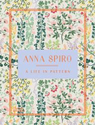
A lavish showcase of work by Anna Spiro, one of Australia's most popular interior designers

A Life in Pattern is the highly anticipated interior design monograph of Anna Spiro, master of the showstopping interior.

Anna Spiro is the founder of Anna Spiro Design and co-founder of Anna Spiro Textiles, interiors and textile design companies that celebrate her signature aesthetic. Her globally adored style is unapologetically maximalist and a paean to comfort, as evidenced in her collaborations with de Gournay, Anthropologie and Designer Rugs. Her devotion to the craft of working with pattern on pattern on pattern, combined with her intuitive layering of colours, objects old and new, art, books and foraged treasures, creates irrepressible spaces that sing with individuality.

Featuring over 250 photographs, this is a sourcebook of inspiration and joy. A Life in Pattern showcases the kind of artistry that can only come from an interior designer at the height of their powers.

About the Author:

Anna Spiro has been working as an interior designer for more than two decades. Her distinctive style and approach were launched onto the world stage with her highly lauded re-design of the boutique hotel, Halcyon House. In 2014 Anna published her first book, Absolutely Beautiful Things. Her passion for fabulous fabrics and life-long dream to create her own textile collection has recently been realised with the formation of Anna Spiro Textiles. She is launching a hand-painted wallpaper range with De Gournay in 2021.

Цена: 3000 грн
Доступно под заказ
в корзину в избранное
Annie Sloan
ID: 11345
Издательство: Ryland Peters & Small / CICO books

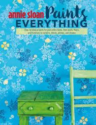
Decorative paint expert Annie Sloan shows how paint can transform any surface in your house.

In this, her most personal book yet, Annie Sloan opens up a world of possibilities when it comes to decorating your home. As well as ways to transform walls and furniture, you’ll also learn wonderful techniques for painting floors, fabrics, lighting and more.

Discover three chapters, all packed full of inspiration and advice: Furniture and Lighting, Fabric and Other Surfaces, and Walls and Floors. Forty step-by-step projects will guide you through the methods for using paint in ways you never thought possible, with clear instructions accompanying each picture, and helpful tips along the way. Learn about printing, stencilling, gilding, transferring images and dyeing fabric, as well as all the secrets of making the most of Annie’s own Chalk Paint® range. Find out, too, how to combine colours for different styles, and how to tap into your creativity by painting patterns freehand.

No matter what your skill level, Annie Sloan Paints Everything will enable you to make over your home so you have the naturally stylish, individual interior you’ve always wanted.

Цена: 1200 грн
Доступно под заказ
в корзину в избранное
Carlos Mota
ID: 16719
Издательство: Vendome Press

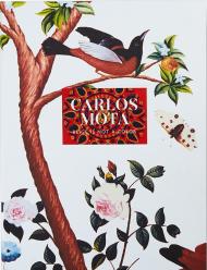
To celebrate the publication of Beige Is Not a Color, Carlos Mota has designed an oversize portfolio box, wrapped in his signature motif, to house a first-printing copy of the volume along with five postcards of images selected by Carlos Mota from the color-drenched pages of his outstanding new book. The interior of the portfolio is printed in a motif adapted by Carlos Mota from a traditional Indian block print. A collector’s item, this boxed edition is strictly limited to a production of 350 copies. Available only through Vendome Press and Abrams.

About the Authors:

Carlos Mota is a creative consultant with extensive experience in styling, interior design, product design, and advertising campaigns. Formerly international style editor for Architectural Digest and editor at large for Elle Decor, he is the author of A Touch of Style. He lives in New York.

Цена: 3800 грн
Доступно под заказ
в корзину в избранное
Riccardo Falcinelli
ID: 18839
Издательство: Penguin Books

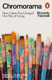
The new colour bible: a gorgeously illustrated exploration of colour and the modern gaze, from an award-winning designer

'One of the best books on colour I've read. A layered tapestry of stories, insights and ideas, each beautifully and clearly written. For anyone interested in colour, it's a must' Marion Deuchars

Why are pencils yellow and white goods white? Why is black the colour of mourning? What connects Queen Victoria's mauve gown and Michelle Obama's yellow dress?

In Chromorama, acclaimed graphic designer Riccardo Falcinelli delves deep into the history of colour to show how it has shaped the modern gaze. With over four hundred illustrations throughout and with examples ranging widely across art and culture - from the novels of Gustave Flaubert to The Simpsons, from Byzantine jewellery to misshapen fruit, from Mondrian to Hitchcock's thrillers - Falcinelli traces the evolution of our long relationship with colour, and how first the industrial revolution, and then the dawn of the internet age, changed it forever.

Beautifully designed, deeply researched, and written with warmth and wit, Chromorama is an engrossing account of shade and light, of tone and hue, of dyes, pigments, and pixels. It is the story of why we now see the world the way we do.

About the Author:

Riccardo Falcinelli is an award-winning graphic designer and best-selling author whose work has been highly acclaimed in Italy and around the world. He teaches at the ISIA Faculty of Design in Rome.

Цена: 1200 грн
Доступно под заказ
в корзину в избранное
Farbbüro Isler and Bader
ID: 14576
Издательство: niggli Verlag

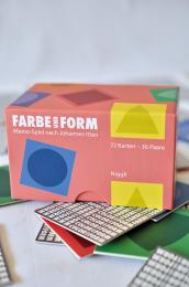
This memo-game is based on a very special concept: the colors follow the format used in Johannes Itten’s color theory: red for a square, blue for a circle, yellow for a triangle, orange for a trapezium, green for a spherical triangle, and purple for an ellipse. The colors are shown with the corresponding form, which increases their specific impression.

Furthermore, each color is present in six different nuances; this increases the perception of the color tones and supports the creative process of finding new names to specify the individual forms. As the cards are turned over new color contrasts are revealed; these can also be used to intensify knowledge of color theory. Thus, these cards must not just be used for playing the memo-game, they can also be used for inspiration and for experimenting with different color combinations, series and tones.

_________

Посмотреть видео о наборе Color and Form: Memo Game Based on Johannes Itten

Цена: 1200 грн
Доступно под заказ
в корзину в избранное
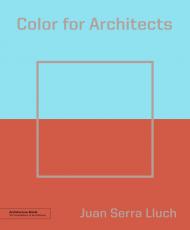
Juan Serra Lluch
ID: 12943
Издательство: Princeton Architectural Press

As far back as the earliest Greek temples, color has been an integral part of architecture but also one of its least understood elements.

Color theory is rarely taught in architecture schools, leaving architects to puzzle out the hows and whys of which colors to select and how they interact, complement, or clash. Color for Architects is profusely illustrated and provides a clear, concise primer on color for designers of every kind.

This latest volume in our Architecture Briefs series combines the theoretical and practical, providing the basics on which to build a fuller mastery of this essential component of design. A wealth of built examples, exercises, and activities allows students to apply their learning of color to real-world situations.

Цена: 1500 грн
Доступно под заказ
в корзину в избранное
SendPoints
ID: 12036
Издательство: SendPoints

Color plays a significant role in design. It can make a design work more impressive, appealing and distinctive. For designer, it means the basic skill in combing colors.

This book includes basic color theories that help readers gain a better understanding of color. It also delves into the psychology of color, along with color associations and applications in commercial designs. Featuring referential color schemes and creative projects with color codes as well as color talk, this is an essential manual of great practicality and inspiration.

Цена: 2000 грн
Доступно под заказ
в корзину в избранное
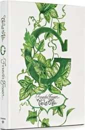
Carlos Mota
ID: 17084
Издательство: Vendome Press

An exuberant celebration of the color green — in nature, art, interiors, and design.

Green is like water: it is everywhere, and we can’t live without it. Green is the color of nature and the environment. Green is life. Interior designer and style guru Carlos Mota has such a passion for green that he has now devoted an entire book to it. G: Forever Green celebrates the color in all its manifold manifestations: in nature, food, fashion, jewelry, art, interiors, and architecture.

From the brilliant markings on a butterfly’s wings to the feathers of a tropical bird’s breast, from Magritte’s oversized apple to the brocade drapery in the background of a Holbein portrait, from a leafy arbor to a leafy wallpaper, from celadon to forest to emerald to acid to lime to Kelly, the variety is astounding. Illustrated with Mota’s own photographs, taken as he has traveled the world, as well as images by prominent photographers, G: Forever Green features rooms by notable designers, among them Kelly Wearstler, Alessandra Branca, Mark D. Sikes, Robert Couturier, Gert Voorjans, and Nicky Haslam.

This stunning volume, superbly produced with a green metallic edge stain, is a testament to the power of green to soothe, inspire, and excite.

About the Author:

Carlos Mota is a creative consultant with extensive experience in styling, interior design, and product design. He has created environments for catalogs and advertising campaigns for numerous companies and brands. Formerly the international style editor for Architectural Digest and editor at large for Elle Decor, he has been named to the prestigious 2022 AD100 list. The author of Beige Is Not a Color, Mota lives in New York.

Цена: 4500 грн
Доступно под заказ
в корзину в избранное
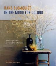
Hans Blomquist
ID: 11919
Издательство: Ryland Peters & Small / CICO books

Color is powerful – it can change our moods or raise our spirits. It can be positively life-enhancing, yet so many of us struggle with choosing the right shades for our home, instead falling back on a safe but unadventurous palette of bland neutrals.

In this, his third book, celebrated interior stylist Hans Blomquist reveals his lifelong passion for color and the way in which it can affect our emotions. Color can soothe, enchant or excite. And as Hans demonstrates, it has the ability to render rooms cool and calming, dynamic and stimulating or moody and intriguing.

As ever, Hans draws his inspiration from the treasures of the natural world, exploring shades from the dazzling optic white of newly fallen snow to the fiery crimson heart of a newly unfurled poppy and the inky canopy of the midnight sky. Divided into five sections – Dark, Pale, Soft, Natural and Bright – In the Mood for Colour will make you see color in a completely different light.

About the Author:

Hans Blomquist is an art director and stylist whose evocative, painterly style is highly sought after by many prestigious brands. Hans started out working for IKEA in Sweden and ended up art directing their catalogue. His other clients include Harrods, Marks & Spencer, John Lewis, H&M, and IKEA. Hans now lives in Paris.

Цена: 1700 грн
Доступно под заказ
в корзину в избранное
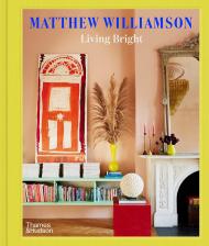
Matthew Williamson, Michelle Ogundehin
ID: 17061
Издательство: Thames & Hudson

A practical guide and personal invitation from the king of colour to find your own style and embrace the paint pot whether designing a castle or a cupboard.

"The most joyful, inspirational interiors, with a fascinating personal story from the master of colour himself! Matthew shows us how to live life bright!" - Sienna Miller, actress

Think beige, grey and white are the only neutrals? Think again. As a lifelong fan of rich jewel tones, fashion designer turned interiors expert Matthew Williamson makes the case for living cocooned in colour. Pink can be subtle, warming and very liveable, while used sparingly fiery red can get you going. Let Matthew help you find your style DNA and you’ll soon be getting out the paint brush and turning bland corners of your home into a technicolour paradise.

Packed with inspirational images of interior decorating projects, including his own homes in London and Mallorca, as well as visual references that will transport you to the places that are close to his heart, Living Bright is the hardworking handbook to take on your journey to colourful living. No space is too small and no project too big. Just follow his simple instructions, work out which shades speak to you and a lifetime of kaleidoscopic colour awaits. Now is the time to banish boring and learn to live bright with joyful interiors that will lift your mood without punishing your bank balance. Whether serene, soft pink, or lively mustard yellow, earthy olive green or rich, regal purple, there’s a shade that will work for everyone and every home.

About the Authors:

Matthew Williamson is a British designer known for his love of pattern and colour. Starting out in fashion in the mid-1990s, for more than a decade, Williamson’s eponymous brand dressed celebrities, appeared on magazine covers and won multiple awards. After collaborating on a number of collections for the home, he moved to Mallorca and pivoted towards interior design. Williamson designs joyful rooms and homewares inspired by his love of travel and was a guest judge on the BBC’s Interior Design Masters television show.

Цена: 1700 грн
Доступно под заказ
в корзину в избранное
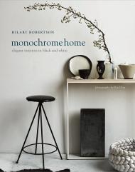
Hilary Robertson
ID: 11845
Издательство: Ryland Peters & Small / CICO books

Decorating in black and white is perennially popular and eternally chic. Hilary Robertson demonstrates how, whether used alone or together, these contrasting shades can create dramatic effects at home, from the classic to the eclectic.

Sought-after interiors stylist Hilary Robertson celebrates the stylish simplicity of the monochromatic home — elegant interiors in black, white, and every shade of grey in between. In the first chapter, The Monochrome Palette, Hilary analyzes five different monochrome schemes, providing moodboards for different effects: In Black and White, Grey Matters, Shades of Pale, Dark Looks, and In the Mix. Following on, Let there be Light provides examples of interiors with a whiter, brighter approach, while The Dark Room visits homes that have employed darker monochrome palettes. Next, in Monochrome Home, Hilary Robertson shows how to bring the look right up to date, visiting the fabulously inspiring homes of artists, architects and designers across the globe from London and Paris to Copenhagen, rural Sweden, and NYC.

About the Author:

Hilary Robertson is a well-known interiors stylist and journalist with an illustrious client list that includes Canvas, Ochre, Elle Decoration, Vogue Living, and the Telegraph Magazine. Also a talented writer, Hilary wrote the text for Josephine Ryan’s French Home (also Ryland Peters & Small). Hilary lives in Brooklyn with her husband and son. She recently opened Mrs. Robertson, a store selling vintage furniture and accessories.

Цена: 1980 грн
Доступно под заказ
в корзину в избранное
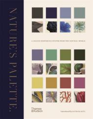
Patrick Baty, Peter Davidson, Elaine Charwat, Giulia Simonini, André Karliczek
ID: 13788
Издательство: Thames & Hudson

The first-ever visual expansion of Werner’s Nomenclature of Colours, featuring over 800 illustration references from the natural world

This chromatic catalogue of the natural world pairs individual colour swatches with examples from the animal, vegetable and mineral kingdoms to create a beautiful and comprehensive colour reference system to grace every bookshelf.

Marking the 200th anniversary of the publication of Syme’s expanded edition of Werner’s Nomenclature of Colours (1821), this lavish volume takes Syme’s field guide of 110 standard colours and – for the first time – fully illustrates it with nineteenth-century depictions of his referenced species. Expert text explains the uses and development of colour standards in relation to zoology, botany, minerology and anatomy, while specimens from contemporary collector’s cabinets (birds, butterflies, eggs, flowers and minerals) are matched to each colour swatch. Syme’s groundbreaking guide attempted to establish a universal colour reference system to help identify, classify and represent species from the natural world: this landmark publication completes his endeavour.

Contents List:

Introduction The Origination, Purpose and Development of Werner’s Nomenclature of Colours by Patrick Baty • i. Whites, Greys and Blacks • 1. Werner’s Mineralogical System and how his Nomenclature of Colours Became Syme’s Colour Standard by Peter Davidson • ii. Blues and Purples • 2. Colours in Zoology: Subjective or Systematic? by Elaine Charwat • iii. Greens • 3. Syme’s Colour Chart in Botany: Origin and Impact by Giulia Simonini • iv. Yellows and Oranges • 4. One for All? Werner’s Nomenclature of Colours as a General Standard of Colour and its Particular Use in Medicine by André Karliczek • v. Reds and Browns

About the Authors:

Patrick Baty is the author of The Anatomy of Colour and owner of Papers and Paints, a specialist paint business in London. His great grandfather, the artist Robert Bevan, was described by a former director of the National Gallery as being ‘perhaps the first Englishman to use pure colour in the 20th century’. He runs a consultancy that advises on the use of paint and colours in historic buildings and has worked with Dulux and Little Greene to develop ranges of traditional paint colours for English Heritage. He also lectures frequently on the subject of paint and colour of the 18th and 19th centuries.

Цена: 1980 грн
Доступно под заказ
в корзину в избранное
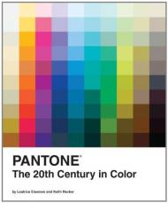
Leatrice Eiseman and Keith Recker
ID: 11630
Издательство: Chronicle Books

Pantone, the worldwide colour authority, invites you on a rich visual tour of 100 transformative years.

From the Pale Gold (15-0927 TPX) and Almost Mauve (12-2103 TPX) of the 1900 Universal Exposition in Paris to the Rust (18-1248 TPX) and Midnight Navy (19-4110 TPX) of the countdown to the Millennium, the 20th century brimmed with colour.

Longtime Pantone collaborators and colour gurus Leatrice Eiseman and Keith Recker identify more than 200 touchstone works of art, products, décor, and fashion, and carefully match them with 80 different official PANTONE colour palettes to reveal the trends, radical shifts, and resurgences of various hues. This vibrant volume takes the social temperature of our recent history with the panache that is uniquely Pantone.

Цена: 1800 грн
Доступно под заказ
в корзину в избранное
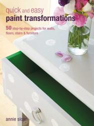
Annie Sloan
ID: 11900
Издательство: Ryland Peters & Small / CICO books

With this book in one hand and a brush in the other, you can learn how to create different paint finishes and effects to change everyday rooms and furniture into something special, all for the price of a pot of paint.

The first section of the book tells you everything you need to know before you start – how to prepare surfaces properly, choose the right paint for the right place and use the best tools. Then, the 50 projects are divided into five sections: Ageing and Distressing; Working with the Base; Working with Colour; Handpainting; and Crackle, Gilding and Decoupage.

There are step-by-step images showing how to achieve the finished look, before shots and inspirational photography showing the effects used on walls and doors, furniture and floors. Learn how to bring old second-hand furniture bang up to date, or how to give modern pieces a softly aged appearance, as well as ways to treat and transform floorboards, doors and plastered walls.

Whatever the style of your interiors, Quick and Easy Paint Transformations will show you the best way to makeover your home.

About the Author:

Annie Sloan is one of the world’s most respected experts in the field of decorative painting. She runs highly successful workshops from her store in Oxford, and teaches in the US and Europe. Annie has written more than ten books, including the bestselling Quick and Easy Paint TransformationsCreating The French LookThe Painted Garden and Annie Sloan’s Painted Kitchen (all published by CICO Books), and has featured prominently on PBS television and the Homes & Gardens TV channel. She also sells her own highly acclaimed range of chalk paint which is available from almost 300 locations worldwide, including over 200 outlets in the US. The author is based between Oxford, UK and France.

Цена: 1200 грн
Доступно под заказ
в корзину в избранное
Chrissie Rucker & The White Company
ID: 15325
Издательство: Mitchell Beazley

From the author of the home decorating bestseller, For the Love of White, comes an inspirational and informative guide to creating a welcoming home through the seasons using a white and neutral palette.

'I love a home to feel warm, inviting, personal and lived-in - and mastering how to decorate with white and neutrals is a wonderful way to achieve this.' - Chrissie Rucker

In her much-anticipated second book, The Art Of Living With White, Chrissie Rucker, Founder of The White Company, explores 10 inspirational homes that illustrate beautifully different ways to use white and neutrals through the seasons. The homes vary in size, style and location - from a minimalist city pied-à-terre to a New England-style country house - but what unites them all is the welcoming, stylish and calm feel that their owners have each created.

The homes are grouped into the four seasons and each chapter ends with a summary of seasonal rituals that will work in any home. A concluding chapter - Inspiration & Resources - considers finding your own style, how to create a good balance between work and home in interior spaces, the art of simple entertaining and the importance of scent and touch in a truly comfortable home.

About the Authors:

Chrissie Rucker is the Founder and Owner of The White Company. Her story began in 1994, when she was unable to find beautifully designed, great quality white home essentials that were also affordable.
What started as a 12-page mail-order company has become one of the UK's most loved brands with more than 60 stores across Europe and the US.

Today The White Company has evolved enormously and become a complete lifestyle brand, offering a wide range of essential home accessories that really make a house a home. From beautiful linens, towels and china to a wider range of scented bath and home treats and a children's range, The Little White Company, it has also introduced an exciting range of clothing, loungewear and nightwear as well as furniture, lighting and rugs.

Chrissie grew up in Kent and left school at 16 to study couture design in London. Her working life began aged 18 working for magazines including Harpers & Queen, Brides, GQ and Vogue. She also held a PR role at Clarins.
Renowned for her meticulous attention to detail when creating products, Chrissie's desire is to constantly improve as well as delight the customer. She and The White Company have received many awards including an MBE and OBE for services to retail, The Sunday Times Profit Track 100 Best Brand Award, Private Business Woman of The Year at The Private Business Awards 2012 sponsored by PWC in association with HSBC and the ECMOD Best Customer Service Award.
In 2014 Chrissie founded The White Heart Foundation, helping vulnerable young men, women and children. Chrissie is also the Founding Patron for Women Supporting Women for The Prince's Trust and is an ambassador for Everywoman.
Chrissie lives with her husband Nick who 'has been my constant inspiration and rock', and is mum to Tom, Ella, India and Bea.

__________

Пролистать книгу The White Company The Art of Living with White: A Year of Inspiration на Google Books.
Цена: 2000 грн
Доступно под заказ
в корзину в избранное
показать по:
на странице