Колористика

Книги о колористике

Вы выбрали:
Сортировка:
наличие
цена
алфавит
SendPoints
ID: 12036
Издательство: SendPoints

Color plays a significant role in design. It can make a design work more impressive, appealing and distinctive. For designer, it means the basic skill in combing colors.

This book includes basic color theories that help readers gain a better understanding of color. It also delves into the psychology of color, along with color associations and applications in commercial designs. Featuring referential color schemes and creative projects with color codes as well as color talk, this is an essential manual of great practicality and inspiration.

Цена: 2000 грн
Доступно под заказ
в корзину в избранное
ID: 13054
Издательство: SendPoints

Power up your packaging design with COLOURS!

The red and yellow McDonald's, the Tiffany Blue, the blue and yellow IKEA, the Coca Cola Red, etc., a number of world-famous brands have successfully developed their own colour system for their brand identity, including packaging and storefront, making a strong impression on consumers. Colour has become a more powerful marketing tool than ever: it stimulates buying and infuses enduring vigour into the packaging.

This book reveals the secrets of commercially successful packaging colours. It introduces colour psychology and marketing strategies of colours using accessible language and vivid illustrations; deeply analyses the combination of colour and marketing in packaging via case studies; and showcases packaging designs worldwide with excellent colour matching, revealing their design concepts and approaches.

- Detailed analysis of colour psychology, colours in marketing, and packaging colours.
- Case studies of successful colour matching of packaging designs.
- Display of excellent packaging designs, revealing the ideas and techniques of colour combination.

Цена: 1700 грн
Доступно под заказ
в корзину в избранное
Jon Dowling
ID: 16986
Издательство: Counter-Print

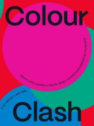
Colour is one of the essential elements of many branding designs.

It can help give an identity personality and warmth, express emotion, communicate messages in an unconscious and subtle way and it can keep or navigate the viewer’s interest, drawing the eye and making elements stand out.

This book explores colour palettes in graphic design that surprise, engage, challenge and grab our attention - the combinations that maybe shouldn’t work but just do. These are palettes that break the established rules and laws we have been taught about colour theory and remind us that colour can be fun as well as meaningful.

About the Author:

Counter-Print is an independent publisher and online store specialising in design and visual culture. They produce and curate a unique selection of books from around the world.

Цена: 1250 грн
Доступно под заказ
в корзину в избранное
Tiziana Paci
ID: 17992
Издательство: Hoaki

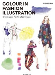
This book is a practical manual intended specifically for anyone interested in delving into the technique of granting colour to fashion figurine illustrations to give them more life and expressiveness. In a clear and educational way,

Tiziana Paci, autor of the well-know book Figure Drawing for Fashion Design, explains in detail the different themes examined in the work through images and examples along with concise and to-the-point texts ideal for neophytes as well as people who have been working in this field for years.

Цена: 1980 грн
Доступно под заказ
в корзину в избранное
ID: 18007
Издательство: Hoaki

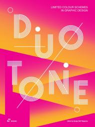
This book explores the possibilities and applications of two-color printing technique in graphic design using different approaches such as: colour matching, duotone effects and gradation.

The wide selection of projects in the book covers different design categories, from logos, brochures, posters, packaging materials, book covers and exhibition materials to screen designs for corporate websites and promotional microsites. The wide variety of designs reveal the endless possibilities of duotone and the ways in which designers and artists make full use of two bright colours to create dramatic and dynamic compositions. 

Duotone is the next big trend in graphic design. It enhances readability, makes the most of minimalist designs without overwhelming the eye, and is the perfect way to effortlessly create unforgettable atmospheres.

Цена: 1980 грн
Доступно под заказ
в корзину в избранное
Lauren Wager, Sophia Ahmad
ID: 18010
Издательство: Hoaki

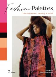
A new and stunning exploration of colour through the lens of contemporary fashion.

Color consultant and curator Lauren Wager, author of the best-selling Palette Perfect volumes, and colorist, designer and trend forecaster Sophia Naureen Ahmad, team up in this practical and inspirational compendium that examines how colors can be used and combined to achieve specific effects in fashion. We learn what each color means, where the color name comes from and color combinations that go well with each color, as well as different fabrics and decorative elements used in fashion in relation to color. Quick and easy explanations reveal what each color communicates, how it can be combined most effectively, what it is known for and its common uses in fashion.

Vivid photographs bring the descriptions and explanations to life, allowing us to see with our own eyes how colors and fabrics can be combined with others to communicate a palette of different moods, emotions and states. A kind of color dictionary within the world of fashion, this practical guide filled with vital information and suggestive images will undoubtedly serve as a valuable source of inspiration for fashion designers, stylists, fashionistas and anyone else interested in fashion. 

About the Authors:

Lauren Wager is a designer, curator, and color specialist living in Columbus, Ohio with her family. She works on color consulting projects in which she creates palettes and mood boards for various brands and products. Wager is co-owner of Georgie Home, a company that designs home textile products. She is also the creator of Color Collective, an online blog which serves as a color resource for artists and designers. Wager is author of the worldwide bestsellers Color Collective's Palette Perfect and Palette Perfect Vol 2, which have both been translated into several languages. She has done social media collaborations with Pantone, Marine Layer, Everlane, Le Bon Shoppe, Richer Poorer and Crow Works. Wager is a collector - always on the lookout for pretty rocks, stickers, vintage wrapping paper and fabrics. She enjoys coffee, reading, plants, and discovering color palettes in unexpected places.

Sophia Naureen Ahmad specializes in communication through color. She's a colorist, designer and writer with over ten years' experience working with global fashion brands. She has studied art history at the University of Virginia, fashion design at Parsons School of Design and, most recently, color design at Politecnico di MIlano. This book is her second collaboration with Lauren Wager.
Цена: 1500 грн
Доступно под заказ
в корзину в избранное
Carlos Mota
ID: 17084
Издательство: Vendome Press

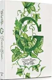
An exuberant celebration of the color green — in nature, art, interiors, and design.

Green is like water: it is everywhere, and we can’t live without it. Green is the color of nature and the environment. Green is life. Interior designer and style guru Carlos Mota has such a passion for green that he has now devoted an entire book to it. G: Forever Green celebrates the color in all its manifold manifestations: in nature, food, fashion, jewelry, art, interiors, and architecture.

From the brilliant markings on a butterfly’s wings to the feathers of a tropical bird’s breast, from Magritte’s oversized apple to the brocade drapery in the background of a Holbein portrait, from a leafy arbor to a leafy wallpaper, from celadon to forest to emerald to acid to lime to Kelly, the variety is astounding. Illustrated with Mota’s own photographs, taken as he has traveled the world, as well as images by prominent photographers, G: Forever Green features rooms by notable designers, among them Kelly Wearstler, Alessandra Branca, Mark D. Sikes, Robert Couturier, Gert Voorjans, and Nicky Haslam.

This stunning volume, superbly produced with a green metallic edge stain, is a testament to the power of green to soothe, inspire, and excite.

About the Author:

Carlos Mota is a creative consultant with extensive experience in styling, interior design, and product design. He has created environments for catalogs and advertising campaigns for numerous companies and brands. Formerly the international style editor for Architectural Digest and editor at large for Elle Decor, he has been named to the prestigious 2022 AD100 list. The author of Beige Is Not a Color, Mota lives in New York.

Цена: 4000 грн
Доступно под заказ
в корзину в избранное
Josef Albers
ID: 13378
Издательство: Yale University Press

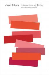
Josef Albers’s classic Interaction of Color is a masterwork in art education. Conceived as a handbook and teaching aid for artists, instructors, and students, this influential book presents Albers’s singular explanation of complex color theory principles.

Originally published by Yale University Press in 1963 as a limited silkscreen edition with 150 color plates, Interaction of Color first appeared in paperback in 1971, featuring ten color studies chosen by Albers, and has remained in print ever since. With over a quarter of a million copies sold in its various editions since 1963, Interaction of Color remains an essential resource on color, as pioneering today as when Albers first created it.

Fifty years after Interaction’s initial publication, this anniversary edition presents a significantly expanded selection of close to sixty color studies alongside Albers’s original text, demonstrating such principles as color relativity, intensity, and temperature; vibrating and vanishing boundaries; and the illusion of transparency and reversed grounds. A celebration of the longevity and unique authority of Albers’s contribution, this landmark edition will find new audiences in studios and classrooms around the world.

About the Author:

Josef Albers, one of the most influential artist-educators of the twentieth century, was a member of the Bauhaus group in Germany during the 1920s. In 1933 he came to the United States, where he taught at Black Mountain College for sixteen years. In 1950 he joined the faculty at Yale University as chairman of the department of design. Albers was elected to the National Institute of Arts and Letters in 1968 and was professor emeritus of art at Yale until his death in 1976.

___________

Пролистать книгу Interaction of Color: 50th Anniversary Edition на Google Books.

Цена: 980 грн
Доступно под заказ
в корзину в избранное
Patrick Baty, Peter Davidson, Elaine Charwat, Giulia Simonini, André Karliczek
ID: 13788
Издательство: Thames & Hudson

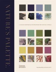
The first-ever visual expansion of Werner’s Nomenclature of Colours, featuring over 800 illustration references from the natural world

This chromatic catalogue of the natural world pairs individual colour swatches with examples from the animal, vegetable and mineral kingdoms to create a beautiful and comprehensive colour reference system to grace every bookshelf.

Marking the 200th anniversary of the publication of Syme’s expanded edition of Werner’s Nomenclature of Colours (1821), this lavish volume takes Syme’s field guide of 110 standard colours and – for the first time – fully illustrates it with nineteenth-century depictions of his referenced species. Expert text explains the uses and development of colour standards in relation to zoology, botany, minerology and anatomy, while specimens from contemporary collector’s cabinets (birds, butterflies, eggs, flowers and minerals) are matched to each colour swatch. Syme’s groundbreaking guide attempted to establish a universal colour reference system to help identify, classify and represent species from the natural world: this landmark publication completes his endeavour.

Contents List:

Introduction The Origination, Purpose and Development of Werner’s Nomenclature of Colours by Patrick Baty • i. Whites, Greys and Blacks • 1. Werner’s Mineralogical System and how his Nomenclature of Colours Became Syme’s Colour Standard by Peter Davidson • ii. Blues and Purples • 2. Colours in Zoology: Subjective or Systematic? by Elaine Charwat • iii. Greens • 3. Syme’s Colour Chart in Botany: Origin and Impact by Giulia Simonini • iv. Yellows and Oranges • 4. One for All? Werner’s Nomenclature of Colours as a General Standard of Colour and its Particular Use in Medicine by André Karliczek • v. Reds and Browns

About the Authors:

Patrick Baty is the author of The Anatomy of Colour and owner of Papers and Paints, a specialist paint business in London. His great grandfather, the artist Robert Bevan, was described by a former director of the National Gallery as being ‘perhaps the first Englishman to use pure colour in the 20th century’. He runs a consultancy that advises on the use of paint and colours in historic buildings and has worked with Dulux and Little Greene to develop ranges of traditional paint colours for English Heritage. He also lectures frequently on the subject of paint and colour of the 18th and 19th centuries.

Цена: 1980 грн
Доступно под заказ
в корзину в избранное
ID: 14564
Издательство: Victionary

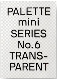
viction:ary’s original PALETTE colour-themed series has been one of the most sought-after references for designers around the world. Each edition has formed the basis of a classic collection that continues to be relevant and reliable through the variety of compelling concepts and visuals featured. In keeping with the ever-changing demands of creative practitioners today, we are introducing the PALETTE mini-series – redesigned in a convenient size for instant inspiration. Packed with style and substance like their predecessors with the addition of several new projects, they serve as instrumental and timeless sources of inspiration.

By manipulating the sense of absence and presence, transparency is a powerful attribute that can lure viewers into exploring what lies beneath and beyond a surface. Featuring additional projects that play with opacity, transparency, and everything in between in clever ways, PALETTE mini 06 – Transparent is a compelling collection of work from around the world that showcases how transparency is being reinterpreted and rejuvenated in design.

Цена: 1500 грн
Доступно под заказ
в корзину в избранное
ID: 14565
Издательство: Victionary

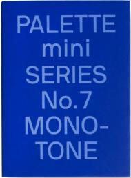
viction:ary’s original PALETTE colour-themed series has been one of the most sought-after references for designers around the world. Each edition has formed the basis of a classic collection that continues to be relevant and reliable through the variety of compelling concepts and visuals featured. In keeping with the ever-changing demands of creative practitioners today, we are introducing the PALETTE mini-series – redesigned in a convenient size for instant inspiration. Packed with style and substance like their predecessors with the addition of several new projects, they serve as instrumental and timeless sources of inspiration.

Manifesting a distinct simplicity, monochromatic hues can make a statement in the midst of all the surrounding visual noise. By consciously capitalising on a sole colour or a tonal palette, the designers in PALETTE mini 07 – Monotone have created variety out of singularity without rigour or restraint, as seen through the thoughtful formulations, materials, and techniques that bring their branding, packaging, and interior projects to life.

Цена: 1500 грн
Доступно под заказ
в корзину в избранное
ID: 15581
Издательство: Victionary

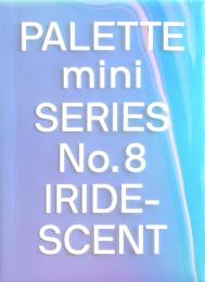
Since it was first released, the original PALETTE series has been an instrumental source of colour-themed references for designers around the world. 8 editions later, in keeping with the demands of creative practitioners today, the PALETTE mini series was introduced at the end of 2019 as flip-friendly versions of the originals – redesigned into a more compact size with minimal layouts for instant inspiration.

Palette Mini Series 08: Iridescent explores the myriad of possibilities that result from multi-coloured illusions that shift with the viewer’s vantage point through projects from all around the world. Whether its kaleidoscopic nature is utilised to create depth and dimension or to transform physical attributes and perspectives, discover how some of the best designers are experimenting with holographic hues to generate visuals and objects that intrigue.

Цена: 1500 грн
Доступно под заказ
в корзину в избранное
ID: 15580
Издательство: Victionary

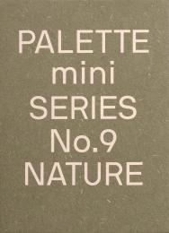
To keep up with the demands of creative practitioners of today, the original PALETTE books have been redesigned into the PALETTE mini series, a flip-friendly, compact source of colour-themed inspiration and references for designers.

Whether it is the warm brown tones of soil and bark or the lively shades of green, red and gold as leaves cycle through the seasons, we will always be drawn to the distinct hues of our planet on an instinctive level no matter what our tastes in colour may be. 

Palette Mini Series 09: Nature is a compelling compilation of projects from around the world that were brought to life by the rich spectra of Earth. From brand identities and packaging design to one-of-a-kind art pieces and visual experiments, it features a variety of impactful ways where colours from our natural environment can be applied to leave meaningful and lasting impressions.

Цена: 1500 грн
Доступно под заказ
в корзину в избранное
Sara Caldas
ID: 15169
Издательство: Hoaki

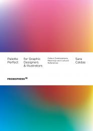
The second book in the best-selling Palette Perfect series focuses on the inventive use of colour in graphic design and illustration, and is both a practical and inspirational volume filled with colour combinations and stories about the meaning of colour in different cultures. The volume is illustratred with projects by renowned international graphic designers, and organized by the time of day associated with moods. Intended for professionals, students, fashion and interior decoration lovers, and all those interested in exciting and unexpected colour combinations that work.

Цена: 1250 грн
Доступно под заказ
в корзину в избранное
SendPoints
ID: 12040
Издательство: SendPoints

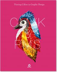
Colors are so universally used that every designer should consider when designing. They are so important that they to some degree decide the overall design.

This book introduces two systems of printing colors — CMYK and PMS — in a plain way, explaining how they are produced and the principles behind them with texts and illustrations. Meanwhile, it showcases a substantial selection of projects for reader’s well-rounded understanding of printing colors and their functions.

1. A detailed introduction to the two systems of printing colors — CMYK and PMS
2. Carefully-selected cases covering various types of graphic design
3. A good combination of theory and practice for easy learning

Цена: 2000 грн
Доступно под заказ
в корзину в избранное
показать по:
на странице