Типографика, Шрифты, Леттеринг

Книги по типографике, шрифтах и леттерингу

Вы выбрали:
Сортировка:
наличие
цена
алфавит
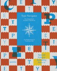
Jan Middendorp, TwoPoints.Net
ID: 13497
Издательство: Gestalten

An essential reference of independent foundries and innovative type designers.

The rapidly expanding online market for digital typefaces is exciting and diverse. With new fonts and type foundries launching on an almost daily basis, it has been difficult to keep track of notable developments — until now. Type Navigator is a useful current handbook of modern fonts, independent foundries, and innovative type designers that provides an overview of today’s vast market. This comprehensive publication offers a valuable overview of international sources for quality fonts. In addition to concise profiles of type foundries and recent typefaces, Type Navigator features inspirational visual examples of fonts in use. A free digital collection of 100 typeface variations from 20 choice foundries accompanies the 320-page book.

In the past, there were only a few specialists worldwide who worked intensively with typography. Since the introduction of digital fonts and their dissemination via the internet, typography has gained a new significance. More and more designers are creating fonts for a variety of applications. Simultaneously, more and more of these designers are founding type foundries to sell their fonts themselves. Supply and demand in this area have been growing considerably for years. The expanding market for typography is exciting and diverse, but it has been difficult to keep track of notable developments –– until now. Type Navigator is a comprehensive handbook of the best independent sources for quality fonts. Structured and indexed according to practical criteria, it offers not only a valuable overview but also possibilities for effective targeted searches. Whether a reader is in need of a specific type of font, is looking for fonts by a select designer, from a certain country, or even just wants to compare prices, 

Type Navigator will provide the necessary information. In addition to abundant examples of fonts as well as concrete applications for typefaces and alphabets, this essential compendium features concise profiles of type foundries and designers. Select interviews with managers of type foundries show how their creative visions are influencing the characteristics of their font libraries. Type Navigator is a valuable reference for agencies, designers, consultants, and customers who are looking for an overview of the modern typefaces currently available and the innovative people and companies behind them. Type Navigator is edited by typography expert Jan Middendorp as well as the former Hort designer Martin Lorenz and his wife Lupi Asensio, who currently work together as TwoPoints.Net.
 

Цена: 1500 грн
Есть в наличии
в корзину в избранное
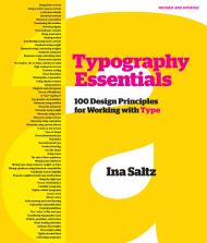
Ina Saltz
ID: 9133
Издательство: Rockport

Typography Essentials: 100 Design Principles for Working with Type is a practical, hands-on resource that distils and organizes the many complex issues surrounding the effective use of typography. An essential reference for designers since 2009, Typography Essentials is now completely refreshed with updated text, new graphics and photos, and a whole new look. 

Divided into four sections — The Letter, The Word, The Paragraph, and The Page — the text is concise, compact, and easy to reference. Each of the 100 principles, which cover all practical aspects of designing with type, has an explanation and inspiring visual examples drawn from international books, magazines, posters, and more.

Typography Essentials is for designers of every medium in which type plays a major role, and is organized and designed to make the process enjoyable and entertaining, as well as instructional.

____________

Пролистать книгу Typography Essentials: 100 Design Principles for Working with Type на Google Books.

Цена: 1200 грн
Есть в наличии
в корзину в избранное
Shaoqiang Wang
ID: 18023
Издательство: Hoaki

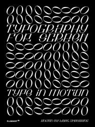
Typography for Screen features various creative typography projects for screens in different devices and applications, such as motion graphics, webpage design, and conceptual experiments and explores typographic application in visual and information hierarchies within the digital screen environment. Exclusive interviews with designers and studios integrate different knowledge and design philosophies constituting a true source of inspiration for designers and students. It includes QR codes with links to the designers' webpages showing the typefaces in use.

About the Author:

Wang Shaoqiang is a professor at the Guangzhou Academy of Fine Arts (China) and Doctoral Supervisor at the College of Arts and Humanities of the Macau University of Science and Technology. He is a prolific editor whose titles focus on design, art and lifestyle. He is also the editor of Design 360° magazine and Asia-Pacific Design yearbook. He has been invited to lecture at numerous universities, design academies and organizations, and he has been a jury member for China's most prestigious design and illustration awards.

Цена: 2500 грн
Есть в наличии
в корзину в избранное
Steven Heller, Lita Talarico
ID: 8541
Издательство: Thames & Hudson

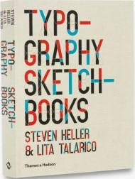
Nearly 120 of the world’s leading typographers and graphic designers open up their private sketchbooks to reveal their creative processes

Aimed at all those who use type, whether by hand or on-screen and selected by the world’s most knowledgeable and well-connected graphic-design commentator, Steven Heller, this survey gets into the minds of designers who create typefaces, word-images and logos through their private sketchbooks.

Arranged by designer, this collection reveals how the world’s top typographers and designers strive to find new and exciting ways of communicating through letters and words.

Contributors include both the world-renowned – Milton Glaser, Erik Spiekermann, Peter Bilak and Jean Baptiste Levée – and the up and coming, while Steven Heller and Lita Talarico’s text provides invaluable commentary on the designers’ creative process, their design philosophies, inspirations, techniques and influences.

About the Authors:

Steven Heller is co-chair of the MFA Design: Designer as Author programme at the School of Visual Arts, New York. He is the author of many books, including Stencil TypeGraphicTypography SketchbooksNew Ornamental Type and New Vintage Type, all published by Thames & Hudson.

Lita Talarico is the founding editor of American Illustration & Photography and the other co-chair of the MFA Designer as Author Department at the School of Visual Arts. She is also reporter-at-large for Italian Design Graphics.

Цена: 1300 грн
Есть в наличии
в корзину в избранное
Timothy Samara
ID: 4077
Издательство: Rockport

New in paperback, The Typography Workbook provides an at-a-glance reference book for designers on all aspects of type.

The book is part of Rockport's popular Workbook series of practical and inspirational workbooks that cover all the fundamental areas of the graphic design business. This book presents an abundance of information on type - the cornerstone of graphic design - succinctly and to the point, so that designers can get the information they need quickly and easily.

Whereas many other books on type are either very technical or showcase oriented, this book offers ideas and inspiration through hundreds of real-life projects showing successful, well-crafted usage of type. The book also offers a variety of other content, including choosing fonts, sizes, and colors; incorporating text and illustrations; avoiding common mistakes in text usage; and teaching rules by which to live (and work) by.

About the Author:

Timothy Samara is a graphic designer based in New York City, where he divides his time between teaching, writing, lecturing, and consulting through STIM Visual Communication. His 18-year career in branding and information design has explored projects in print, packaging, environments, user interface design, and animation. He has been a senior art director at Ruder Finn, New York's largest public relations firm, and senior art director at Pettistudio, a small multidisciplinary design firm. Before relocating to Manhattan, he was principal of Physiologic in Syracuse, located in upstate New York. In 1990, he graduated a Trustee Scholar from the Graphic Design program at the University of the Arts, Philadelphia. Mr. Samara is a faculty member at New York's School of Visual Arts, New York University, Purchase College/SUNY, and The New School, and has published six books on design and typography, all through Rockport Publishers: Making and Breaking the Grid; Typography Workbook; Publication Design Workbook; Type Style Finder; Design Elements, Design Evolution, and, most recently, Letterforms, released in September, 2018. Mr. Samara and his partner live in the Williamsburg neighbourhood of Brooklyn.

Цена: 900 грн
Есть в наличии
в корзину в избранное
Elliot Jay Stocks, Ellen Lupton
ID: 17405
Издательство: Rockport

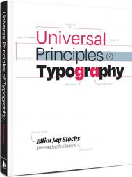
Universal Principles of Typography is a comprehensive, cross-disciplinary encyclopedia for choosing and using type.

Explore 100 key concepts, theories, and guidelines that are critical for choosing and using type.

We communicate with text every single day, but what does it mean to really understand type — to use it with clear intent and purpose? The art and science of typography combines subtle tweaks to line lengths with harmonious combinations of weights and styles; considered typeface pairings with a robust set of alternate characters; exciting technological advances with the realities of font licensing. There are so many ways designers can optimize how text is read and influence the way its message is understood — and yet so many designers miscommunicate without even realizing it.

Richly illustrated and easy to navigate, Universal Principles of Typographypairs clear explanations of each principle with visual examples of it applied in practice. By considering these concepts and examples, you can learn to make more informed, and ultimately better, typography decisions.

Building upon tried-and-tested principles from the world of print through to the very latest advances in browser technology, this book will equip you with everything you need to make the most informed typographic decisions in your design work today.

Featured principles are as diverse as:
- Characters & Glyphs
- Font v. Typeface
- Hierarchy
- Inclusivity
- OpenType
- Pairing type
- Rhythm
- Web fonts

Each principle is presented in a two-page format. The left-hand page contains a succinct definition, a full description of the principle, examples of its use, and guidelines for use. Sidenotes appear to the right of the text, and provide elaborations and references. The right-hand page contains visual examples and related graphics to support a deeper understanding of the principle.

With Universal Principles of Typography, gain a deep understanding of the universal principles of typography and learn how to apply them across any work you do with type, from the simplest of documents to the most complex of cross-platform design systems.

The titles in the Rockport Universal series offer comprehensive and authoritative information and edifying and inspiring visual examples on multidisciplinary subjects for designers, architects, engineers, students, and anyone who is interested in expanding and enriching their design knowledge.

About the Authors:

Elliot Jay Stocks is a designer and musician, based just outside Bristol, UK. After founding the typography magazine 8 Faces in 2010, Elliot joined Typekit (now known as Adobe Fonts) as Creative Director, and helped lead the service’s transition into desktop fonts and the Creative Cloud ecosystem. He then went on to take several Creative Director roles, all while co-running the lifestyle magazine Lagom with his wife. In 2021, Elliot collaborated with Google to launch the typography education resource Google Fonts Knowledge.

Over his nearly two-decade career as a designer, Elliot’s work has been profiled in publications such as Communication Arts, Creative Review, Computer Arts, and Page, and he has long been a familiar face at design and tech conferences around the world. Past highlights include TYPO, An Event Apart, South by Southwest, and The Type Directors Club NYC.

Today, Elliot focuses exclusively on typographic projects, as well as publishing the newsletter Typographic & Sporadic, and hosting the podcast Hello, Type Friends! He also makes electronic music as Other Form, and releases on several independent labels across Europe.

Ellen Lupton is a writer, curator, educator, and designer. She is Senior Curator of Contemporary Design at Cooper Hewitt, Smithsonian Design Museum in New York City. New projects include the books Health Design Thinking and Extra Bold, a feminist career guide for designers. Lupton is founding director of the Graphic Design MFA Program at MICA (Maryland Institute College of Art) in Baltimore, where she has authored numerous books on design processes, including Thinking with Type, Graphic Design Thinking, Graphic Design: The New Basics, and Type on Screen. Her book Design Is Storytelling was published by Cooper Hewitt in 2017. She received the AIGA Gold Medal for Lifetime Achievement in 2007. Recent exhibitions include Face Values: Understanding Artificial Intelligence and Herbert Bayer: Bauhaus Master. The Senses: Design Beyond Vision, Beauty — Cooper Hewitt Design Triennial, How Posters Work, and Beautiful Users. She was named a Fellow of the American Academy of Arts & Sciences in 2019.

_____________

Пролистать книгу Universal Principles of Typography: 100 Key Concepts for Choosing and Using Type на Google Books.

Цена: 1800 грн
Есть в наличии
в корзину в избранное
SendPoints
ID: 12069
Издательство: SendPoints

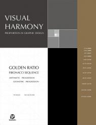
Proportion as a basic element in the field of design has been widely researched and studied. Taking mathematical theories, the golden ratio, and sequence principles into consideration in design and art often helps improve visual aesthetics, and the beauty of well-used proportions can be found in a variety of design projects.

Visual Harmony presents outstanding design work highlighting well-crafted proportions, presenting projects that will be solid references to readers worldwide. It elaborates on the subject with information in the form of descriptive text and diagrams.

Brand logos, visual identities, illustrations, and other artistic works featured in this book stand out from others because of the designers' in-depth understanding of proportions, reflecting the importance of rational thinking in the ever-changing creative world.

Цена: 2500 грн
Есть в наличии
в корзину в избранное
Irene Smit, Astrid van der Hulst
ID: 16804
Издательство: Workman Publishing

Take time to breathe. Take time to create. Take time to reflect, take time to let go. A book that’s unique in the way it mixes reading and doing, A Book That Takes Its Time is like a mindfulness retreat between two covers.Created in partnership with Flow, the groundbreaking international magazine that celebrates creativity, beautiful illustration, a love of paper, and life’s little pleasures, A Book That Takes Its Time mixes articles, inspiring quotes, and what the editors call “goodies” — bound-in cards, mini-journals, stickers, posters, blank papers for collaging, and more — giving it a distinctly handcrafted, collectible feeling.

Read about the benefits of not multitasking, then turn to “The Joy of One Thing at a Time Notebook” tucked into the pages. After a short piece on the power of slowing down, fill in the designed notecards for a Beautiful Moments jar. Make a personal timeline. Learn the art of hand-lettering. Dig into your Beginner’s Mind. Embrace the art of quitting. Take the writing cure. And always smile. Move slowly and with intention through A Book That Takes Its Time, and discover that sweet place where life can be both thoughtful and playful.

About the Author:

Irene Smit and Astrid van der Hulst are the cofounders and creative directors of Flow magazine, a popular international publication packed with paper goodies and beautiful illustrations that celebrates creativity, imperfection, and life's little pleasures. They both live outside Amsterdam.

____________

Пролистать книгу A Book That Takes Its Time: An Unhurried Adventure in Creative Mindfulness


Цена: 1500 грн
Доступно под заказ
в корзину в избранное
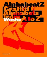
Woshe
ID: 14602
Издательство: Promopress

Graffiti writing was born in the streets of Philadelphia in the late 1960s. But it was in New York in the early 1970s that it became a full-fledged urban art. Passionate about graffiti for 25 years, Woshe tells the reader, in the first section of this book, the incredible story of the birth of this culture. He then invites us to a detailed examination of the 26 letters of the alphabet, their structure and the evolutions contributed by the graffiti writers. Finally, 10 of the most talented creators on the international scene answer to Woshe’s questions about their practice, their relationship to letters, their culture references, and so on. Alphabeatz is both a writing manual, an inspiring ideas box, and a beautiful book on the world of graffiti.

Цена: 1980 грн
Доступно под заказ
в корзину в избранное
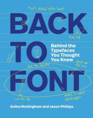
Anitra Nottingham, Jason Phillips
ID: 19051
Издательство: Laurence King Publishing

Warning: this book may cause you to rethink your default typeface settings.

Back to Font uncovers the secrets and lives behind 16 of the most famous typefaces. It answers all sorts of questions you might never have thought to ask before. Like: who were their 'parents' and where were they 'born'? What's pretty and interesting about them, and what isn't? How are the typefaces used (and abused), and where can you find them 'in the wild'? Most importantly, these chatty and opinionated insights will help you decide whether to kiss, marry or kill each typeface.
Who knew type could provoke such controversy? (We did.)

Featuring:
Times New Roman / Gill Sans / Futura / Bodoni / Goudy / Baskerville / Akzidenz Grotesk /
Mrs Eaves / Trajan / Novarese / Bell Centennial / Foundry Sterling / Transport /
Zapf Dingbats / Univers / Papyrus

About the Authors:

Anitra Nottingham worked as a book designer for Oxford University Press, and Penguin Books, Australia. She was Online Director for the School of Graphic Design at the Academy of Art University in San Francisco for 13 years, where she taught typography and graphic design history. Anitra is now Lead Learning Designer at the University of Melbourne Online, where, among other things, she ensures that the learning design team uses en-dashes correctly.

Jason Phillips began his career designing banknotes, before moving into book design for Oxford University Press, Hardie Grant Books, and a number of other Australian and international publishers. He spent a decade teaching tertiary-level typography and editorial design. Jason currently works in curriculum development in the vocational training sector, where his role includes educating stakeholders that Arial is not their friend.

Цена: 1300 грн
Доступно под заказ
в корзину в избранное
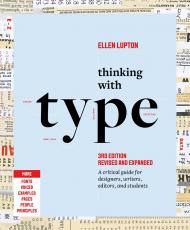
Ellen Lupton
ID: 18518
Издательство: Letterform Archive Books

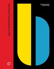
An unprecedented, definitive look at the school’s typography and print design, from its early expressive tendencies to the functional modernism for which it is famed today

The Bauhaus looms large as one of the most influential legacies in 20th-century graphic design. Known for its bold sans-serif typefaces, crisp asymmetrical grids and clean use of negative space, the school emerged as the forebearer of a new look ― one that seized the tools of mass production in the creation of a radical new art. Today, just over 100 years after the Bauhaus’s opening in 1919, the school’s visual hallmarks have come to define modernity as it appears on the printed page.

The official catalog for Letterform Archive’s inaugural gallery exhibition, Bauhaus Typography at 100 explores the school’s legacy in graphic and typographic design through artifacts of its own making ― its books, magazines, course materials, product catalogs, stationery, promotional fliers and other ephemera.

From the book’s beautifully designed pages, readers learn of typographic masters László Moholy-Nagy, Herbert Bayer and Joost Schmidt, who channeled Constructivism’s geometric forms and optimism for industry into printed vehicles for the school’s teachings. Here is where Bauhaus typography ― its rejection of serifs and capitals, embrace of experimental alphabets, insistence on universal clarity, and innovation in layering and hierarchy ― took its distinctive shape.

The catalog also shines light on the Bauhaus’s lesser-known early forays into expressive lettering and illustration, also tracing the school’s immediate impact on seminal design movements such as the New Typography and, of course, on design practitioners working today. Lavishly illustrated, carefully researched and written, and accompanied by an in-depth introduction from noted Bauhaus expert, author and curator Ellen Lupton, Bauhaus Typography at 100 is a must-have for any fan of modern design.

About the Author:

Ellen Lupton is a designer, writer, and educator. Her books include Design Is Storytelling, Graphic Design Thinking, Health Design Thinking, and Extra Bold: A Feminist, Inclusive, Anti-Racist, Nonbinary Field Guide for Graphic Designers. The third edition of her bestselling book Thinking with Type launches in March, 2024. She teaches in the Graphic Design MFA program at Maryland Institute College of Art in Baltimore (MICA), where she proudly serves as the Betty Cooke and William O. Steinmetz Design Chair. She is Curator Emerita at Cooper Hewitt, Smithsonian Design Museum in New York City, where her exhibitions included Herbert Bayer: Bauhaus Master and The Senses: Design Beyond Vision

Цена: 2500 грн
Доступно под заказ
в корзину в избранное
Ben Wittner, Sascha Thoma, Timm Hartmann
ID: 12342
Издательство: niggli Verlag

As a result of globalization and increased interaction across countries and cultures, multilingualism is becoming increasingly important all around the world. Script, as the most important conveyor of information, is at the center of this development. Designers are more and more faced with the challenging task to create advertising posters, signage systems, books or lettering, for example, that not only combine different languages but two or even more writing systems with varying visual precepts and habits.

At first, important general aspects are documented and discussed such as sociocultural premises, technical requirements as well as practical considerations. All eight in-depth presented writing systems are then described by specialists in the field and illustrated by work examples from international designers and studios. "Bi-Scriptual" provides a thorough overview of the various possibilities for the booming field of multiscript design to foster international communication.

_Significance of multilingual typography
_Theoretical backgrounds
_Best-practice in designing with different script-systems
_Work samples by more than 100 studios worldwide

Цена: 3000 грн
Доступно под заказ
в корзину в избранное
Edoardo Fazzioli
ID: 17905
Издательство: Abbeville Press

Beautifully executed illustrations and in-depth commentry are presented in this excellent introduction to the Chinese language and its millieu

Written Chinese can call upon about 40,000 characters, many of which originated some 6,000 years ago as little pictures of everyday objects used by the ancients to communicate with one another. To convey more abstract ideas or concepts, the Chinese stylised and combined their pictographs. For instance, the character for "man" - a straight back above two strong legs - becomes, with the addition of a head and shoulders and arms held sternly akimbo, the character for "official".

This book, modelled after a classic compilation of the Chinese language done in the 18th century, introduces readers to the 214 root pictographs or symbols upon which this writing system, whose rich complexities hold a wealth of cultural meaning, is based. These key characters, called radicals, are all delightfully presented in this volume, with their graphic development traced stage-by-stage to the present representation, where even now (in many of them) one can easily make out what was originally pictured-with the author's guidance.

Centuries ago, when the Japanese took up writing, they also adopted these symbols, though they gave them different names in their own spoken language. Each of the 214 classic radicals is charmingly explored by the author, both for its etymology and for what it reveals about Chinese history and culture. Chinese characters are marvels of graphic design, and this book even shows the proper way to write each radical, stroke by stroke. Finally, there are also samples of each radical combined with other radicals and character elements to demonstrate how new characters are formed-some 8,000 have been added to the language since the 18th century. With all its expertly executed calligraphic illustrations and fascinating commentary, this book serves as an excellent introduction to Chinese writing and its milieu.

About the Author:

Edoardo Fazzioli, who has studied Chinese language and culture at Hong Kong University and is a member of the Italo-Chinese Institute for Economic and Cultural Exchange, has written newspaper articles and scholarly pieces on Chinese life and civilization.

Цена: 1200 грн
Доступно под заказ
в корзину в избранное
Yana Vekshyna
ID: 15273
Издательство: niggli Verlag

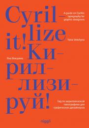
Cyrillic is a script applied by more than 250 million people across Europe and Asia using more than 100 languages. Within the last 15 years it has become increasingly more visible, popular, and utilized in the West.

The Ukrainian author reflects on the relevance of Cyrillic in today’s world, looks at its history and current design trends, provides an overview of the typographic rules and offers practical advice on designing with Cyrillic type. The book also includes interviews with graphic and type design professionals.

In our globalized world, in which multiscripturalism is increasingly important, Cyrillize it! offers designers a method for professionally and successfully handling a different script system. Featuring a playful and esthetically appealing design, and a number of outstanding examples of contemporary graphic design, the publication is also of interest to everybody generally curious about Cyrillic design and related cultures.

_How to design in a script without being able to read it
_Thematizing relevance of Cyrillic today
_Perspective from both native and non-native speakers
_Includes interviews with professionals

Цена: 1700 грн
Доступно под заказ
в корзину в избранное
Damien Gautier, Claire Gautier
ID: 12381
Издательство: niggli Verlag

Why does a newspaper look different than a magazine or a book? What effect does using a certain typeface or a specific grid have? And why do some layouts just seem right, and others seem simply wrong?

This comprehensive handbook and reference volume elaborates by means of sketches and explanations on the basics and terminology that are indispensable for the design and production of print media. From the initial layout and the correct use of colour and typefaces to the right column width and line spacing: "Design, Typography, etc." covers all aspects of good design for books, posters and advertising.

_ Comprehensive handbook
_ Considering all aspects of print media 
_ Practical explanations and illustrative application examples
_ Including extensive glossary

Цена: 2500 грн
Доступно под заказ
в корзину в избранное
показать по:
на странице