Типографика, Шрифты, Леттеринг

Книги по типографике, шрифтах и леттерингу

Вы выбрали:
Сортировка:
наличие
цена
алфавит
Mark van Wageningen
ID: 12945
Издательство: Princeton Architectural Press

To create his award-winning multicolored typefaces, Mark van Wageningen first returned to the past for his research: wood-type printing. 

His subsequentform and color studies led to a series of popular digital typefaces and awards for typographic excellence from the Type Directors Club. 

In Type and Color, the pioneering typographic designer provides all the tools you will need to participate in the hottest typography trend: designing with multicolored fonts. 

This manual, aimed at a broad spectrum of graphic design professionals, offers analyses of chromatic type specimens, instructions for multilayer type design, and applications across a range of print and digital media. From display fonts to running text, discover how color can give words expressive new possibilities.

About the Author

Mark van Wageningen is a (typo)graphic designer and founder of Novo Typo, a design studio based in Amsterdam. A self-proclaimed “ambassador of multicolored typography,” he organizes workshops and presentations at several international design conferences and festivals. Mark van Wageningen’s favorite color is full color.

Цена: 1200 грн
Доступно под заказ
в корзину в избранное
ID: 13543
Издательство: Victionary

Custom typefaces have become an increasingly common means for forward-thinking brands to establish and further strengthen their visual identities. By expressing a unique personality or supporting a campaign effectively, these typefaces go beyond aesthetics and achieving marketing objectives to build value for the brands over the long term. Type for Type collates some of the best custom typography work around the world that demonstrates both creative and commercial ingenuity. It also features cover stories that offer insights by some of the top design studios in the industry as well as compelling project- and technique-related details to inspire both designers and clients alike.

Цена: 1980 грн
Доступно под заказ
в корзину в избранное
Sofie Beier
ID: 13770
Издательство: Bis Publishers

‘Type Tricks’ is about typographical rules and the underlying structure of the work process in the design of new typefaces. In that way, it is both a reference book and a user manual. In an illustrative format, it presents the different stages of type design in an easily accessible manner. Being an expert as a typography professor, Sofie Beier knows exactly what the students need to know and how they can improve their skills.

‘Type Tricks’ is not only perfect for students, it also comes in handy for every type designer. It gives them the opportunity to reread information they were taught at during their time at school. It’s the perfect reference book. The book contains a number of essential tricks that designers need to know and understand. The typographic guidelines are difficult to remember, but with this book you don’t have to remember every single one of them.

About the Author:

Sofie Beier is a type designer and associ­ate professor employed at the School of Design under The Royal Danish Academy of Fine Arts, where she is the head of the MA programme in Type & Wayfinding. She holds a PhD from the Royal College of Art in London and is the author of the book ‘Reading Letters: designing for legibility’.

Цена: 1100 грн
Доступно под заказ
в корзину в избранное
Scott Williams, Henrik Kubel
ID: 11377
Издательство: Laurence King Publishing

This selection of typographic design, edited by leading typographers A2/SW/HK, showcases more than 100 carefully selected contemporary designers, including the best examples of their current work, and also features an introduction by Rick Poynor.

Featured designers include Michael Bierut, Experimental Jetset, Scott King, Cornel Windlin, Hort, karlssonwilker inc., Stefan Sagmeister, Fuel, Gavillet & Rust, De Designpolitie and Richard Turley among others.

There are also essays by acclaimed design writers Emily King, Paul Shaw, Monika Parrinder and Colin Davies that explore the past and future of type design. This book will encourage and inspire the next generation of designers as well as provide a sourcebook for seasoned designers and educators.

Цена: 1300 грн
Доступно под заказ
в корзину в избранное
Andy Altmann
ID: 18136
Издательство: Circa Press

Designer Andy Altmann has been pursuing an obsession with typographic oddities for more than 30 years; and he’s not necessarily interested in the kind of thing you might expect. He delights in the weird and wonderful and finds inspiration in the ordinary. At last, he has organised his typographic hits and misses in a 400-page, whopper of a scrapbook. Conceived and edited by Andy, typo* is a cornucopia of curiosities. Between its covers you’ll find everything from Swiss minimalism to Victorian street signs, from soap packets to magazine covers, from high art to the handmade. Essential is too small a word for this book: every graphic designer and typographer should have a copy. Keep it by the keyboard or refer to it secretly when stuck for an idea, you’ll wonder how you ever managed without it.

*typo (noun): an error (as of spelling) in typed or typeset material; (abbr.) typography or typographer.

About the Author:

Andy Altmann has an independent design consultancy, based in London. He was a founding partner at Why Not Associates – one of the UK’s leading multi-disciplinary design companies. Andy founded Why Not Associates in 1987, with fellow Royal College of Art graduates David Ellis and Howard Greenhalgh. Although he trained as a graphic designer, Andy’s work has taken him into the blurred boundaries of design and art. In over 30 years of experience he has worked on projects ranging from exhibition design to postage stamps, via advertising, publishing, television titles, commercials, corporate identity and large-scale public art. His clients include the Royal Academy of Arts, Channel 4, V&A, Grace Jones, Pompidou Centre, Royal Mail, Nike, Paul Smith, Chris Ofili, Kobe Museum of Fashion, and Tate Modern. All his work is bound by a fundamental love of typography, research and experimentation. He has given numerous lectures on his work all around the world – from Siberia to Japan via Manchester! In 1991 Why Not Associates collaborated with Edward Booth-Clibborn and Rick Poyner to edit and design Typography Now: The Next Wave – which became the most significant, most referenced, best-selling survey of typographic trends and thinking of its time. A monograph was published in 1998, documenting the first ten years of Why Not Associates’ work and a second, published in 2004, documented another five years.

________________________

Пролистать книгу   typo*: A Scrapbook of Typographic Obsession​  на сайте издательства.


Цена: 3500 грн
Доступно под заказ
в корзину в избранное
Emil Ruder
ID: 18271
Издательство: niggli Verlag

The unabbreviated edition of the 1967 original edition is a masterpiece that is still one of the most important manuals in the field, capturing Ruder's ideas, methods and approaches.

This book is the legacy of Emil Ruder, one of the originator of Swiss Style, famous throughout the world for the use of asymmetric layouts, use of a grid, sans-serif typefaces and flush left, ragged right text. His holistic approach is still recognized as fundamental for graphic designers and typographers all over the world. This volume represents a critical reflection on his teaching and practice and a life- time of accumulated knowledge.

Beyond that, it is a comprehensive masterpiece seen in its overall structure: in the themes presented, in the comparison of similarities and contrasts, in the richness of the illustrations and the harmoniously inserted types. Behind the purely pedagogic examples of exact proportions, a rich, philosophical thinking shines through. Today, more than forty years after this book was first published, it is still widely used and referenced.

_ unabbreviated edition of the 1967 original edition
_ masterpiece that is still one of the most important manuals in the field
_ capturing Ruder’s ideas, methods and approaches
_ carefully selected examples

About the Author:

Emil Ruder (20 March 1914 – 13 March 1970) was a Swiss typographer and graphic designer who, with Armin Hofmann, joined the faculty of the Schule für Gestaltung Basel (Basel School of Design). One of the main masters of Swiss design.
Цена: 3000 грн
Доступно под заказ
в корзину в избранное
Phaidon Editors, with an introduction by Evan Moffitt
ID: 18392
Издательство: Phaidon

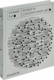
A ground-breaking global survey of today’s most innovative artists working with text

The inclusion of text in works of art was a revolutionary creative advancement of the twentieth century, with artists subverting traditional conceptions of ‘art’ and ‘writing.’ Younger generations of artists have continued to use the inherent readability of words to communicate ideas to viewers across a diverse array of mediums, including painting, sculpture, installation, and video.

Nominated by 66 leading global experts (including curators, critics, museum directors, and professors), Vitamin Txt showcases 103 living artists, from 34 countries, who place the use of text centrally within their artistic practices. With more the 500 artworks illustrated, and an introduction about the history of artists using text from ancient Chinese calligraphy to contemporary digital art, the book’s focus allows for a showcase of a range of different mediums, providing a cross-disciplinary view into the art world today.

Advisors include: Negar Azimi, Naomi Beckwith, Meriem Berrada, Isolde Brielmaier, Yeon Shim Chung, Tandazani Dhlakama, Yilmaz Dziewior, Touria El Glaoui, Ruth Erickson, Alison Gingeras, Krist Gruijthuijsen, Jennifer Higgie, Mami Kataoka, Sunjung Kim, Venus Lau, Helen Molesworth, Kimberly Moulton, Fumio Nanjo, Chika Okeke-Agulu, Adriano Pedrosa, Nada Raza, Dieter Roelstraete, Andrew Russeth, Nancy Spector, Sarah Thornton, Marianna Vecellio, Gilbert Vicario, Victor Wang

Artists featured include: Ghada Amer, Hellen Ascoli, Kamyar Bineshtarigh, Sophie Calle, Alejandro Cesarco, Heman Chong, Tony Cokes, Tracey Emin, Jeffrey Gibson, Shilpa Gupta, Jenny Holzer, Roni Horn, Ichihara Hiroko, Christine Sun Kim, Barbara Kruger, Glenn Ligon, Harland Miller, Shirin Neshat, Adam  Pendleton, Shubigi Rao, Kameelah Janan Rasheed, Kay Rosen, Ed Ruscha, David Shrigley, Studio for Propositional Cinema, Hank Willis Thomas, Rirkrit Tiravanija, Nora Turato, Kaylene Whiskey, John Wood and Paul Harrison, Xu Bing, Young-Hae Chang Heavy Industries

About the Author:

Phaidon Editors

Evan Moffitt is a writer, editor, and freelance critic based in New York.

Цена: 3200 грн
Доступно под заказ
в корзину в избранное
Pepin Presd Design
ID: 1487
Издательство: Pepin Press

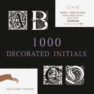
A lavish treasury of decorative initials presented in a wide variety of styles ranging from Medieval, Celtic, Renaissance, Victorian and Classica, to Art Nouveau and Art Deco. All letters from A-Z are shown on average in 30 different styles. Black and White high resolution initials, MAC or PC compatible. The books acts as a full CD browser

Товар отсутствует
cообщить о поступлении
Bob Gordon
ID: 4984
Издательство: Ilex

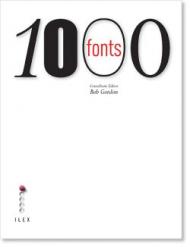
1000 Fonts is the fast and easy way to identify the font that works perfectly for any purpose. Each typeface is displayed in its entirety with a brief introduction and suggestions for use, and there are hundreds of real-world examples of the fonts in action. Supplemented by a glossary and an extensive resource section, this thorough and accessible volume offers a myriad of options to anyone seeking to make their words stand out. Covering everything from serif and sans serif text fonts to ornamentals, dingbats and display fonts, this chunky, practical reference will prove itself invaluable to any graphic designer – or to anyone who wants to look beyond Times New Roman and Arial.

Товар отсутствует
cообщить о поступлении
Wilson Harvey
ID: 1081
Издательство: РИП-холдинг

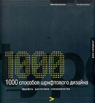
- Внимание! Книга на английском языке! - Способность дизайнера грамотно работать со шрифтами - это высший пилотаж. Возможность искусно обращаться со шрифтом говорит о глубоком понимании всех сложностей типографики, а также об остром глазе, способном заметить едва различимые детали. В книге вы найдете коллекцию из 1000 примеров продуманного и вдохновленного использования шрифтов в соответствии с классическими правилами, и нарушая все правила. Фотографии и иллюстрации в этой книге рассказывают о способах создания шрифтов. Читатели смогут более детально узнать о каждой стадии работы. В книге множество примеров шрифтового дизайна, которые расположены в определенном порядке, что позволяет быстро находить необходимую информацию. Издание послужит источником вдохновение при создании плаката, приглашения или брошюры в любом разделе вы без труда сможет найти новые динамичные идеи.

Товар отсутствует
cообщить о поступлении
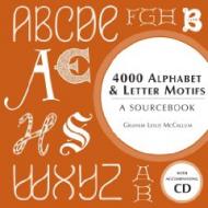
Graham McCallum
ID: 4577
Издательство: Anova

This title is the next in the bestselling series for all crafters and designers: 4000 stunning motifs of initials, whole alphabets, numbers and characters - from question marks to musical notation. Like all of his previous motif books, the author provides alphabets and initials in a range of historic fonts and scripts. He also presents Roman alphabets that show the influence of other cultures, such as Cyrillic (Russian/Slavonic) scripts and Rune letters. But unique alphabets and elaborate initials - created by the author himself - are also featured to make up a great sourcebook for all those working in the creative field.

Товар отсутствует
cообщить о поступлении
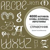
Грэхем Лесли Маккэлэм
ID: 6643
Издательство: АСТ

4000 Alphabet & Letter Motifs

Книга содержит более 4000 образцов букв.
В книге представлены как алфавиты целиком, так и тщательно выполненные отдельные буквицы.
От латинской азбуки до современных шрифтовых коллекций для художников-графиков.
Включены наглядные таблицы, показывающие развитие письменности от иероглифов до современных букв.
Изображения можно копировать, увеличивать, срисовывать или видоизменять.
Подходит для художественного творчества в любой области: от вышивки до работ по дереву, от выполнения татуировок до графического дизайна.

Товар отсутствует
cообщить о поступлении
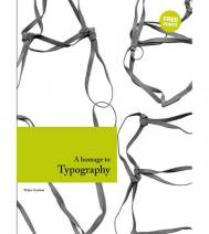
Pedro Guitton
ID: 4916
Издательство: Index Book

A Homage to Typography contains 100 fonts and their applications, designed by top typographers. It covers typography in a wide variety of media, including examples ranging from publishing and corporate identity to product design and signage. Includes a CD with 57 free fonts.

Товар отсутствует
cообщить о поступлении
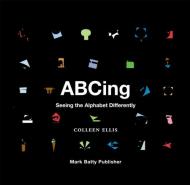
Colleen Ellis
ID: 8855
Издательство: Mark Batty Publisher

From abstract to zeitgeist, ABCing: Seeing the Alphabet Differently spurs alternative approaches to seeing and understanding letterforms, and the world.

Colleen Ellis has dismantled the Latin alphabet, shifting the focus from the subject - the letter - to the surrounding space, introducing new ways of visualizing, thinking and talking about art and design. Each illustration is created using only the negative shapes of a letter. The shapes are rotated and resized; they are not duplicated, mirrored or otherwise altered. The shapes are then composed as a visual translation of a given word’s meaning, creating visual and conceptual connections between the letter, the word and the surrounding space.

Both seasoned designers and students of all ages will value this book, which colorfully reminds everyone how new perspectives can provide new meanings

Товар отсутствует
cообщить о поступлении
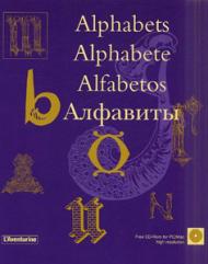
ID: 3633
Издательство: L'Aventurine
Данное издание как антология алфавитов предлагает вниманию читателя исключительные примеры из истории шрифтов и каллиграфии. Восемь столетий декоративного письма предстанут перед Вами в этой книге. Все иллюстрации в этой книге представлены на CD, которые могут быть использованы как на PC так и на MAC компьютерах. Изображения сохранены в файлах формата TIFF высокого разрешения.
Товар отсутствует
cообщить о поступлении
показать по:
на странице