Типографика, Шрифты, Леттеринг

Книги по типографике, шрифтах и леттерингу

Вы выбрали:
Сортировка:
наличие
цена
алфавит
Timothy Samara
ID: 4077
Издательство: Rockport

New in paperback, The Typography Workbook provides an at-a-glance reference book for designers on all aspects of type.

The book is part of Rockport's popular Workbook series of practical and inspirational workbooks that cover all the fundamental areas of the graphic design business. This book presents an abundance of information on type - the cornerstone of graphic design - succinctly and to the point, so that designers can get the information they need quickly and easily.

Whereas many other books on type are either very technical or showcase oriented, this book offers ideas and inspiration through hundreds of real-life projects showing successful, well-crafted usage of type. The book also offers a variety of other content, including choosing fonts, sizes, and colors; incorporating text and illustrations; avoiding common mistakes in text usage; and teaching rules by which to live (and work) by.

About the Author:

Timothy Samara is a graphic designer based in New York City, where he divides his time between teaching, writing, lecturing, and consulting through STIM Visual Communication. His 18-year career in branding and information design has explored projects in print, packaging, environments, user interface design, and animation. He has been a senior art director at Ruder Finn, New York's largest public relations firm, and senior art director at Pettistudio, a small multidisciplinary design firm. Before relocating to Manhattan, he was principal of Physiologic in Syracuse, located in upstate New York. In 1990, he graduated a Trustee Scholar from the Graphic Design program at the University of the Arts, Philadelphia. Mr. Samara is a faculty member at New York's School of Visual Arts, New York University, Purchase College/SUNY, and The New School, and has published six books on design and typography, all through Rockport Publishers: Making and Breaking the Grid; Typography Workbook; Publication Design Workbook; Type Style Finder; Design Elements, Design Evolution, and, most recently, Letterforms, released in September, 2018. Mr. Samara and his partner live in the Williamsburg neighbourhood of Brooklyn.

Цена: 900 грн
Есть в наличии
в корзину в избранное
Elliot Jay Stocks, Ellen Lupton
ID: 17405
Издательство: Rockport

Universal Principles of Typography is a comprehensive, cross-disciplinary encyclopedia for choosing and using type.

Explore 100 key concepts, theories, and guidelines that are critical for choosing and using type.

We communicate with text every single day, but what does it mean to really understand type — to use it with clear intent and purpose? The art and science of typography combines subtle tweaks to line lengths with harmonious combinations of weights and styles; considered typeface pairings with a robust set of alternate characters; exciting technological advances with the realities of font licensing. There are so many ways designers can optimize how text is read and influence the way its message is understood — and yet so many designers miscommunicate without even realizing it.

Richly illustrated and easy to navigate, Universal Principles of Typographypairs clear explanations of each principle with visual examples of it applied in practice. By considering these concepts and examples, you can learn to make more informed, and ultimately better, typography decisions.

Building upon tried-and-tested principles from the world of print through to the very latest advances in browser technology, this book will equip you with everything you need to make the most informed typographic decisions in your design work today.

Featured principles are as diverse as:
- Characters & Glyphs
- Font v. Typeface
- Hierarchy
- Inclusivity
- OpenType
- Pairing type
- Rhythm
- Web fonts

Each principle is presented in a two-page format. The left-hand page contains a succinct definition, a full description of the principle, examples of its use, and guidelines for use. Sidenotes appear to the right of the text, and provide elaborations and references. The right-hand page contains visual examples and related graphics to support a deeper understanding of the principle.

With Universal Principles of Typography, gain a deep understanding of the universal principles of typography and learn how to apply them across any work you do with type, from the simplest of documents to the most complex of cross-platform design systems.

The titles in the Rockport Universal series offer comprehensive and authoritative information and edifying and inspiring visual examples on multidisciplinary subjects for designers, architects, engineers, students, and anyone who is interested in expanding and enriching their design knowledge.

About the Authors:

Elliot Jay Stocks is a designer and musician, based just outside Bristol, UK. After founding the typography magazine 8 Faces in 2010, Elliot joined Typekit (now known as Adobe Fonts) as Creative Director, and helped lead the service’s transition into desktop fonts and the Creative Cloud ecosystem. He then went on to take several Creative Director roles, all while co-running the lifestyle magazine Lagom with his wife. In 2021, Elliot collaborated with Google to launch the typography education resource Google Fonts Knowledge.

Over his nearly two-decade career as a designer, Elliot’s work has been profiled in publications such as Communication Arts, Creative Review, Computer Arts, and Page, and he has long been a familiar face at design and tech conferences around the world. Past highlights include TYPO, An Event Apart, South by Southwest, and The Type Directors Club NYC.

Today, Elliot focuses exclusively on typographic projects, as well as publishing the newsletter Typographic & Sporadic, and hosting the podcast Hello, Type Friends! He also makes electronic music as Other Form, and releases on several independent labels across Europe.

Ellen Lupton is a writer, curator, educator, and designer. She is Senior Curator of Contemporary Design at Cooper Hewitt, Smithsonian Design Museum in New York City. New projects include the books Health Design Thinking and Extra Bold, a feminist career guide for designers. Lupton is founding director of the Graphic Design MFA Program at MICA (Maryland Institute College of Art) in Baltimore, where she has authored numerous books on design processes, including Thinking with Type, Graphic Design Thinking, Graphic Design: The New Basics, and Type on Screen. Her book Design Is Storytelling was published by Cooper Hewitt in 2017. She received the AIGA Gold Medal for Lifetime Achievement in 2007. Recent exhibitions include Face Values: Understanding Artificial Intelligence and Herbert Bayer: Bauhaus Master. The Senses: Design Beyond Vision, Beauty — Cooper Hewitt Design Triennial, How Posters Work, and Beautiful Users. She was named a Fellow of the American Academy of Arts & Sciences in 2019.

_____________

Пролистать книгу Universal Principles of Typography: 100 Key Concepts for Choosing and Using Type на Google Books.

Цена: 1800 грн
Есть в наличии
в корзину в избранное
SendPoints
ID: 12069
Издательство: SendPoints

Proportion as a basic element in the field of design has been widely researched and studied. Taking mathematical theories, the golden ratio, and sequence principles into consideration in design and art often helps improve visual aesthetics, and the beauty of well-used proportions can be found in a variety of design projects.

Visual Harmony presents outstanding design work highlighting well-crafted proportions, presenting projects that will be solid references to readers worldwide. It elaborates on the subject with information in the form of descriptive text and diagrams.

Brand logos, visual identities, illustrations, and other artistic works featured in this book stand out from others because of the designers' in-depth understanding of proportions, reflecting the importance of rational thinking in the ever-changing creative world.

Цена: 2500 грн
Есть в наличии
в корзину в избранное
Irene Smit, Astrid van der Hulst
ID: 16804
Издательство: Workman Publishing

Take time to breathe. Take time to create. Take time to reflect, take time to let go. A book that’s unique in the way it mixes reading and doing, A Book That Takes Its Time is like a mindfulness retreat between two covers.Created in partnership with Flow, the groundbreaking international magazine that celebrates creativity, beautiful illustration, a love of paper, and life’s little pleasures, A Book That Takes Its Time mixes articles, inspiring quotes, and what the editors call “goodies” — bound-in cards, mini-journals, stickers, posters, blank papers for collaging, and more — giving it a distinctly handcrafted, collectible feeling.

Read about the benefits of not multitasking, then turn to “The Joy of One Thing at a Time Notebook” tucked into the pages. After a short piece on the power of slowing down, fill in the designed notecards for a Beautiful Moments jar. Make a personal timeline. Learn the art of hand-lettering. Dig into your Beginner’s Mind. Embrace the art of quitting. Take the writing cure. And always smile. Move slowly and with intention through A Book That Takes Its Time, and discover that sweet place where life can be both thoughtful and playful.

About the Author:

Irene Smit and Astrid van der Hulst are the cofounders and creative directors of Flow magazine, a popular international publication packed with paper goodies and beautiful illustrations that celebrates creativity, imperfection, and life's little pleasures. They both live outside Amsterdam.

____________

Пролистать книгу A Book That Takes Its Time: An Unhurried Adventure in Creative Mindfulness


Цена: 1500 грн
Доступно под заказ
в корзину в избранное
Woshe
ID: 14602
Издательство: Promopress

Graffiti writing was born in the streets of Philadelphia in the late 1960s. But it was in New York in the early 1970s that it became a full-fledged urban art. Passionate about graffiti for 25 years, Woshe tells the reader, in the first section of this book, the incredible story of the birth of this culture. He then invites us to a detailed examination of the 26 letters of the alphabet, their structure and the evolutions contributed by the graffiti writers. Finally, 10 of the most talented creators on the international scene answer to Woshe’s questions about their practice, their relationship to letters, their culture references, and so on. Alphabeatz is both a writing manual, an inspiring ideas box, and a beautiful book on the world of graffiti.

Цена: 1980 грн
Доступно под заказ
в корзину в избранное
Ellen Lupton
ID: 18518
Издательство: Letterform Archive Books

An unprecedented, definitive look at the school’s typography and print design, from its early expressive tendencies to the functional modernism for which it is famed today

The Bauhaus looms large as one of the most influential legacies in 20th-century graphic design. Known for its bold sans-serif typefaces, crisp asymmetrical grids and clean use of negative space, the school emerged as the forebearer of a new look ― one that seized the tools of mass production in the creation of a radical new art. Today, just over 100 years after the Bauhaus’s opening in 1919, the school’s visual hallmarks have come to define modernity as it appears on the printed page.

The official catalog for Letterform Archive’s inaugural gallery exhibition, Bauhaus Typography at 100 explores the school’s legacy in graphic and typographic design through artifacts of its own making ― its books, magazines, course materials, product catalogs, stationery, promotional fliers and other ephemera.

From the book’s beautifully designed pages, readers learn of typographic masters László Moholy-Nagy, Herbert Bayer and Joost Schmidt, who channeled Constructivism’s geometric forms and optimism for industry into printed vehicles for the school’s teachings. Here is where Bauhaus typography ― its rejection of serifs and capitals, embrace of experimental alphabets, insistence on universal clarity, and innovation in layering and hierarchy ― took its distinctive shape.

The catalog also shines light on the Bauhaus’s lesser-known early forays into expressive lettering and illustration, also tracing the school’s immediate impact on seminal design movements such as the New Typography and, of course, on design practitioners working today. Lavishly illustrated, carefully researched and written, and accompanied by an in-depth introduction from noted Bauhaus expert, author and curator Ellen Lupton, Bauhaus Typography at 100 is a must-have for any fan of modern design.

About the Author:

Ellen Lupton is a designer, writer, and educator. Her books include Design Is Storytelling, Graphic Design Thinking, Health Design Thinking, and Extra Bold: A Feminist, Inclusive, Anti-Racist, Nonbinary Field Guide for Graphic Designers. The third edition of her bestselling book Thinking with Type launches in March, 2024. She teaches in the Graphic Design MFA program at Maryland Institute College of Art in Baltimore (MICA), where she proudly serves as the Betty Cooke and William O. Steinmetz Design Chair. She is Curator Emerita at Cooper Hewitt, Smithsonian Design Museum in New York City, where her exhibitions included Herbert Bayer: Bauhaus Master and The Senses: Design Beyond Vision

Цена: 2500 грн
Доступно под заказ
в корзину в избранное
Ben Wittner, Sascha Thoma, Timm Hartmann
ID: 12342
Издательство: niggli Verlag

As a result of globalization and increased interaction across countries and cultures, multilingualism is becoming increasingly important all around the world. Script, as the most important conveyor of information, is at the center of this development. Designers are more and more faced with the challenging task to create advertising posters, signage systems, books or lettering, for example, that not only combine different languages but two or even more writing systems with varying visual precepts and habits.

At first, important general aspects are documented and discussed such as sociocultural premises, technical requirements as well as practical considerations. All eight in-depth presented writing systems are then described by specialists in the field and illustrated by work examples from international designers and studios. "Bi-Scriptual" provides a thorough overview of the various possibilities for the booming field of multiscript design to foster international communication.

_Significance of multilingual typography
_Theoretical backgrounds
_Best-practice in designing with different script-systems
_Work samples by more than 100 studios worldwide

Цена: 3000 грн
Доступно под заказ
в корзину в избранное
Edoardo Fazzioli
ID: 17905
Издательство: Abbeville Press

Beautifully executed illustrations and in-depth commentry are presented in this excellent introduction to the Chinese language and its millieu

Written Chinese can call upon about 40,000 characters, many of which originated some 6,000 years ago as little pictures of everyday objects used by the ancients to communicate with one another. To convey more abstract ideas or concepts, the Chinese stylised and combined their pictographs. For instance, the character for "man" - a straight back above two strong legs - becomes, with the addition of a head and shoulders and arms held sternly akimbo, the character for "official".

This book, modelled after a classic compilation of the Chinese language done in the 18th century, introduces readers to the 214 root pictographs or symbols upon which this writing system, whose rich complexities hold a wealth of cultural meaning, is based. These key characters, called radicals, are all delightfully presented in this volume, with their graphic development traced stage-by-stage to the present representation, where even now (in many of them) one can easily make out what was originally pictured-with the author's guidance.

Centuries ago, when the Japanese took up writing, they also adopted these symbols, though they gave them different names in their own spoken language. Each of the 214 classic radicals is charmingly explored by the author, both for its etymology and for what it reveals about Chinese history and culture. Chinese characters are marvels of graphic design, and this book even shows the proper way to write each radical, stroke by stroke. Finally, there are also samples of each radical combined with other radicals and character elements to demonstrate how new characters are formed-some 8,000 have been added to the language since the 18th century. With all its expertly executed calligraphic illustrations and fascinating commentary, this book serves as an excellent introduction to Chinese writing and its milieu.

About the Author:

Edoardo Fazzioli, who has studied Chinese language and culture at Hong Kong University and is a member of the Italo-Chinese Institute for Economic and Cultural Exchange, has written newspaper articles and scholarly pieces on Chinese life and civilization.

Цена: 1200 грн
Доступно под заказ
в корзину в избранное
Damien Gautier, Claire Gautier
ID: 12381
Издательство: niggli Verlag

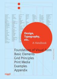
Why does a newspaper look different than a magazine or a book? What effect does using a certain typeface or a specific grid have? And why do some layouts just seem right, and others seem simply wrong?

This comprehensive handbook and reference volume elaborates by means of sketches and explanations on the basics and terminology that are indispensable for the design and production of print media. From the initial layout and the correct use of colour and typefaces to the right column width and line spacing: "Design, Typography, etc." covers all aspects of good design for books, posters and advertising.

_ Comprehensive handbook
_ Considering all aspects of print media 
_ Practical explanations and illustrative application examples
_ Including extensive glossary

Цена: 2500 грн
Доступно под заказ
в корзину в избранное
Chris Campe, Ulrike Rausch
ID: 15296
Издательство: Thames & Hudson

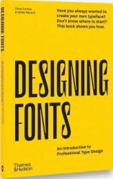
Learn the basics of type design, from sketched letters to finished font, in this uncomplicated but thorough introduction to type design

Type design is often presented in either such detail-obsessed complexity that it is not welcoming to beginners, or it is so simplified with the help of apps and web services that the resulting fonts are virtually useless. This book is different. It will show you how to design professional fonts without having to uncover all of type design’s secrets first.

With easy-to-follow instructions, many examples and professional tips, the book teaches you how to design unique typefaces tailor-made for your own projects or customer orders. Designing Fonts has two parts. Part 1 explains the theoretical, creative and technical basics of type design and font production. Six chapters then cover everything from alphabet to font, showing you how to find and develop typeface ideas, design matching letters, produce fonts and expand them with special functions. Part 2 comprises eight workshops that explore how to design and implement different kinds of typefaces, from decorative interlocking display fonts with alternative letters to well-developed headline fonts with multiple cuts and OpenType features.

Contents List:

Introduction • Type Design Basics: What are Fonts?; A Professional Font in 9 Steps • Designing Type: Letterform Anatomy; Tools and Letterforms; Developing Type Ideas; Formal Relationships; Optical Corrections • Creating Fonts: Getting to Know the Software; Analog –> Digital • Producing Fonts: Expanding Fonts; Setting the Side-Bearings; Exporting Fonts • Programming Fonts: OpenType Features; Writing Code; Instructions for OpenType Features • Workshops

About the Authors:

Chris Campe's Hamburg design studio 'All Things Letters' specializes in typographic ideas and hand-designed typefaces. Chris's work has been widely used by publishers, packagers, websites and retailers. Ulrike Rausch
is a Berlin-based type designer. Since founding her font label 'LiebeFonts' in 2009, her high-quality, handwritten fonts have been used around the world in publications, advertisements and on websites.

Цена: 1700 грн
Доступно под заказ
в корзину в избранное
Victionary
ID: 18634
Издательство: Victionary

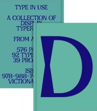
Display in Use collates the best typefaces for big canvases and serves as a reference point for inspiration-seeking designers and typographers alike.

Renowned for their bold and attention-grabbing nature, display fonts are a brand’s go-to if it is looking to stand out amongst a sea of competition. Known for their intricate details, expressive style, playful elements, and varied weights, they are adaptable across diverse design contexts, seamlessly integrating into print, digital, and beyond. Display fonts also play a crucial role in determining a brand’s personality and impressions at first glance.

A continuation of the Sans/Sans Serif In Use collection, this edition features a curated selection of display type specimens, their design applications, and the thoughts that go behind the craft. Display In Use collates the best typefaces for big canvases and serves as a reference point for inspiration-seeking designers and typographers alike.

Цена: 2500 грн
Доступно под заказ
в корзину в избранное
Jon Dowling
ID: 18812
Издательство: Counter-Print

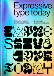
Discover the vibrant world of expressive typography, where letters dance off the page and words become works of art. In an era dominated by fleeting attention spans and visual overload, this book celebrates the enduring power of typography to captivate, provoke, and inspire.

In an era dominated by fleeting attention spans and visual saturation, this book celebrates the enduring power of expressive typography to captivate, provoke, and inspire. Discover how designers masterfully wield type as a tool for expression, pushing boundaries and defying conventions to create compelling narratives and evoke profound emotions.

From daring design agencies pushing the boundaries of convention to playful experimentation with form and content, this book showcases the boundless creativity unleashed by those who use type as a tool of expression. Beyond the surface beauty lies a deeper narrative — a story of emotion, meaning, and connection. The insights offered by industry leaders via their insightful interviews and the sheer diversity of design on show help to uncover a new world of possibilities, where typography is pushed to its limits in the search for new forms of expression.

About the Author:

Jon Dowling is the co-founder of Counter-Print Books, a distinguished publishing house celebrated for its dedication to design, art and creativity. With an unwavering passion for visual aesthetics, Dowling has curated a diverse collection of books that inspire and educate. His journey began as a graphic designer, and over the years, he has evolved into a prolific publisher, collaborating with renowned artists and designers worldwide. Dowling's commitment to fostering artistic exploration and his keen eye for innovation have positioned Counter-Print Books at the forefront of the design industry, making it a trusted source for creative inspiration and knowledge.

Цена: 1250 грн
Доступно под заказ
в корзину в избранное
ID: 12063
Издательство: SendPoints

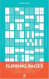
Layout — an often misunderstood aspect of design. So often, as layout designers, we hear people telling us that layout is easy, just putting text and images on a page and moving it around to make it “nice”. However, the reality is that a book designer has to follow tonnes of design, typographical and composition rules. The process behind fine tuning these details is gruelling and tedious work.

We believe that a successful book layout design is not only about what designers should do — but also what designers should not do. It is about the thought processes behind these decisions, solving these problems with the turn of each page as well as balancing the harmony between text and images. And these points are just what Flipping Pages strives to present.

 - Systematic basics of layout and editorial design used by most designers on a daily basis. From the setting of the page size, to setting the grid and finally filling the page with images and text, it provides a basic introduction for the designer to begin his/her journey into layout and editorial design.
 - A great quantity of the best in editorial design in recent years amply with and without grids
 - Profound as well as lucid explanation about processes and thoughts behind the scenes of each page

Цена: 2000 грн
Доступно под заказ
в корзину в избранное
Abbey Sy
ID: 14290
Издательство: Rockport

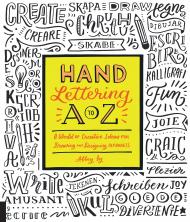
Create an alphabet all your own with a helping hand from Hand Lettering A to Z and its team of international artists here to help you get started.

Your hand lettering contains a little bit of you! Hand lettering not only expresses what you have to say, but also demonstrates creativity in your communications. In Hand Lettering A to Z, artist and author Abbey Sy has invited four international artists--Meg Hyland, Joao Neves, Tessa Go, and Lisa Lorek -- to join her in designing all new alphabets for you to draw and use in many different languages.

You don’t have to be a trained artist to master the art of hand lettering. These alphabets are for every skill level and will suits any taste. Do you want colourful script full of bombast? Maybe an austere black and white script? Whether you're going for classic or just plain fun, Hand Lettering A to Z has direction for you. So why wait to get creative? Grab some supplies and customize twenty-six letters of your own!

About the Author:

Abbey Sy is an artist and designer whose passion for hand lettering and design is inspired by retro advertising, desaturated hues, and vintage labels. She is the author of Hand Lettering A to Z (Rockport Publishers) and The Complete Photo Guide to Hand Lettering and Calligraphy (CPi). Abbey is also the founder and creative director of ABC Magazine, a publication for artists, crafters, and makers; produces her own merchandise, and teaches art and hand lettering classes. She is based in Manila, Philippines.
See more of Abbey’s work on abbey-sy.com, on Instagram and Twitter @abbeysy, on Facebook @artbyabbeysy, and on her YouTube channel Abbey Sy.

________

Пролистать книгу Hand Lettering A to Z: A World of Creative Ideas for Drawing and Designing Alphabets на Google Books.

Цена: 950 грн
Доступно под заказ
в корзину в избранное
Rory McCartney and Charlie Morgan
ID: 15695
Издательство: Rizzoli

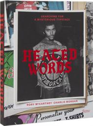
The iron-on lettering that is the subject of Heated Words: Searching for a Mysterious Typeface remains without attribution. Created anonymously and passed down over decades and across subcultures, the typeface is unique within the histories of typography and street fashion.

With roots dating back to the first calligraphic forms, the enigmatic letters evolved from embellished military flight jackets and sports uniforms in the early part of the twentieth century. Seemingly omnipresent from the 1970s onward in youth culture in New York City, this particular blackletter typeface — bold and imposing — would go on to decorate the fabric of the most influential music and fashion subcultures of the last half-century.

Heated Words provides a unique thread through the subcultural landscape of the last fifty years. With insights from voices in the fields of music, fashion and typography, the unique volume features previously unpublished archival images, including hundreds of illustrations and ephemera. Exploring the visual branding of the “outsider” and the resurgence of analog typography, Heated Words is presented through a layout and design that echo the frenetic history of the letters themselves.

About the Authors:

Rory McCartney is a creative director working within art, fashion, and music. He established Modern Construct, a creative practice with a focus on typography, and holds a research position at The Slade School of Fine Art, London. Charlie Morgan has spent the last quarter-century at the intersection between brands and culture, working in-house with brands such as Crooked Tongues, VANS, VICE, and New Balance.

Цена: 3000 грн
Доступно под заказ
в корзину в избранное
показать по:
на странице