Типографика, Шрифты, Леттеринг

Книги по типографике, шрифтах и леттерингу

Вы выбрали:
Сортировка:
наличие
цена
алфавит
Kristina Nickel
ID: 7686
Издательство: Gestalten

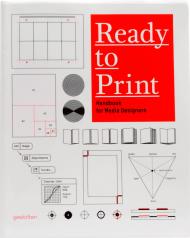
A user-friendly handbook that helps designers to prepare their files for optimal printing. 

"This book is brilliant! It's the only one I would take with me to a desert island so that I could continue to design and produce there."   - Erik Spiekermann Ready to Print is an easy to follow reference for designers that thoroughly explains each stage of how to prepare data for prepress and production. Clearly structured chapters on “Paper,” “Printing Techniques,” “Typography,” “Trapping,” “Color,” “Image Editing,” and “PDF” as well as abundant descriptive graphics impart essential knowledge in a comprehensive way. From the traits of various types of paper to the recommended settings when exporting data into a print-ready PDF, the book thoroughly explains both opportunities and hurdles in pre-print and production. In short, the book shows all designers how to create the best-possible print product.

These days, designers must be proficient in creating final artwork and be familiar with pre-print and production processes. Ready to Print helps designers prepare their data and materials so that the best-possible result can be achieved with an optimal print run. Detailed descriptions of each step also ensure that designers can accurately plan their workflow and budget in these areas.

Ready to Print imparts the fundamentals of how printing functions and points out options and hurdles along the way to creating an outstanding print product. The chapters Paper, Printing Techniques, Typography, Trapping, Color, Image Editing, and PDF make the comprehensive book a clearly-structured companion for navigating through pre-print and production. All of the content - from the traits of various types of paper to the recommended settings when exporting data into a print-ready PDF - are explained thoroughly in plain language and with the help of numerous illustrations and graphics.

The original German edition of Ready to Print was written and compiled by Kristina Nickel, a production manager well versed in pre-print and production processes. The content of this English version was edited by typography and design expert Erik Spiekermann and translated by his son, Dylan.
Товар отсутствует
cообщить о поступлении
Gregor Stawinski
ID: 5883
Издательство: Laurence King Publishing

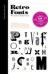
Retro Fonts is a fantastic compilation of over 400 of the best retro fonts from 1830 to the end of the 20th century. The fonts are presented in the style of old type specimen books as alphabets with sample words/phrases, shown opposite classic examples of the fonts in use in their historical context.

Arranged chronologically into eight sections representing different stylistic eras, each with an introduction discussing the typography of that era, the fonts range from Art Deco, Bauhaus and Swiss through to Sixties, Disco and Punk. Featuring both familiar fonts and lesser-known examples ripe for rediscovery, this is a unique source of inspiration for all graphic designers and typographers. The accompanying CD contains 222 copyright-free fonts.

About the Author:

Gregor Stawinski is a graphic designer based in Munich.

Товар отсутствует
cообщить о поступлении
Steven Heller, Louise Fili
ID: 9553
Издательство: Thames & Hudson

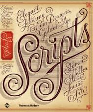
Filled with examples from a broad spectrum of sources – advertising, street signs, invitations, type-specimen books, personal letters – this collection will be a delight for designers and an invaluable sourcebook of long-overlooked lettering.

From wedding announcements to IOUs, there are hundreds – perhaps thousands – of scripts, some ‘classic’, others eccentric. Whether elegant, quirky, fluid, brutish or ostentatious, these typefaces are stylized to suggest, imply or symbolize certain traits linked to handwriting.

The 'Golden Age' of scripts ran from the 19th to the mid-20th century; this book presents an unparalleled compilation of popular, rare and forgotten scripts from that era, from many countries.

Contents
Introduction: Elegance & Eccentricity
1 French/L’écriture
2 British/Scripts
3 German/Der Schrift
4 Italian/Il Corviso
5 American/Scripts

Товар отсутствует
cообщить о поступлении
Studio Rarekwai
ID: 8849
Издательство: Laurence King Publishing

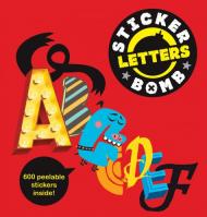
Stickerbomb Letters features an extensive assortment of cool and quirky font and typography designs. Including both alphabets on their own and type slogans, the stickers are fun for everyone to play with, and to use to create their own words from individual letters.

This collectable, fully-peelable sticker book is filled with an amazing collection of over 500 stickers created by artists, illustrators and graffiti writers from around the world.

Selected artists include: Chato, Dabs, Darbotz, Helen Mycroft, Jo Contino, Niark1, Redy, Remi Rough, TuTu indo and the YokStickerbomb Letters features an extensive assortment of cool and quirky font and typography designs. Including both alphabets on their own and type slogans, the stickers are fun for everyone to play with, and to use to create their own words from individual letters.

This collectable, fully-peelable sticker book is filled with an amazing collection of over 500 stickers created by artists, illustrators and graffiti writers from around the world.

Selected artists include: Chato, Dabs, Darbotz, Helen Mycroft, Jo Contino, Niark1, Redy, Remi Rough, TuTu indo and the Yok.

Товар отсутствует
cообщить о поступлении
Steven Heller, Mirko Ilic
ID: 9130
Издательство: Rockport

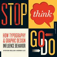
This revolutionary guide is not only the first to look at how typography in design creates a call to action, but it also explores type and image as language. Stop, Think, Go, Do is packed with arresting imagery from around the world that influences human behavior. Page after page, you’ll find innovative messages that advocate, advise caution, educate, entertain, express, inform, play, and transform.

Товар отсутствует
cообщить о поступлении
Stephen Coles, Erik Spiekermann
ID: 9329
Издательство: Thames & Hudson

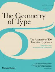
The Geometry of Type explores 100 traditional and modern typefaces in detail, with a full spread devoted to each entry.

Characters from each typeface are enlarged and annotated to reveal key features, anatomical details, and the finer, often-overlooked elements of type design, which shows how these attributes affect mood and readability. Sidebar information lists the designer and foundry, the year of release and the different weights and styles available, while feature boxes explain the origins and best uses for each typeface, such as whether it is suitable for running text or as a display font for headlines. To help the reader spot each typeface in the wider world, the full character set is shown, and the best letters for identification are highlighted.

This beautiful and highly practical work of reference for font spotters, designers and users is a close-up celebration of typefaces and great type design.

About the Author:

Stephen Coles is a writer and typographer. After six years as creative director at FontShop in San Francisco, he now edits the websites Typographica, Fonts In Use and The Mid-Century Modernist. Stephen is a regular contributor to The Print and The Codex magazines, a Type Camp instructor and a member of the FontFont TypeBoard. He also contributed editorial content to the most recent edition of FontBook: Digital Typeface Compendium.

Товар отсутствует
cообщить о поступлении
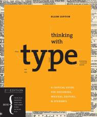
Ellen Lupton
ID: 10666
Издательство: Princeton Architectural Press

Our all-time best-selling book is now available in a revised and expanded second edition.

Thinking with Type is the definitive guide to using typography in visual communication, from the printed page to the computer screen. This revised edition includes forty-eight pages of new content, including the latest information on style sheets for print and the web, the use of ornaments and captions, lining and non-lining numerals, the use of small caps and enlarged capitals, as well as information on captions, font licensing, mixing typefaces, and hand lettering.

Throughout the book, visual examples show how to be inventive within systems of typographic form--what the rules are and how to break them. Thinking with Type is a type book for everyone: designers, writers, editors, students, and anyone else who works with words.

The popular online companion to Thinking with Type has been revised to reflect the new material in the second edition.

____________

Пролистать книгу Thinking with Type, Second Revised and Expanded Edition

Товар отсутствует
cообщить о поступлении
ID: 7825
Издательство: Dover

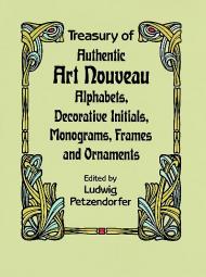
Rare, versatile, copyright-free volume offers the largest, finest collection of Art Nouveau typographic material: 137 complete alphabets; 23 upper-case fonts; 33 sets of decorative initials; 1951 monograms; 146 signet designs; 179 miscellaneous designs (many with borders) and numerous ornaments. Plus, a selection of Gothic, Roman and Italic faces.

Товар отсутствует
cообщить о поступлении
Enric Jardí
ID: 7331
Издательство: Actar

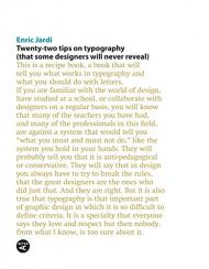
This is a recipe book of twenty-two tips in creating the best typography and twenty-two things you should never do with lettering. Secrets which many designers will never reveal. In an era of typographic fundamentalism and the cult of forms, this list of dos and don'ts explodes myths and provides a fresh view of typography.

Enric Jardí is Professor of design at prominent institutions including Eina, Elisava, and Universitat Ramon Llull. He is President of the ADG-FAD, based in Catalonia, one of the most important graphic design institutions internationally.

Товар отсутствует
cообщить о поступлении
Alston W. Purvis
ID: 5212
Издательство: Taschen

Know your type

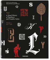
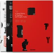
Type 2: A Visual History of Typefaces and Graphic Styles, 1901-1938 offers a connoisseur's overview of typeface design, exploring the most elegant fonts from the history of publishing. Taken from a distinguished Dutch collection, this exuberant two-volume edition traces the evolution of the printed letter via exquisitely designed catalogs, showing type specimens in roman, italic, bold, semi-bold, narrow, and broad fonts. Borders, ornaments, initial letters and decorations are also included, along with lithographic examples, letters by signwriters, inscription carvers, and calligraphers. 

Featuring works by type designers including William Caslon, Fritz Helmuth Ehmcke, Peter Behrens, Rudolf Koch, Eric Gill, Jan van Krimpen, Paul Renner, Jan Tschichold, A. M. Cassandre, Aldo Novarese, and Adrian Frutiger.

In order to accommodate a vast amount of material, we have divided this text into two volumes. This, the second volume, covers the period from 1900 to the mid-20th century and contains a historical outline by Alston W. Purvis.

Includes exclusive access with TASCHEN keycard to online image library: over 1400 high-resolution scans of type specimens downloadable for unrestricted use.

The editors and authors: 

Cees W. de Jong is a designer and publisher based in Laren, the Netherlands. He has published numerous books on design, architecture and art, and is now working as a design/publishing consultant and author. He has also published many books on graphic design.

Alston W. Purvis is a professor of the visual arts division of the School of Arts at Boston University, USA. He is also the author on many books on graphic design.

The late Jan Tholenaar was a collector of the printed letter in all its various incarnations, but especially exquisite design catalogs and specimen books. He lived in Amsterdam, where he passed away in 2009.

Товар отсутствует
cообщить о поступлении
ID: 13265
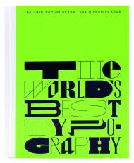
Издательство: SendPoints

Among the graphic design competitions on a global scale, there is a sparkling and well-targeted competition which never seeks to make money by charging extra expense and always adheres to its own principles and quality requirements. It is: Type Directors Club of New York (NY TDC). The entry fee for this competition is very low, enabling students and rookie designers to participate. The jury consists of young and top creatives from around the world who treat every piece of work with caution and criticism and make judgments based on their professional competence. The winning entries will be exhibited in major cities around the world. Collecting all the winning entries of the year, “Type Directors Club of New York: Typography 39”will also be released globally. In this wonderful book, you will experience works of world-class quality and be inspired to move forward at the same time.

NY TDC was founded in 1946, and its Best Typeface Design Award is one of the most influential typeface design awards. The exhibition of the wining entries is an annual event with high reputation and professionalism in the industry, and 64 exhibitions have been held so far. The NY TDC typeface design competition is the world’s first typeface-based competition and one of the most important graphic design competitions in the world, attracting graphic designers, art directors, editors, multimedia professionals, students and entrepreneurs to it every year. This year, the competition attracted 1,835 pieces of work from more than 55 countries across 5 continents. The Collection of the winning entries of the year is released worldwide and regarded as a bible by designers all around the globe.

Товар отсутствует
cообщить о поступлении
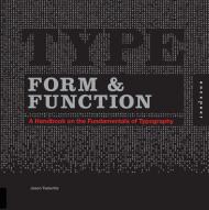
Jason Tselentis
ID: 9070
Издательство: Rockport

Type, Form, and Function is a useful, comprehensive typography resource that both students and professional designers should have in their library. It looks at the influences of modern typography and symbols going back through time and examines certain type treatments and movements in design and logo types. It focuses on how type works and emphasizes typographic fundamentals, while touching on logo/logotype design and page layout (print and interactive). This book promises to guide designers through the visual typographic clutter to make their designed messages more meaningful.

Jason Tselentis is a designer, writer, and educator living in North Carolina. He has completed print and interactive design for: Experience Music Project and Science Fiction Museum; Henry Art Museum; Intel Labs; the National Park Service; Sony BMG Music; Continental Tires; and 20th Century Fox. As Assistant Professor at Winthrop University’s Department of Design, Jason teaches graphic design and typography.

Пролистать книгу Jason Tselentis - Type Form & Function: A Handbook on the Fundamentals of Typography: A Handbook on the Fundaments of Typography на Google Books

Товар отсутствует
cообщить о поступлении
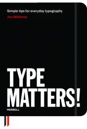
Jim Williams
ID: 8075
Издательство: Merrell Publishers

Once upon a time, only typesetters needed to know about kerning, leading, ligatures and hanging punctuation.

Today, however, most of us work on computers, with access to hundreds of fonts, and we’d all like our letters, reports and other documents to look as good – and be as readable – as possible. But what does all the confusing terminology about ink traps, letter spacing and visual centring mean, and what are the rules for good typography?

Type Matters! is a book of tips for everyday use, for all users of typography, from students and professionals to anyone who does any layout design on a computer.

The book is arranged into three chapters: an introduction to the basics of typography; headline and display type; and setting text.

Within each chapter, there are sections devoted to particular principles or problems, such as selecting the right typeface, leading and the treatment of numbers.

Examples show precisely what makes good typography – and, crucially, what doesn’t. Authoritatively written and designed by a practitioner and teacher of typography, Type Matters! has a beautifully clear layout that reinforces the principles discussed throughout.

• The ultimate book of typography tips for anyone interested in improving the look of their type
• Clear subject-by-subject structure helps the reader quickly identify the relevant topic
• Elegantly designed, with soft flexi binding, ribbon placeholders and an elastic enclosure, ideal for handy desktop reference

Товар отсутствует
cообщить о поступлении
Editors: Jan Middendorp, TwoPoints.Net
ID: 7687
Издательство: Gestalten
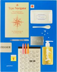
An essential reference of independent foundries and innovative type designers.

The rapidly expanding online market for digital typefaces is exciting and diverse. With new fonts and type foundries launching on an almost daily basis, it has been difficult to keep track of notable developments - until now. Type Navigator is a useful current handbook of modern fonts, independent foundries, and innovative type designers that provides an overview of today’s vast market. This comprehensive publication offers a valuable overview of international sources for quality fonts. In addition to concise profiles of type foundries and recent typefaces, Type Navigator features inspirational visual examples of fonts in use. A free digital collection of 100 typeface variations from 20 choice foundries accompanies the 320-page book.

In the past, there were only a few specialists worldwide who worked intensively with typography. Since the introduction of digital fonts and their dissemination via the internet, typography has gained a new significance. More and more designers are creating fonts for a variety of applications. Simultaneously, more and more of these designers are founding type foundries to sell their fonts themselves. Supply and demand in this area have been growing considerably for years. The expanding market for typography is exciting and diverse, but it has been difficult to keep track of notable developments - until now.

Type Navigator is a comprehensive handbook of the best independent sources for quality fonts. Structured and indexed according to practical criteria, it offers not only a valuable overview, but also possibilities for effective targeted searches. Whether a reader is in need of a specific type of font, is looking for fonts by a select designer, from a certain country, or even just wants to compare prices, Type Navigator will provide the necessary information.

In addition to abundant examples of fonts as well as concrete applications for typefaces and alphabets, this essential compendium features concise profiles of type foundries and designers. Select interviews with managers of type foundries show how their creative visions are influencing the characteristics of their font libraries.

Type Navigator is a valuable reference for agencies, designers, consultants, and customers who are looking for an overview of the modern typefaces currently available and the innovative people and companies behind them.

A free digital collection of 100 typeface variations from 20 choice foundries accompanies the 320-page book.

Type Navigator is edited by typography expert Jan Middendorp as well as the former Hort designer Martin Lorenz and his wife Lupi Asensio, who currently work together as TwoPoints.Net.

Товар отсутствует
cообщить о поступлении
Cees W. de Jong, Alston W. Purvis, Jan Tholenaar
ID: 10665
Издательство: Taschen

Know your type. A visual history of fonts and graphic styles: 1628–1938

This book offers a connoisseur’s overview of typeface design, exploring the most elegant fonts from the history of publishing. Taken from a distinguished Dutch collection, this exuberant two-volume edition traces the evolution of the printed letter via exquisitely designed catalogs, showing type specimens in roman, italic, bold, semi-bold, narrow, and broad fonts. Borders, ornaments, initial letters, and decorations are also included, along with lithographic examples, letters by signwriters, inscription carvers, and calligraphers.

Featuring works by type designers including: William Caslon, Fritz Helmuth Ehmcke, Peter Behrens, Rudolf Koch, Eric Gill, Jan van Krimpen, Paul Renner, Jan Tschichold, A. M. Cassandre, Aldo Novarese, and Adrian Frutiger.

In order to accommodate a vast amount of material, we have divided this text into two volumes. The first volume covers pre–20th-century typeface specimens, with texts by editor Cees de Jong and collector Jan Tholenaar. The second volume covers the period from 1900 to the mid-20th century and contains a historical outline by Alston W. Purvis.

Includes exclusive access with TASCHEN keycard to online image library: over 2,400 high-resolution scans of type specimens downloadable for unrestricted use.

The editors and authors:

Cees W. de Jong is a designer and publisher based in Naarden, the Netherlands. He has published numerous books on design, architecture, art and graphic design, and is now working as a design/publishing consultant and author.

Alston W. Purvis is professor of the visual arts division of the School of Arts at Boston University, USA. He is also the author on many books on graphic design.

Jan Tholenaar was a collector of the printed letter in all its various incarnations; especially in the form of design catalogs and specimen books. He lived in Amsterdam, where he passed away in 2009.

Товар отсутствует
cообщить о поступлении
показать по:
на странице