Типографика, Шрифты, Леттеринг

Книги по типографике, шрифтах и леттерингу

Вы выбрали:
Сортировка:
наличие
цена
алфавит
Sarah Hyndman
ID: 12332
Издательство: Laurence King Publishing

We are all type consumers and interact with type in our everyday lives. Typefaces in all shapes and sizes evoke an emotional response and trigger associated memories before we’ve even read the words.

How to Draw Type and Influence People shows how we use type to understand different messages. Each typeface is introduced and explained and then creative exercises show the reader how to draw each font and invite them to explore the associations evoked by the styles, to reveal why they have come about and how to create their own versions.

Ideal for all those who work with type daily, this book provides an accessible way into the world of typefaces, for the general reader, but also graphic designers who want to explore fonts in more detail and design their own letterforms.

About the Author:

Sarah Hyndman is a graphic designer, author and public speaker, known for her interest in the psychology of type. Her aim is to change the way we think and talk about typography by demonstrating that it is fun and accessible for everybody. Sarah leads tailored workshops and runs events, and in 2014 she delivered a TEDx talk. She collaborates with the Crossmodal Research Laboratory at the University of Oxford.

Товар отсутствует
cообщить о поступлении
Lindsey Marshall, Lester Meachem
ID: 10113
Издательство: Laurence King Publishing

This book is a guide to the use of type in design for print and screen. It provides a creative, informative and practical introduction for those studying all pathways of graphic design.

The authors discuss who uses type, where and when type is employed, audience and appropriateness of type and communication. The book includes basic information about type and its terminology, using typefaces, designing and communicating with type, colour and movement, experimentation with type and production issues. Throughout, examples are drawn from design for both print and screen.

How to Use Type includes illustrated activities and case studies linked to key issues discussed in the text. This book offers an invaluable overview of an essential aspect of visual communication.

Товар отсутствует
cообщить о поступлении
ID: 12231
Издательство: Gingko Press

The sans-serif typeface Franklin Gothic was designed by Morris Fuller Benton in 1902 and continues to be widely used in newspapers, books, billboards and advertisements.

Named in honour of iconic American printer Benjamin Franklin, the impactful, bold typeface has been spun off into a variety of related faces throughout the past century.

In I LOVE TYPE 06 - FRANKLIN GOTHIC, internationally acclaimed designers including Akatre, Cypher13 and Studio Blanco show off their finest creations incorporating the grace and style of Franklin Gothic.

Товар отсутствует
cообщить о поступлении
ID: 12230
Издательство: Gingko Press

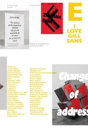
Gill Sans, a sans-serif typeface widely used today, was designed by Eric Gill in 1926; the first public usage of the typeface was that same year, when Gill used it on signage for a new bookshop opening in his hometown of Bristol. I LOVE TYPE 05 - GILL SANS explores the multitude of unexpected ways this popular typeface has been used, subverted and reinvented by a host of clever and inspired designers in recent years.

Товар отсутствует
cообщить о поступлении
Carol Belanger Grafton
ID: 10135
Издательство: Dover

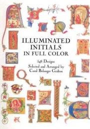
Among the glories of extant medieval manuscripts are the splendid illuminated initials in which geometric, curvilinear, animal, religious and other motifs intertwine to form extraordinarily beautiful and decorative letters.

For this striking volume, Carol Belanger Grafton has selected 548 illuminated letters-alphabetically arranged-from 19th-century reprints of medieval manuscripts. Here are magnificently ornamented initials-some the length of an entire margin, another encompassing the page itself, others delicate miniatures. All are imaginatively and beautifully enhanced with royal and saintly figures, mythical creatures, knights in battle, exquisite florals and much more.

Encompassing all the letters of the alphabet, and including a selection of hand-colored chromolithographs, this practical archive of lovely copyright-free designs not only provides commercial artists and illustrators with a wealth of usable letters, it offers a splendid sampling of the ancient art of manuscript illuminations.

Товар отсутствует
cообщить о поступлении
P22
ID: 2261
Издательство: Rockport

2000 photos/illustrations

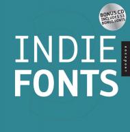
If you’re searching for a font that goes beyond ho-hum, this book is for you. Today’s computers provide a selection of fonts that serve reasonably well for workaday letters and publications, but have become utterly boring from overuse. If you want your project to attract the reader’s attention, you need an original font.

Indie Fonts provides a showcase collection of over 1600 diverse fonts from 19 18 of today’s hottest digital type foundries and features the best work of these designers. Indie Fonts will help readers find some of the highest quality fonts available today.

The type styles range from the best of Matthew Carter’s classic designs to the latest irreverence of ingoFonts. Designers searching for unique typefaces will find what they are looking for, whether historical revivals or futuristic techno faces.
Товар отсутствует
cообщить о поступлении
P22
ID: 2262
Издательство: Rockport

2000 photos/illustrations

If you seem like your hunger for new fonts is insatiable, then Indie Fonts 2 is the book for you. It is the second installment in Rockport’s Indie Fonts series and brings you even more fonts to choose from. Don’t settle for ordinary fonts when you can capture your reader’s attention with an original font that hasn’t been become overused and boring.

Indie Fonts 2 includes more than 1600 diverse fonts from 19 of today’s hottest digital type foundries and features the best work of these designers. This comprehensive collection helps designers do their jobs even better by providing some of the highest quality fonts available today.

The type styles range from the best of Matthew Carter’s classic designs to the latest irreverence of ingoFonts. Designers searching for unique typefaces will find what they are looking for, whether historical revivals or futuristic techno faces.


Товар отсутствует
cообщить о поступлении
P22
ID: 2779
Издательство: Rockport

2000 color photos/illustrations

If you're searching for a font that goes beyond ho-hum, this book is for you. Today's computers provide a selection of fonts that serve reasonably well for workaday letters and publications, but have become utterly boring from overuse. To attract a reader's attention, you need an original font.

This third volume of Indie Fonts provides a showcase collection of 1,600 new fonts from today's hottest digital type foundries, and features the best work of these designers. As with the first two volumes, Indie Fonts 3 will help readers find some of the highest quality fonts available today.

Type styles range from the best of Matthew Carter's classic designs to the latest irreverence of ingoFonts. Designers searching for unique typefaces will find what they are looking for, whether historical revivals or futuristic techno faces.

On the included CD, you'll also get a collection of 53 bonus fonts.

Товар отсутствует
cообщить о поступлении
Anna Minguet
ID: 11688
Издательство: Monsa

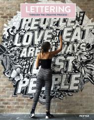
This is not just another lettering book. At present, this art has been performed for several decades. It enjoys a high level of popularity due to the possibilities, uses, and techniques that give you the opportunity to experience, play, and enjoy while you create. There are more people now than ever who understand its potential and are dedicated to making “letters” full of beauty and individual style.

Following the hand of authentic masters of the art of lettering from around the world, you can enter into their fascinating worlds full of unique letters and learn their techniques, tips and tricks from each artist.

Товар отсутствует
cообщить о поступлении
Imogen Owen
ID: 14580
Издательство: Quadrille Publishing

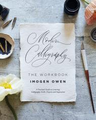
Modern Calligraphy: The Workbook is a guide to the popular craft of calligraphy.

Starting with a lettering warm-up, Imogen Owen begins with the basics as she takes you through all the key steps to improve your skills.

With Imogen's careful guidance, practise your technique and build on your confidence as your work through the exercises – there is lots of space in the book as well as links to printable templates.

Modern Calligraphy: The Workbook is a companion book to Modern Calligraphy Workshop: The Creative Art of Pen, Brush and Chalk Lettering.

About the Author:

Imogen Owen runs her letterpress and lettering studio of the same name in Leicestershire. Having fallen in love with letterpress at Camberwell College of Arts, she set up her own studio designing and printing letterpress stationery, which she sells worldwide. Imogen then went on to teach the first modern calligraphy workshops in the UK and her courses continue to sell out.

Товар отсутствует
cообщить о поступлении
Anneloes van Gaalen
ID: 11503
Издательство: Bis Publishers

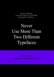
Never Use More than Two Different Typefaces presents a humorous overview of the rules governing typography.

A joy for graphic designers and everyone who has anything to do with designing texts. Like no other, this is a world that is held together by rules, which designers, of course, often take great delight in breaking.In this series, "ridiculous" is a relative term, because what is nonsense for one can be an important guideline for another. In these books, it is not about laying down the law.

This is the fifth book in the Ridiculous Design Rules series by Anneloes van Gaalen.  This new publication is about ridiculous "or not?" rules in typography, a joy for graphic designers and everyone who has anything to do with designing texts. Like no other, this is a world that is held together by rules, which designers, of course, often take great delight in breaking.

In this series, ‘ridiculous’ is a relative term, because what is nonsense for one can be an important guideline for another. In these pleasing and educational books, it is not about laying down the law. For each of the 51 rules covered in each book, Van Gaalen refers to quotes by famous fellow designers, who either think there is something to the rule or have made a personal variation of it. Whether you agree with them or not, the Ridiculous Design books sharpen your own thoughts about the rules and the assumed truths of design, advertising, fashion, photography and the Internet.

Each rule is convincingly illustrated, with the illustrations either confirming or disproving the rule in question.

__________

Пролистать книгу  Never Use More Than Two Different Typefaces: And 50 Other Ridiculous Typography Rules
Товар отсутствует
cообщить о поступлении
Anneloes van Gaalen
ID: 11504
Издательство: Bis Publishers

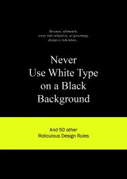
A list of inspirational/delusional design jargon for the world to judge

The world of fashion and design is inundated with a seemingly endless list of rules. Think of “Less is More,” “Form Follows Function,” “Keep it Simple,” “Dress Your Age,” and the list goes on and on. They’re familiar sayings that some designers consider to be valuable words of wisdom, which serve as a guiding line and source of inspiration.
To others, these rules are mere restrictions: design dogmas and fashion formulae that need to be bended, twisted or broken altogether.

Rules tend to have a life of their own: over time their meaning changes or the rule is adopted by a whole new group of followers. Take, for instance, the classic “Form Follows Function.” It started out life as an architecture guideline but has crept its way into other creative fields. This evolution is reflected in this book by the chronologically placed quotes that accompany each rule and that are courtesy of designers, architects, fashion designers, typographers and other creatives.

All rules are also accompanied by an image that either negates or supports the rule. Our aim is not to list all the rules that you need to adhere to. Nor do we take sides in the whole rules debate. Granted, creativity knows no bounds and therefore it seems rather ridiculous to restrict that creativity by sticking to a couple of age-old rules. However, in some cases the rules seems more like the basic principles that every designer should love, honor and obey.

Whichever side of the fence you yourself are sitting on in the rules debate, you’re bound to find this book a source of inspiration, comfort, joy or just good old fun. Enjoy.

__________

Пролистать книгу  Never Use White Type on a Black Background: And 50 Other Ridiculous Design Rules

Товар отсутствует
cообщить о поступлении
Steven Heller, Gail Anderson
ID: 8819
Издательство: Thames & Hudson

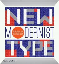
Modernism's timeless functionality and utilitarian beauty are constantly reinterpreted in the world of design. New Modernist Type gathers hundreds of contemporary examples showing how simplicity, clarity and homage to historical modernism are still at play in the work of today’s most exciting graphic designers.

Steven Heller, design historian and critic, and Gail Anderson, designer and educator, have made an international selection of ‘new modernist’ designs, from classical, constructivist or retro works to optical, kinetic or metaphorical creations. Heller’s highly informed commentary illuminates the historical context of these new tendencies.

With its breathtaking spectrum of modernist typographies created for today’s design briefs, New Modernist Type is an essential sourcebook and inspiration for student and professional graphic designers

Товар отсутствует
cообщить о поступлении
Roger Fawcett-Tang
ID: 1822
Издательство: Laurence King Publishing

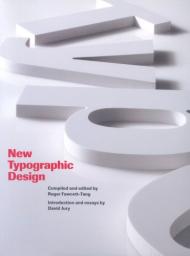
A visual guide to the best in contemporary typographic design, this book features examples and usages of modern typography from around the world. Covering a wide variety of applications, from design to print - magazines, books, brochures, posters, etc - to signage systems and screen-based typography, the book gives an insight into the current trends and directions of modern typography and provides a rich source of inspiration for design students and established designers alike. An introductory essay by David Jury discusses the role of change in typographic design in the last two centuries. The book is then divided into four showcase sections that illustrate key areas of typography today. Contributors include Antoine et Manuel, Eggars Diaper, Emigre, Hort, M/M, Meta Design, Norm, North, Projekt Triangle, RGB, Stefan Sagmeister, Stiletto NYC and Surface.

Товар отсутствует
cообщить о поступлении
ID: 7466
Издательство: Feierabend Unique Books

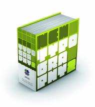
This new book features approx. 700 pages packed with brand-new fonts including experimental, playful typography as well as plain and sober designs.

The passion for the creation of well-designed fonts is visible on every single page in this book. Regardless of whether a font is seen as art or just as a functional means of communication – typography is a supreme discipline of graphic design.

Товар отсутствует
cообщить о поступлении
показать по:
на странице