Колористика

Книги про колористику

Ви обрали:
Сортування:
наявність
ціна
алфавіт
Leatrice Eiseman and Keith Recker
ID: 11630
Видавництво: Chronicle Books

Pantone, the worldwide colour authority, invites you on a rich visual tour of 100 transformative years.

From the Pale Gold (15-0927 TPX) and Almost Mauve (12-2103 TPX) of the 1900 Universal Exposition in Paris to the Rust (18-1248 TPX) and Midnight Navy (19-4110 TPX) of the countdown to the Millennium, the 20th century brimmed with colour.

Longtime Pantone collaborators and colour gurus Leatrice Eiseman and Keith Recker identify more than 200 touchstone works of art, products, décor, and fashion, and carefully match them with 80 different official PANTONE colour palettes to reveal the trends, radical shifts, and resurgences of various hues. This vibrant volume takes the social temperature of our recent history with the panache that is uniquely Pantone.

Ціна: 1700 грн
Є в наявності
в кошик в обране
Alexandra Loske
ID: 15210
Видавництво: Ilex

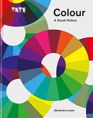
Discover the story of colour through the significant scientific discoveries and key artist’s works over 400 years.

From Isaac Newton’s investigations through to Olafur Eliasson’s experiential creations, this stunning book documents the fascinating story of colour with an extraordinary collection of original colour material that includes charts, wheels, artists’ palettes, swatches and schemes.

“In 1704, the scientist Isaac Newton published Opticks, the result of many years of researching light and colour. By splitting white light, Newton identified the visible range of colours, or the rainbow spectrum. In Opticks, he built a colour system around his findings, and he visualised this system in a circular shape, making it one of the first printed colour wheels.
The influence of Newton and his followers, combined with the invention of many new pigments as well as watercolours in moist cake form, had made painting with colour an exciting occupation not just for serious artists but also for a much wider audience. The colour revolution had begun.”

Contents:
Introduction
1. Unravelling the Rainbow: The Eighteenth-Century Colour Revolution
2. Romantic Ideas & New Technologies: The Early Nineteenth Century
3. Industrialism to Impressionism: The Later Nineteenth Century
4. Colour for Colour’s Sake: Colour into the Future:
Glossary
Bibliography
Index

________

Пролистать книгу Tate: Colour: A Visual History на Google Books.

Ціна: 1700 грн
Є в наявності
в кошик в обране
Patrick Baty
ID: 11969
Видавництво: Thames & Hudson

The definitive book on the use of paint and colour in interior decoration from the 1660s to the 1960s

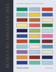
The definitive book on the use of colour and paint in interior decoration over a three-hundred-year period, The Anatomy of Colour is certain to appeal to both amateur and professional restorers, renovators, enthusiastic decorators and all those with an interest in interior decoration and design.

Drawing on his huge specialist archive, Patrick Baty traces the evolution of pigments and paint colours together with colour systems and standards, and examines their impact on the colour palettes used in interiors from the 1660s to the 1960s. He first charts the creation in paint of the common and expensive colours made from traditional earth pigments between 1650 to 1799. Next, he examines the emergence of colour systems and standards and their influence on paint colours together with the effect of industrialized production on the texture and durability of paints. Finally, Baty turns his attention to 20th-century colour standards, including those developed originally for the purpose of identifying flowers, such as the Répertoire de Couleurs des Fleurs, des Feuillages et des Fruits, each incarnation of the British Colour Standard cards, Walpamur paint swatch cards and Parson’s Tint Book of Historical Colours.

Throughout the book reproductions of interiors highlighting the distinctive colour trends and styles of painting particular to each period and room accompany the in-depth analysis of the history of colour and the development and use of paint colours in interior design.

About the author:

Historian of architectural paint and colour Patrick Baty works as a consultant in the decoration of historic buildings and is proprietor of ‘Papers and Paints’ in London. He has been employed by Dulux and Little Greene to develop ranges of traditional paint colours for English Heritage, and he regularly lectures on the subject of paint and paint colour in 18th- and 19th-century interiors.

Ціна: 1800 грн
Є в наявності
в кошик в обране
Kelly Grovier
ID: 17026
Видавництво: Thames & Hudson

Унікальний підхід до історії мистецтва через історію кольору та пігментів.

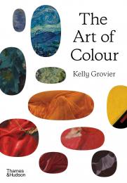
Чи знаєте ви, що ультрамарин, який мерехтить у центрі «Молочниці» Вермеєра, поєднує цей шедевр із зороастрійськими малюнками 6-го століття, знайденими на стінах печерних храмів у Баміані, Афганістан? Або що бурхливі хвилі, які виростають у небезпечній Великій хвилі Хокусая біля Канагави, завдячують своїм поглинаючим синім блиском алхіміку, який народився в замку Франкенштейна в 1673 році? І чи справді прерафаеліти були одержимі темно-коричневим відтінком, отриманим із подрібнених останків стародавніх мумій? (Спойлер: вони були.)

Винайдені доісторичними мешканцями печер і середньовічними фокусниками, хитрими шахраями та кмітливими вченими, кольори мистецтва розповідають власну захоплюючу історію. Понад десять захоплюючих розділів відома письменниця Келлі Гров’єр допомагає яскраво оживити цю історію, розкриваючи дивовижні передісторії пігментів, які визначають найвидатніші твори в історії мистецтва. Між цими розділами переплетена серія сюжетів, присвячених ключовим моментам еволюції теорії кольору – від одкровень епохи Просвітництва до радикалізму Баухаузу – тоді як репродукції ретельно відібраних творів мистецтва допомагають висвітлити повороти оповіді.

Історія кольору — це епічна сага про людську винахідливість і ненаситне бажання. Прочитайте цю книгу, і ви ніколи не дивитеся на твір мистецтва однаково.

Про автора:

Келлі Гров’є є автором статей для BBC Culture і автором кількох відомих досліджень мистецтва, зокрема 100 Works of Art That Will Define Our Age, Art Since 1989, та A New Way of Seeing: The History of Art in 57 Works, опублікованих Thames & Hudson. Його остання книга, On Line: Conversations with Sean Scully, заснована на розкриваючих бесідах з його близьким другом, всесвітньо відомим художником-абстракціоністом. Його твори публікувалися в Times Literary Supplement, The Independent, Sunday Times, Observer, RA Magazine і Wired. Його історія лондонської в’язниці Ньюгейт, The Gaol, була «Книгою тижня» BBC Radio 4. Він є співзасновником наукового журналу European Romantic Review.

Він є автором трьох поетичних збірок, у тому числі «The Lantern Cage», і був описаний рецензентами як «поет правди і краси» (The TLS) і «своєрідний Вільям Блейк для двадцять першого століття» (журнал «Планета»).

Келлі народилася в Гранд-Рапідс, штат Мічиган, і виросла в районі затоки Сан-Франциско. Він здобув освіту в Каліфорнійському університеті в Лос-Анджелесі та Оксфордському університеті, де отримав докторський ступінь як стипендіат Маршалла. Живе в Ірландії з дружиною та сином.

Ціна: 1700 грн
Є в наявності
в кошик в обране
Leatrice Eiseman
ID: 13401
Видавництво: Rockport

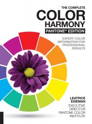
The only color guide a designer will ever need; The Complete Color Harmony, Pantone Edition has been completely updated with Pantone colors and new text.

The Complete Color Harmony: Pantone Edition is the latest in Rockport Publishers' best-selling Color series. This edition has been completely revised from start to finish, and now features new text by Leatrice Eiseman, executive director of the Pantone Color Institute. And the color "moods" that she writes about in each chapter are based and matched with Pantone colors. The book expands on previous editions for the most comprehensive color reference to date.

This edition includes information on creating special effects, as well as an entirely new section devoted to the psychology of color. Eiseman helps readers determine their best color choices and suggests why some colors may inspire their creativity while others don't. The book includes new color palette sections along with expanded and updated color trends.

________________

Пролистать книгу The Complete Color Harmony, Pantone Edition: Expert Color Information for Professional Results на Google Books.

Ціна: 1200 грн
Є в наявності
в кошик в обране
Tina Sutton, Stuart Semple
ID: 17876
Видавництво: Rockport

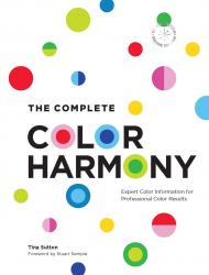
The Complete Color Harmony: Deluxe Edition is the ultimate deluxe guide to color, featuring curated palettes and valuable information on the powerful effects of color.

This premium anniversary edition of The Complete Color Harmony gives you the color explorations, insights, and palettes from the original version in a deluxe new package that includes a pullout poster, gatefold foreword by internationally acclaimed contemporary artist Stuart Semple, and all-new image references.

The Complete Color Harmony was the first book published by the acclaimed design publisher Rockport Publishers, and has gone on to become an essential reference for generations of designers. This special edition of that classic reference celebrates Rockport Publisher’s 40th anniversary.

Get an introduction to using the color wheel and discover the key aspects of color, such as warm, cool, pale, and bright. Then, delve into moods and color and see how a wide variety of palettes can come across as earthy, powerful, regal, calm, dependable, and more.

In this book you’ll discover:
- Hundreds of organized color palettes that can be used for a variety of art and design projects.
- Why certain colors attract.
- How colors evoke certain moods.
- Advice on choosing the best colors to work with.
- A CMYK process color chart and color swatches to make choosing colors and palettes easy.

With all the expert information in this convenient portable guide, you’ll feel confident in every color choice.

About the Author:

Tina Sutton speaks on u201cThe Psychology of Coloru201d at many school, businesses, and museums. She writes a weekly column for the Boston Globe Magazine.

Ціна: 1500 грн
Є в наявності
в кошик в обране
Sean Adams
ID: 11967
Видавництво: Abrams

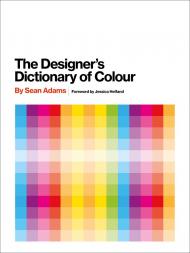
The Designer’s Dictionary of Color пропонує глибокий огляд 30 кольорів, що є ключовими для мистецтва та графічного дизайну.

Упорядкована за спектром, у розділах «колір за кольором» для зручної навігації, ця книга документує кожен відтінок з діаграмами, що показують колірний діапазон та варіації палітри.

У розділах детально описано творчу історію кожного кольору та культурні асоціації, з прикладами використання кольорів, які тягнуться від художнього до утилітарного — чи то бірюза на обкладинці альбому Ріда Майлза, чи авокадо-фарба на універсалі Dodge 1970-х років.

Практичний та натхненний ресурс як для дизайнерів, так і для студентів, «Дизайнерський словник кольору» відкриває світ кольору для всіх, хто прагне використати його неймовірну силу.

Про автора:

Шон Адамс є партнером-засновником каліфорнійської дизайнерської фірми AdamsMorioka, яка отримала нагороди, і його називають одним із 40 найважливіших людей, які формують дизайн на міжнародному рівні. Колишній член національної ради AIGA та президент AIGA Los Angeles, він викладає в ArtCenter College of Design, а також є частим лектором та суддею конкурсів. Шон є співавтором Logo Design Workbook та Color Design Workbook, а також автором серії «Майстри дизайну». Він живе та працює в Лос-Анджелесі.

Ціна: 1250 грн
Є в наявності
в кошик в обране
Stephen Westland, Maggie Maggio
ID: 17404
Видавництво: Rockport

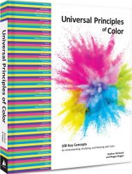
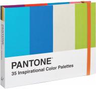
Universal Principles of Color is an in-depth introduction to color and its myriad applications, presenting 100 elements, theories, innovative ideas, and effective uses and solutions.

A comprehensive, cross-disciplinary overview of color, Universal Principles of Color presents 100 core concepts and guidelines that are critical to a successful use of color. Richly illustrated and easy to navigate, it pairs clear explanations of every topic with visual examples of it applied in theory and in practice.

The book is organized alphabetically so that principles can be easily and quickly referenced. For those interested in addressing a specific color challenge or application problem, the principles are also indexed by pathways based on nine topics of color study ranging from science, art and design, and industry. "

Each principle is presented in a two-page format:

- The left-hand page contains a succinct definition, a full description of the principle, and examples of and guidelines for its use. Side notes, which appear to the right of the text, provide elaborations and references.
- The right-hand page contains visual examples and related graphics to support a deeper understanding of the principle.

Whether in a branding campaign or a healthcare facility, a product’s packaging or a software user interface, the color we see is the culmination of many concepts and practices brought together from a variety of disciplines to increase appeal, influence perception, and enhance usability.

By considering these concepts and examples, you can learn to make more informed and ultimately better color decisions. This landmark reference is the standard for designers, engineers, architects, and students who seek to broaden and improve their understanding of and expertise in color.

The titles in the Rockport Universal series offer comprehensive and authoritative information and edifying and inspiring visual examples on multidisciplinary subjects for designers, architects, engineers, students, and anyone who is interested in expanding and enriching their design knowledge.

About the Authors:

Stephen Westland is Professor of Color Science and Technology in the School of Design at the University of Leeds (UK). He was previously Head of the School of Design at Leeds (2006-2013). His research interests are color design, color vision and color measurement and he has published over 250 peer-reviewed papers, book chapters and books about these topics. He is a Fellow of the Society of Dyers and Colourists and was President of the Society in 2019. In 2008 he was awarded the Davies Medal from the Royal Photographic Society (London) for his color research. He has won numerous research grants from both government and industry and has recently worked with AkzoNobel, Colgate and Unilever on color-related projects. He holds several visiting professorships including at the University of Texas (USA) and Huazhong University of Science and Technology in Wuhan (China). 

Maggie Maggio is a designer, artist and art educator who has studied, taught, and worked with color for over forty years. Her personal explorations into the science of light and pigments led to the creation of workshops for artists and designers who want to incorporate the latest research in color science into their creative practice. As a member of the Board of Directors of the US Inter-Society Color Council (ISCC) and co-chair of the International Color Association Study Group on Color Education, Maggie focuses on bridging between the art, science and industry of color and advancing color literacy for the 21st century. She is the current chair of the Joint International Color Association/ISCC Color Literacy Project advocating for the integration of art and science in color education programs worldwide.

__________

Пролистать книгу Universal Principles of Color: 100 Key Concepts for Understanding, Analyzing, and Working with Color на Google Books.
Ціна: 1800 грн
Є в наявності
в кошик в обране
David Hornung
ID: 13467
Видавництво: Laurence King Publishing

Застосовуючи практичний підхід до кольору, книга Colour: A Workshop for Artists and Designers є безцінним ресурсом як для студентів-мистецтвознавців, так і для професіоналів. Завдяки послідовності спеціально розроблених завдань та глибоких обговорень, вона ефективно долає розрив між теорією та практикою кольору, щоб вселити впевненість та розуміння кожному, хто працює з кольором. Це третє видання оновлено більш сучасними прикладами, взятими не лише з живопису, а й з текстилю, графічного дизайну, ілюстрації та анімації. Розширене обговорення цифрових технік, нові завдання та оновлений дизайн об’єднані, щоб створити легко читабельний та актуальний текст.

Про автора:

Девід Хорнунг — професор мистецтва в Університеті Адельфі в Гарден-Сіті, штат Нью-Йорк. Він виставляв свої картини на багатьох персональних та групових виставках у США та Великій Британії.


Ціна: 1800 грн
Очікується надходження
в кошик в обране
Patrick Baty, Peter Davidson, Elaine Charwat, Giulia Simonini, André Karliczek
ID: 13788
Видавництво: Thames & Hudson

Перше в історії візуальне розширення Werner’s Nomenclature of Colours, що містить понад 800 посилань на ілюстрації зі світу природи

Цей хроматичний каталог природного світу поєднує окремі зразки кольорів із прикладами з тваринного, рослинного та мінерального царств, щоб створити красиву та всеосяжну систему відліку кольорів, яка прикрасить кожну книжкову полицю.

Відзначаючи 200-ту річницю публікації розширеного видання Werner’s Nomenclature of Colours (1821), цей розкішний том містить польовий довідник Сайма зі 110 стандартних кольорів і – вперше – повністю ілюструє його зображеннями дев’ятнадцятого століття видів, на які він посилається. Експертний текст пояснює використання та розробку стандартів кольорів у зв’язку з зоологією, ботанікою, мінералологією та анатомією, тоді як зразки з сучасних колекційних шаф (птахи, метелики, яйця, квіти та мінерали) підбираються до кожного зразка кольору. Новаторський посібник Сайма намагався створити універсальну систему відліку кольорів, щоб допомогти ідентифікувати, класифікувати та представляти види зі світу природи: ця знакова публікація завершує його прагнення.

Список вмісту:

Вступ Виникнення, призначення та розвиток Номенклатури кольорів Вернера Патріка Баті • i. Білі, сірі та чорні • 1. Мінералогічна система Вернера та як його Номенклатура кольорів стала стандартом кольорів Сайма, автор Пітер Девідсон • ii. Сині та фіолетові • 2. Кольори в зоології: суб’єктивні чи систематичні? Елейн Чарват • iii. Зелень • 3. Колірна таблиця Сайма в ботаніці: походження та вплив Джулії Сімоніні • iv. Жовті та помаранчеві • 4. Один за всіх? Werner’s Nomenclature of Colours як загальний стандарт кольору та його конкретне використання в медицині, Андре Карлічек • проти червоних і коричневих

Про авторів:

Патрік Баті є автором The Anatomy of Colour та власником компанії Papers and Paints, спеціалізованого підприємства з виробництва фарб у Лондоні. Його прадід, художник Роберт Беван, був описаний колишнім директором Національної галереї як «можливо, перший англієць, який використовував чистий колір у 20 столітті». Він керує консультаційною компанією, яка консультує щодо використання фарби та кольорів в історичних будівлях, і працював з Dulux і Little Greene над розробкою діапазонів традиційних кольорів фарби для англійської спадщини. Він також часто читає лекції на тему фарби та кольору 18-го та 19-го століть.

Ціна: 1980 грн
Очікується надходження
в кошик в обране
Ros Byam Shaw
ID: 15023
Видавництво: Thames & Hudson

A visual analysis of the colours used in furnishing fabrics and wallpapers from the 15th century to now, providing inspiration for designers

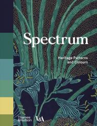
Spectrum offers a fascinating visual analysis of the colour palettes used in furnishing fabrics and wallpapers from the 15th century to the present day. Presented in chronological order, the earliest detail is taken from an early 15th-century embroidery in brick red, dusky pink, sage green, mustard yellow and smoky blue, the last from a graphic wallpaper design of 2009 that combines orange and yellow on a dramatic, dark background. Next to each pattern is a colour grid, which shows the relative proportions of the colours used, each labelled with its CMYK number – a worldwide standard printing code for colour that precisely identifies it. The grid gives a clear understanding of the ways colours have been expertly combined at different periods to create the beautiful designs we admire and emulate today.

This unique sourcebook will provide inspiration for all designers, both amateur and professional.

Contents List:

Introduction • About this book • About these objects • 15th century • 16th century • 17th century • 18th century • 19th century • 20th–21st century • Further reading

About the Author:

Ros Byam Shaw is a journalist who writes on design and interiors for The World of Interiors and House and Garden. She is the author of Farrow & Ball Living with Colour and Farrow & Ball Decorating with Colour as well as numerous other books on historic houses and interiors.

Ціна: 1250 грн
Очікується надходження
в кошик в обране
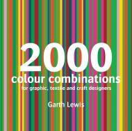
Garth Lewis
ID: 5265
Видавництво: Batsford

A rich resource for all designers and artists looking for inspiration and guidance on colour combinations.

A huge range of combinations is provided, with full readings for both CMYK (for designers working in print) and RGB (for Web-based and other multi-media designers). As an accomplished colour theorist, the author looks at colour combinations through various elements of colour theory, from hues, values and chroma to working with concepts such as simultaneous contrast and perceptual transparency.

The author has also generated an inspirational series of colour palettes taken from photographs of the world around us, depicting landscapes, urban subjects and everyday objects.

The book also contains a selection of work from cutting-edge designers and artists who explain the use of colour in their work and offer exciting new palettes. The colour combinations are rendered as two- and three-colour graphics, stripe studies and more unstructured and complex compositions, all of which showcase the huge variety of effects that can be achieved with colour.

This fascinating book reveals the true magic of colour and is an essential reference book for any designer and artist.

Ціна: 1250 грн
Доступно на замовлення
в кошик в обране
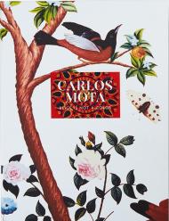
Carlos Mota
ID: 16719
Видавництво: Vendome Press

Щоб відсвяткувати публікацію книги Beige Is Not a Color, Карлос Мота розробив велику коробку для портфоліо, обгорнуту його фірмовим мотивом, щоб вмістити перший друкований примірник тому разом із п’ятьма листівками із зображеннями, відібраними Карлосом Мотою з кольорових сторінок його видатної нової книги. Внутрішня частина портфоліо надрукована з мотивом, адаптованим Карлосом Мотою з традиційного індійського друкарського друку. Це колекційне видання в коробці суворо обмежене 350 примірниками. Доступне лише через Vendome Press та Abrams.

Про авторів:

Карлос Мота — креативний консультант з великим досвідом у стилі, дизайні інтер’єрів, дизайні продуктів та рекламних кампаніях. Раніше він був міжнародним редактором стилю Architectural Digest та головним редактором Elle Decor, а також автором книги A Touch of Style. Він живе в Нью-Йорку.

Ціна: 3800 грн
Доступно на замовлення
в кошик в обране
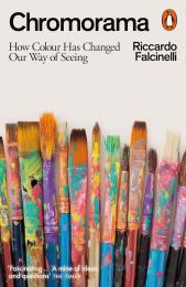
Riccardo Falcinelli
ID: 18839
Видавництво: Penguin Books

Нова кольорова біблія: чудово ілюстроване дослідження кольору та сучасного погляду від дизайнера-лауреата премій

«Одна з найкращих книг про колір, які я читала. Багатошаровий гобелен історій, ідей та поглядів, кожна з яких написана чудово та чітко. Для всіх, хто цікавиться кольором, це обов'язкова книга» Маріон Дюшар

Чому олівці жовті, а техніка для дому – біла? Чому чорний – колір жалоби? Що пов'язує бузкову сукню королеви Вікторії та жовту сукню Мішель Обами?

У книзі Chromorama відомий графічний дизайнер Ріккардо Фальчінеллі заглиблюється в історію кольору, щоб показати, як він сформував сучасний погляд. Маючи понад чотириста ілюстрацій та приклади з широкого кола мистецтва та культури – від романів Гюстава Флобера до «Сімпсонів», від візантійських ювелірних виробів до деформованих фруктів, від Мондріана до трилерів Гічкока – Фальчінеллі простежує еволюцію наших довгих стосунків з кольором і те, як спочатку промислова революція, а потім світанок інтернет-ери змінили їх назавжди.

Чудово оформлена, глибоко досліджена та написана з теплотою та дотепністю, Chromorama — це захоплива розповідь про тінь і світло, тон і відтінки, барвники, пігменти та пікселі. Це історія про те, чому ми зараз бачимо світ саме так, як ми його бачимо.

Про автора:

Ріккардо Фальчінеллі — графічний дизайнер, що отримав нагороди, та автор бестселерів, чиї роботи отримали високе визнання в Італії та в усьому світі. Він викладає на факультеті дизайну ISIA в Римі.

Ціна: 980 грн
Доступно на замовлення
в кошик в обране
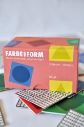
Farbbüro Isler and Bader
ID: 14576
Видавництво: niggli Verlag

This memo-game is based on a very special concept: the colors follow the format used in Johannes Itten’s color theory: red for a square, blue for a circle, yellow for a triangle, orange for a trapezium, green for a spherical triangle, and purple for an ellipse. The colors are shown with the corresponding form, which increases their specific impression.

Furthermore, each color is present in six different nuances; this increases the perception of the color tones and supports the creative process of finding new names to specify the individual forms. As the cards are turned over new color contrasts are revealed; these can also be used to intensify knowledge of color theory. Thus, these cards must not just be used for playing the memo-game, they can also be used for inspiration and for experimenting with different color combinations, series and tones.

_________

Посмотреть видео о наборе Color and Form: Memo Game Based on Johannes Itten

Ціна: 1200 грн
Доступно на замовлення
в кошик в обране
показати по:
на сторінці