Друкарня, Шрифти, Леттеринг

Книги з типографіки, шрифтів та леттерингу

Ви обрали:
Сортування:
наявність
ціна
алфавіт
Ina Saltz
ID: 9068
Видавництво: Rockport

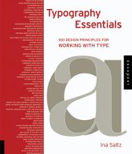
A deep understanding of letterforms and knowledge of their effective use can only be obtained with constant observation and experimentation; it evolves over a lifetime of design practice and study. This comprehensive guide is intended to advance the progress of designers seeking to deepen their typographic expertise. Typography Essentials is a practical, hands-on resource to distill, organize, and compartmentalize - but not to oversimplify - the many complex issues surrounding the effective use of typography. It is for designers of every medium in which type plays a major role, and is organized and designed to make the process enjoyable and entertaining, as well as instructional.

This book is divided into four easy-to-use sections: The Letter, The Word, The Paragraph, and The Page. Each of the 100 principles has an explanation and examples representing the principle in action.

Ina Saltz is an art director, designer, writer, photographer and professor (of Electronic Design and Multimedia at The City College of New York) whose areas of expertise are typography and magazine design. For over 22 years, Ina was an editorial design director at Time Magazine (International Editions), Worth Magazine, and other magazines including Golf Magazine, Golf for Women Magazine, and World business Magazine. Ina frequently lectures on topics related to magazine design and typography, including Toronto, Atlanta, Denver, Moscow, Amsterdam and Calgary. She lives with her husband in New York City.

Пролистать книгу Ina Saltz - Typography Essentials: 100 Design Principles for Working with Type на Google Books

Посмотреть новое издание 2019 года -  Typography Essentials: 100 Design Principles for Working with Type

ID: 14843
Видавництво: SendPoints

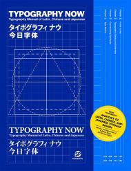
Following up on Layout Now and Color Now, SendPoints continues to craft practical guidebooks for readers in the design cosmos. This time, it is about the type, which we read and use every day.

Typography Now guides readers through everything they need to know to understand, create, and use Latin, Chinese, and Japanese typefaces in an increasingly interrelated world. The fundamentals, including typographic terms, character structures, style classifications, size, weight, text families, and more will provide readers with prerequisite knowledge to understand and identify different types. Typography Now introduces readers to esteemed type foundries and their design processes and techniques to demonstrate how type is created. The coverage of layout rules will help readers grasp how to effectively design with text on the page as well as combine text with mixed scripts (Chinese, Japanese, and Roman).

In addition, you will find some of the best examples of typographic choices, as well as talks with experts at type foundries about the present and future of type, and demonstrations of some of the hottest new typefaces.

Jason Tselentis, Allan Haley, Richard Poulin, Tony Seddon, Gerry Leonidas, Ina Saltz, Kathryn Henderson, Tyler Alterman
ID: 9069
Видавництво: Rockport

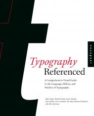
Typography, Referenced is the single most comprehensive volume covering every aspect of typography that any design student, professional designer, or design aficionado needs to know today.

In these pages, you'll find:

- Thousands of illustrated examples of contemporary usage in design
- Historical developments from Greek lapidary letters to the movie Helvetica
- Landmark designs turning single letters into typefaces
- Definitions of essential type-specific language, terms, ideas, principles, and processes
- Ways technology has influenced and advanced type
- The future of type on the web, mobile devices, tablets, and beyond

In short, Typography, Referenced is the ultimate source of typographic information and inspiration, documenting and chronicling the full scope of essential typographic knowledge and design from the beginnings of moveable type to the present "golden age" of typography.

"The many authors who worked on this volume - Haley (ABC’s of Type), Richard Poulin (typography, Sch. of Visual Arts NY; The Language of Graphic Design), Jason Tselentis (Type Form and Function), Tony Seddon (Graphic Design for Non-Designers), Gerry Leonidas (typography, Univ. of Reading, UK), Ina Saltz (electronic design & multimedia, City Coll., CUNY), Kathryn Henderson (Online and on Paper), and Tyler Alterman - have created an attractive, informative book with an uncertain purpose. The introduction pitches the title as something between a reference and a book for casual perusal (likening it to Judy Jones and William Wilson’s An Incomplete Education). A later section, ostensibly on designing with type, provides plenty of colour pictures of modern applications but little textual analysis, making this section like part of a coffee-table book. However, the overall breadth of material, both conceptual and practical - including information about existing typefaces and how to work with them - and a section at the end listing schools, periodicals, conferences, museums, and websites related to typography, make it suitable as a textbook for an introductory college class on typography. Unsurprisingly, the book is also well designed. VERDICT: This title is somewhat technical for average readers, and the number of authors leads to uneven writing. Still, high school seniors and college students beginning their path toward careers as graphic designers or commercial artists will find this guide invaluable." — Library Journal

About the Authors:

Jason Tselentis teaches graphic design and typography at Winthrop University in Rock Hill, South Carolina. He is the author of Type, Form, and Function by Rockport Publishers.

Allan Haley is Director of Words & Letters at Monotype Imaging, based in Woburn, Massachusetts. He is responsible for strategic planning and creative implementation of just about everything related to typeface designs, and editorial content for the company’s type libraries and websites.

Richard Poulin is design director and principal of Poulin + Morris Inc., in New York City. He is a faculty member at the School of Visual Arts, and he is the author of The Language of Graphic Design by Rockport Publishers.

Tony Seddon is a designer living in Alfriston, East Sussex, UK. He has written three books: Images: A Creative Digital Workflow for Graphic Designers, Graphic Design for Nondesigners, and Art Directing Projects for Print.

Gerry Leonidas is a Senior Lecturer in Typography at the University of Reading, UK. He teaches typographic design and typeface design at under- and postgraduate levels.

Ina Saltz is an art director, designer, and author of numerous articles on design and typography. She is the author of Typography Essentials by Rockport Publishers. She lives in New York City.

Kathryn Henderson is a writer, editor, and designer interested in the convergence between design and pop culture. Currently, you can find her at Pentagram Design obsessing over new design work and assisting with daily communications as deputy editor of Content Development for https://www.pentagram.com. She resides in Brooklyn, NY.

Tyler Alterman is a fourth-year student in The City University of New York's Macaulay Honors College studying creative behavior change. His obsessions include the science of persuasion, cognitive neuroscience, graphic design, cinnamon pita chips, and any fine type with high contrast, ball terminals, or geometric forms. He lives in New York City.
Shaoqiang Wang
ID: 11498
Видавництво: Promopress

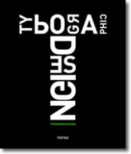
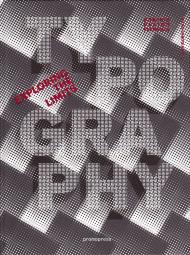
Типографіка об'єднує найкреативніші типографічні проекти з усього світу. Незалежно від того, чи використовуються вони в брендингу, рекламі, упаковці чи інших креативних дизайнах, представлені тут шрифти мають силу привертати увагу та надихати. Типографіка – це важливе введення в цю захопливу та фундаментальну галузь графічного дизайну.

ID: 9815
Видавництво: Birkhauser

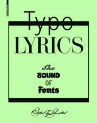
Graphic designers love music. This is attested not least by the tremendous enthusiasm that readers of the typography magazine Slanted bring to its "Typo Lyrics" column, in which designers interpret music in entirely new ways with the help of fonts.

For this publication of the same name, celebrated graphic designers like Fons Hickmann as well as talented young designers from all over the world have taken song lyrics and used them as the inspiration for innovative font designs.

The result is a collection of fascinating visuals – "typographic images" that present contemporary fonts a little bit differently. The extraordinary interplay of type design and music brings the fonts to life and practically sets them dancing. In contrast to classical pattern books and font fans, this volume provides a special, more emotional experience of typography and illustrates the great expressive potential of typefaces.

On analogy with the traditional classification of fonts, the book is organized into eleven chapters, each of which treats a particular font family and song lyrics from a particular musical style.

Laura Meseguer
ID: 5909
Видавництво: Index Book

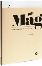
This is the first book in the new Typo collection, which is conceived as a source of inspiration for designers who use typography as one of the main resources in their projects –from both an expressive and communicative standpoint. The first volume of the collection is TypoMag and is dedicated to typography as used in magazines. TypoMag analyzes excellence in the use of typography, custom-made fonts and the personalized fonts used in almost 30 magazines on a variety of topics.

Ивановская В.И.
ID: 6656

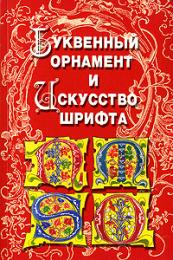
Культура шрифта является неотъемлемой частью художественной культуры. Каждый новый образец шрифта создается в соответствии с эстетикой, модой, требованиями научно-технического прогресса. И если алфавит остается неизменным, то шрифт с течением времени меняется. Художник-шрифтовик учитывает наклон литеры - прямой, курсив, наклонный, цветовую насыщенность - светлый, полужирный, жирный, размер буквы - кегль. Часто он вносит в шрифт дополнительные художественные элементы в виде завитков, сюжетных композиций, варьирует высоту относительно строки и т.п. Пространственное расположение буквы на бумаге, ее начертание, пластика, пространственная глубина - все это основы для создания новых шрифтов.

ID: 11208

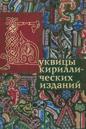
В отличие от "Буквенного орнамента и искусства шрифта", вышедшего в 2008 г., это издание не содержит образцы шрифтов.
Здесь собраны буквицы кириллических изданий.
Большое количество инициалов и орнаментальных заставок издания В.И.Бутовского "История русского орнамента XI-XVII вв." можно найти в другом нашем издании - "Русские орнаменты", здесь они не повторяются.

Книга разделена на три части: буквицы рукописных и печатных изданий, фрагменты известного букваря Кариона Истомина и книжные заставки или цельные скомпонованные страницы с буквицами.
 
В колонтитулах указан период изданий. В случае книг XIX-XX вв. многие издательства использовали одинаковые буквицы и заставки, поэтому часто даны период и издательство, а не конкретная книга.

Патриция Селигман, Тимоти Ноад
ID: 7503
Видавництво: Арт-Родник

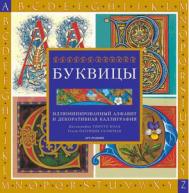
The Illuminated Alphabet

Создайте яркие замысловатые буквицы, а затем украсьте их золотом и богатыми орнаментами. В этой книге вы найдете множество самых разных шрифтов и идей по их оформлению. Например, иллюминирование в кельтском стиле, в основе которого лежит ирландский шрифт, отличается буйством переплетающихся спиралей, в то время как характерной чертой готического стиля являются спиралевидные завитки растительных мотивов. Неважно, работаете ли вы с простыми образцами пли, наоборот, с более сложными: в любом случае иллюминированные вами буквицы будут красивыми и элегантными.

Маргарет Морган
ID: 2883
Видавництво: Арт-Родник

Декоративная каллиграфия – искусство украшения книг буквицами с узором и рисунками, которое было распространено в монастырях в Средние века в Европе. Позолоченные буквицы в древних манускриптах были очень красивы. В наше время это удивительное искусство обрело новую жизнь.

В энциклопедии вы найдете подробные инструкции по созданию буквиц и декоративных шрифтов в шести исторических стилях, включая кельтский, готический и романский. Кроме того, здесь приводятся идеи для создания бордюров и других декоративных элементов, а также подробные инструкции по нанесению позолоты.

В каждом разделе даны рекомендации, которые помогут вам максимально эффектно вписать буквицы в ваше изделие. Источником вдохновения станет для вас Современная галерея в конце книги.

Владимир Ефимов, Анна Шмелева
ID: 6348
Видавництво: ИндексМаркет

Вторая книга из серии «Великие Шрифты» повествует о шрифтах с засечками, то есть антикве. В книге собраны классические и современные шрифты, освещена история их создания, раскрыты прототипы и источники вдохновения их авторов. Описана также и жизнь шрифтов после рождения, их применение, влияние на типографику и шрифтовой дизайн.

ID: 8978
Видавництво: Арт-Родник

Эта книга посвящена классическому искусству каллиграфии. Здесь подробно изложены все аспекты, которые необходимо знать при изучении различных каллиграфических стилей и техник. Благодаря нашему руководству вы сможете овладеть навыками каллиграфии с использованием кистей, перьев, чернил и прочих инструментов и материалов. Книга построена по аналогии с энциклопедией: на основании монографических разделов, включающих в себя небольшие подразделы. Все статьи сопровождаются подробными иллюстрациями, благодаря чему вы сможете разобраться с любой темой.

Благодаря книге «Каллиграфия. Все о технике» вы узнаете:

• Все о письменности
• Все о письменных принадлежностях
• Все о материалах для письма
• Все об основах для письма
• Все о стилях
• Все о технике
• Все о графике

Патриция Картер
ID: 6540
Видавництво: Арт-Родник

The Art of Illumination

В этой книге Патриция Картер рассказывает об иллюминировании самых разных предметов: поздравительных открыток, закладок для книг, экслибрисов, почтовой бумаги, шкатулок, пресс-папье и др. Здесь представлены семь полностью иллюминированных алфавитов, которые вы можете использовать для создания восхитительных буквиц, а также множество узоров в различных стилях - от классического до современного - и различной степени сложности.
В книге описаны техники золочения, пуантилизма и зеркального переноса узоров.
Цветочные, стилизованные, декоративные и геометрические мотивы, узоры и бордюры.

Кликушин Г.Ф.
ID: 175
Видавництво: Архитектура-С

В настоящей книге собраны декоративные (орнаментированные, каллиграфические, титульные, брусковые, рубленые и др.) шрифты, которые могут быть использованы для художественно-оформительских работ в печати, в наглядной агитации и рекламе. Книга представляет интерес для учащихся и студентов художественных учебных заведений а также для всех, кто интересуется шрифтовой графикой.

Робин Уильямс
ID: 11660
Видавництво: Питер

Дизайнеры и недизайнеры всего мира уже два десятилетия используют в своих работах фундаментальные принципы, изложенные Робин Уильямс. Познакомьтесь с полностью обновленным полноцветным четвертым изданием «Дизайн. Книга для недизайнеров».

• Четыре секрета, которые пригодятся в любом дизайнерском проекте
• Принципы работы с цветом
• Стили дизайна
• Оттачивание дизайна с помощью шрифтов
• Варианты дизайна для брошюр, листовок, писем, рекламы

«Большинство, глядя на плохо оформленную страницу, скажут, что она им не нравится, однако они не знают, как ее исправить. Эта книга не заменит учебу в школе дизайна. Я не утверждаю, что после ее прочтения вы станете дизайнером. Но я ручаюсь, что вы больше никогда не будете смотреть на страницы, как раньше. Я гарантирую, что, если вы станете следовать этим базовым принципам, ваша работа будет выглядеть более профессиональной, цельной и интересной. И вы почувствуете, что ваши возможности стали шире». Робин Уильямс

показати по:
на сторінці