Подобрать по характеристикам

Издательства

Цена (370 - 19800 грн)

Цена
грн ok

Дизайн

Дизайн

Ви обрали:
Сортування:
наявність
ціна
алфавіт
Victionary
ID: 2753
Видавництво: Index Book

From 2D to 3D design, types are another key visual besides pure graphics and illustration. How to deal with types is a common challenge among designers/artists from various design disciplines. We are excited to present you our latest title Type Addicted which shows you the new trend of A to Z typo-graphics.

Type is one of the graphic elements that designers always get addicted to play with. It is commonly used on almost every item in our daily life. The title not only presents a rich selection of experimental and inspirational typefaces and its application, it also reveals the diversity and innovative approaches of contemporary typography. Examples of work by up-and-coming practitioners as well as international and renowned icons are demonstrated; new directions and trend of nowadays typography around the world will also be disclosed eventually. This is truly developed for type addicts!

ID: 13265
Видавництво: SendPoints

Among the graphic design competitions on a global scale, there is a sparkling and well-targeted competition which never seeks to make money by charging extra expense and always adheres to its own principles and quality requirements. It is: Type Directors Club of New York (NY TDC). The entry fee for this competition is very low, enabling students and rookie designers to participate. The jury consists of young and top creatives from around the world who treat every piece of work with caution and criticism and make judgments based on their professional competence. The winning entries will be exhibited in major cities around the world. Collecting all the winning entries of the year, “Type Directors Club of New York: Typography 39”will also be released globally. In this wonderful book, you will experience works of world-class quality and be inspired to move forward at the same time.

NY TDC was founded in 1946, and its Best Typeface Design Award is one of the most influential typeface design awards. The exhibition of the wining entries is an annual event with high reputation and professionalism in the industry, and 64 exhibitions have been held so far. The NY TDC typeface design competition is the world’s first typeface-based competition and one of the most important graphic design competitions in the world, attracting graphic designers, art directors, editors, multimedia professionals, students and entrepreneurs to it every year. This year, the competition attracted 1,835 pieces of work from more than 55 countries across 5 continents. The Collection of the winning entries of the year is released worldwide and regarded as a bible by designers all around the globe.

Jason Tselentis
ID: 9070
Видавництво: Rockport

Type, Form, and Function is a useful, comprehensive typography resource that both students and professional designers should have in their library. It looks at the influences of modern typography and symbols going back through time and examines certain type treatments and movements in design and logo types. It focuses on how type works and emphasizes typographic fundamentals, while touching on logo/logotype design and page layout (print and interactive). This book promises to guide designers through the visual typographic clutter to make their designed messages more meaningful.

Jason Tselentis is a designer, writer, and educator living in North Carolina. He has completed print and interactive design for: Experience Music Project and Science Fiction Museum; Henry Art Museum; Intel Labs; the National Park Service; Sony BMG Music; Continental Tires; and 20th Century Fox. As Assistant Professor at Winthrop University’s Department of Design, Jason teaches graphic design and typography.

Пролистать книгу Jason Tselentis - Type Form & Function: A Handbook on the Fundamentals of Typography: A Handbook on the Fundaments of Typography на Google Books

Editors: Jan Middendorp, TwoPoints.Net
ID: 7687
Видавництво: Gestalten
An essential reference of independent foundries and innovative type designers.

The rapidly expanding online market for digital typefaces is exciting and diverse. With new fonts and type foundries launching on an almost daily basis, it has been difficult to keep track of notable developments - until now. Type Navigator is a useful current handbook of modern fonts, independent foundries, and innovative type designers that provides an overview of today’s vast market. This comprehensive publication offers a valuable overview of international sources for quality fonts. In addition to concise profiles of type foundries and recent typefaces, Type Navigator features inspirational visual examples of fonts in use. A free digital collection of 100 typeface variations from 20 choice foundries accompanies the 320-page book.

In the past, there were only a few specialists worldwide who worked intensively with typography. Since the introduction of digital fonts and their dissemination via the internet, typography has gained a new significance. More and more designers are creating fonts for a variety of applications. Simultaneously, more and more of these designers are founding type foundries to sell their fonts themselves. Supply and demand in this area have been growing considerably for years. The expanding market for typography is exciting and diverse, but it has been difficult to keep track of notable developments - until now.

Type Navigator is a comprehensive handbook of the best independent sources for quality fonts. Structured and indexed according to practical criteria, it offers not only a valuable overview, but also possibilities for effective targeted searches. Whether a reader is in need of a specific type of font, is looking for fonts by a select designer, from a certain country, or even just wants to compare prices, Type Navigator will provide the necessary information.

In addition to abundant examples of fonts as well as concrete applications for typefaces and alphabets, this essential compendium features concise profiles of type foundries and designers. Select interviews with managers of type foundries show how their creative visions are influencing the characteristics of their font libraries.

Type Navigator is a valuable reference for agencies, designers, consultants, and customers who are looking for an overview of the modern typefaces currently available and the innovative people and companies behind them.

A free digital collection of 100 typeface variations from 20 choice foundries accompanies the 320-page book.

Type Navigator is edited by typography expert Jan Middendorp as well as the former Hort designer Martin Lorenz and his wife Lupi Asensio, who currently work together as TwoPoints.Net.

Nancy Skolos, Tom Wedell
ID: 3745
Видавництво: Rockport

300 photos/illustrations

Working with type and image and the integration of these two elements to create persuasive and effective design pieces are the foundations of good graphic design. Yet, very little practical information exists for these tasks.

This book changes all it. It gives designers the practical know-how to combine type and image for dynamic effect as well as to use them in contrast to create tension and meaning in design. Creating strong layouts is the most important as well as the most challenging of any project. This book inspires through excellence by exhibiting great design work then deconstructing the processes in simple visual terms.

Type, Image, Message: Merging Pictures and Ideas looks at this respected art form while providing practical information that can be used by any designer wishing to hone the skills needed to merge type with images in an inspired manner.

Nancy Skolos and Thomas Wedell are the principals of Skolos-Wedell, an interdisciplinary graphic design and photography studio.

Husband and wife, photographer and designer, the two work to diminish the boundaries between graphic design and photography - creating collaged three-dimensional images influenced by modern painting, technology, and architecture. With a home and studio halfway between Boston and Providence, they balance their commitments to professional practice and teaching at the Rhode Island School of Design, where Skolos is Head of the Department of Graphic Design.

The studio's work has received numerous awards and has been widely published and exhibited. Skolos-Wedell's posters are included in the graphic design collections of the Museum of Modern Art, the Library of Congress, the Metropolitan Museum of Art, the Israel Museum, and the Museum fur Gestaltung, Zurich, Switzerland. Skolos is an elected member of the Alliance Graphique Internationale.

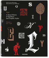
Cees W. de Jong, Alston W. Purvis, Jan Tholenaar
ID: 10665
Видавництво: Taschen

Know your type. A visual history of fonts and graphic styles: 1628–1938

This book offers a connoisseur’s overview of typeface design, exploring the most elegant fonts from the history of publishing. Taken from a distinguished Dutch collection, this exuberant two-volume edition traces the evolution of the printed letter via exquisitely designed catalogs, showing type specimens in roman, italic, bold, semi-bold, narrow, and broad fonts. Borders, ornaments, initial letters, and decorations are also included, along with lithographic examples, letters by signwriters, inscription carvers, and calligraphers.

Featuring works by type designers including: William Caslon, Fritz Helmuth Ehmcke, Peter Behrens, Rudolf Koch, Eric Gill, Jan van Krimpen, Paul Renner, Jan Tschichold, A. M. Cassandre, Aldo Novarese, and Adrian Frutiger.

In order to accommodate a vast amount of material, we have divided this text into two volumes. The first volume covers pre–20th-century typeface specimens, with texts by editor Cees de Jong and collector Jan Tholenaar. The second volume covers the period from 1900 to the mid-20th century and contains a historical outline by Alston W. Purvis.

Includes exclusive access with TASCHEN keycard to online image library: over 2,400 high-resolution scans of type specimens downloadable for unrestricted use.

The editors and authors:

Cees W. de Jong is a designer and publisher based in Naarden, the Netherlands. He has published numerous books on design, architecture, art and graphic design, and is now working as a design/publishing consultant and author.

Alston W. Purvis is professor of the visual arts division of the School of Arts at Boston University, USA. He is also the author on many books on graphic design.

Jan Tholenaar was a collector of the printed letter in all its various incarnations; especially in the form of design catalogs and specimen books. He lived in Amsterdam, where he passed away in 2009.
Cees W. de Jong, Alston W. Purvis, Jan Tholenaar
ID: 12352
Видавництво: Taschen

For the Love of Letters. A history of fonts and graphic styles from 1628 to 1938

A connoisseur’s overview of typeface design, Type offers a dependable history of elegant fonts from 1628 to the mid-20th century. Derived from a distinguished Dutch collection, exquisitely designed catalogues trace the evolution of the printed letter through specimens in roman, italic, bold, semi-bold, narrow, and broad fonts, as well as borders, ornaments, and initial letters.

This comprehensive collection offers a thorough overview of typeface design from 1628 to the mid-20th century. Derived from a distinguished Dutch collection, a series of exquisitely designed catalogues traces the evolution of the printed letter via specimens in roman, italic, bold, semibold, narrow, and broad fonts. Borders, ornaments, initial letters, and decorations are also included, along with lithographic examples, letters by sign writers, inscription carvers, and calligraphers.

The first part of the book covers pre-20th-century typefaces, with texts by editor Cees de Jong and collector Jan Tholenaar. The second part deals with the period from 1900 to the mid-20th century and contains a historical outline by Alston W. Purvis. Featured type designers include William Caslon, Fritz Helmuth Ehmcke, Peter Behrens, Rudolf Koch, Eric Gill, Jan van Krimpen, Paul Renner, Jan Tschichold, A. M. Cassandre, Aldo Novarese, and Adrian Frutiger.

The editors and authors:

Cees W. de Jong is a designer and publisher based in Naarden, the Netherlands. He has published numerous books on design, architecture, art and graphic design, and is now working as a design/publishing consultant and author.

Alston W. Purvis is a professor of the visual arts division of the School of Arts at Boston University, USA. He is also the author of many books on graphic design.

Jan Tholenaar was a collector of the printed letter in all its various incarnations; especially in the form of design catalogs and specimen books. He lived in Amsterdam, where he passed away in 2009.
Cees de Jong, Jan Tholenaar, Alston W. Purvis
ID: 4350
Видавництво: Taschen

Faces And Characters Of Distinction. 

A visual history of fonts and graphic styles, volume 1: 1628–1900

This exuberant selection of typographic fonts and styles traces the modern evolution of the printed letter, reproducing pages from exquisitely designed catalogs showing type specimens in roman, italic, bold, semi-bold, narrow, and broad fonts. Also included are borders, ornaments, initial letters and decorations, and many spectacular examples of their use. Victorian fonts, spectacular in their complexity, are accorded a prominent place. In addition, examples from lithography and letters by inscription carvers and calligraphers are also included and described.

Featuring works by type designers William Caslon, Fritz Helmuth Ehmcke, Peter Behrens, Rudolf Koch, Eric Gill, Jan van Krimpen, Paul Renner, Jan Tschichold, A. M. Cassandre, Aldo Novarese, and Adrian Frutiger.

To accommodate the vast amount of material, we have divided the subject into two volumes. This, the first volume, covers pre–20th Century typeface specimens, with texts by editor Cees de Jong and collector Jan Tholenaar.

Includes exclusive access with TASCHEN keycard to online image library: over 1000 high-resolution scans of type specimens downloadable for unrestricted use.

Dave Addey
ID: 12279
Видавництво: Abrams

In Typeset in the Future, blogger and designer Dave Addey invites sci-fi movie fans on a journey through seven genre-defining classics, discovering how they create compelling visions of the future through typography and design. The book delves deep into 2001: A Space Odyssey, Star Trek: The Motion Picture, Alien, Blade Runner, Total Recall, WALL·E, and Moon, studying the design tricks and inspirations that make each film transcend mere celluloid and become a believable reality. These studies are illustrated by film stills, concept art, type specimens, and ephemera, plus original interviews with Mike Okuda (Star Trek), Paul Verhoeven (Total Recall), and Ralph Eggleston and Craig Foster (Pixar). Typeset in the Future is an obsessively geeky study of how classic sci-fi movies draw us in to their imagined worlds — and how they have come to represent “THE FUTURE” in popular culture.

About the Author: 

Dave Addey is the creator of the website Typeset in the Future, a detailed, geeky, and humorous study of the design and typography of classic science fiction movies. He is a designer, writer, and software developer based in Santa Cruz, California. Matt Zoller Seitz is the editor-in-chief of RogerEbert.com, the TV critic for New York Magazine, the author of The Wes Anderson Collection, The Wes Anderson Collection: The Grand Budapest Hotel, The Oliver Stone Experience, and Mad Men Carousel, and the coauthor of TV (The Book). He is based in New York City.

Jordi Villafranca
ID: 8494
Видавництво: Index Book

Typo Latino is a publication where we showcase the work of emerging typographers as well as established type designers from across the globe. What differentiates Typo Latino from other font books is that we feature typefaces, outline the process of constructing them and provide short explanations from the authors on the formal characteristics or applications of each typeface. We want to show the working process, the final result and the end uses where they exist. As a compilation of best works by Latin authors, this text serves as a tribute to and an emphasis on Latin character. Among the 30 typographers are Andreu Balius, Alexander Paul, Eduardo Manso and Iñigo Jerez.

Josep Maria Minguet, Fabiola Reyes
ID: 2834
Видавництво: Monsa
TYPO tries to go beyond a conventional book on typography and show a varied selection of projects pertaining to several creative fields like graphic design, fashion, sculpture, industrial design, and architecture, among others, where artists and designers from all over the world use and experiment with typography.
Many of the projects included in this book have been created by defying the barriers of typographic design to give way to original and alternative solutions in more or less evident ways to interact with the individual and provoke reactions, sensation and even feelings.
Stefan Sagmeister, Andrew Byrom, Olga Adelantado, Catherine Griffiths, BorjaGarmendia, Silvia B., Why Not Associates, Gordon Young, David Delfín and Pentagram are some of artists invited to appear in this book to show that the borders between design, art and typography don¹t really exist S

The pagination of this book also belongs to a graphic font collection created by the design team of the Spanish magazine Neo2, the Danish agency of strategic design e-Types, and the design studio Underware, specializing in typographical design and production.
ID: 3634
Видавництво: L'Aventurine

CD: 271 изображение высокого качества в формате TIFF

Хорошее типографское оформление книги зависит от правильного выбора и размещения многих элементов декора: разделителей, буквиц, рамок, концевых украшений. Каждое украшение имеет четко определенное место в структуре книги и усиливает, выделяет, подчеркивает или уравновешивает текст на ее страницах. Типографские украшения часто объединены между собой, орнаменты могут быть многофункциональными, это приводит к целому ряду взаимосвязанных повторяющихся и изменяющихся элементов декора, включающих концевые элементы, разделители и рамки.

16-е столетие - золотой век типографского декорирования. Такие художники как Жан Казин и Джефри Тори разработали прекрасные флероны, концевые украшения, рамки и арабески.

В 17-м веке книги были главным образом украшены с титульной стороны, а также полностраничными иллюстрациями, в то время как в 18-м столетии - веке Рококо - декоративные украшения и иллюстрации становятся тесно связанными между собой, образуя художественное смешение декоративного и иллюстрационного оформления.

В 19-м столетии типографские мастера одновременно являлись прекрасными художниками, которые сами оформляли и декорировали издаваемые книги. Гравюры размещались сверху или на нижней части страниц текста, с бесчисленными разновидностями орнаментов, заимствованных из прошлых веков, также как и в сегодняшней архитектуре и индустриальных искусствах. Все эти прекрасные декоративные элементы со временем постепенно теряли свою роль в визуальной структуре книг и использовались в рекламном деле.

Предлагаемая книга, с сотнями уникальных примеров, позволит Вам использовать декоративные элементы из прошлого и находить вдохновение для создания ваших собственных композиций.

Все иллюстрации, представленные в этой книге сохранены на прилагающемся компакт-диске.
Могут использоваться как на PC, так и на Mac компьютерах.
Изображения сохранены в файлах формата TIFF высокого разрешения и могут свободно применяться в некоммерческих целях.

Josep Maria Minguet (Editor)
ID: 4930
Видавництво: Monsa

Typograpic Design is a book about the last tendencies in the universe of fonts. Designers from all over the world create multiple typographies which have born from the experimentation of its shapes, ligatures or proportions.
This title presents a comprehensive selection of complete alphabets and its applications on posters, logos, advertisements, magazines, club flyers, or exhibitions.


Este libro aborda las últimas tendencias en el universo de las fuentes. Diseñadores de todo el mundo crean múltiples y variadas tipografías, que han nacido de la experimentación de sus formas, ligaduras, o proporciones.
Este libro presenta una amplia selección de alfabetos completos y sus aplicaciones en pósters, logotipos, publicidad, magazines, flyers, o exposiciones.

Type Directors Club
ID: 6901
Видавництво: Harper Collins Publishers

For over fifty years, the Type Directors Club has encouraged the worldwide graphic arts community to achieve excellence in typography through its annual international competitions. Typography 31 is the only annual devoted exclusively to typography and presents the finest work in this field for the year 2009. Selected from approximately 2300 international submissions to the annual Type Directors Club competition, the winning designs are models of excellence and innovation in the use of type design, encompassing a wide range of categories, including books, magazines, corporate identities, logo types, stationery, annual reports, video and web graphics, and posters.

Ina Saltz
ID: 9068
Видавництво: Rockport

A deep understanding of letterforms and knowledge of their effective use can only be obtained with constant observation and experimentation; it evolves over a lifetime of design practice and study. This comprehensive guide is intended to advance the progress of designers seeking to deepen their typographic expertise. Typography Essentials is a practical, hands-on resource to distill, organize, and compartmentalize - but not to oversimplify - the many complex issues surrounding the effective use of typography. It is for designers of every medium in which type plays a major role, and is organized and designed to make the process enjoyable and entertaining, as well as instructional.

This book is divided into four easy-to-use sections: The Letter, The Word, The Paragraph, and The Page. Each of the 100 principles has an explanation and examples representing the principle in action.

Ina Saltz is an art director, designer, writer, photographer and professor (of Electronic Design and Multimedia at The City College of New York) whose areas of expertise are typography and magazine design. For over 22 years, Ina was an editorial design director at Time Magazine (International Editions), Worth Magazine, and other magazines including Golf Magazine, Golf for Women Magazine, and World business Magazine. Ina frequently lectures on topics related to magazine design and typography, including Toronto, Atlanta, Denver, Moscow, Amsterdam and Calgary. She lives with her husband in New York City.

Пролистать книгу Ina Saltz - Typography Essentials: 100 Design Principles for Working with Type на Google Books

Посмотреть новое издание 2019 года -  Typography Essentials: 100 Design Principles for Working with Type

Видавництва
A B C D E F G H I G K L M N O P Q R S T U V W X Y Z 0-9
А Б В Г Д Е Ё Ж З И Й К Л М Н О П Р С Т У Ф Х Ц Ч Ш Щ Ы Э Ю Я