Типографика, Шрифты, Леттеринг

Книги по типографике, шрифтах и леттерингу

Ви обрали:
Сортування:
наявність
ціна
алфавіт
Hans Lijklema
ID: 3628
Видавництво: Pepin Press
The Free Font Index contains comprehensive letterproofs of more than 500 fonts from 35 type foundries in 17 countries and interviews with 6 font designers. All fonts contained in the book are included on the accompanying CD and are licensed for personal and commercial use. A number of exceptional fonts have also been included which contain character sets for Central/Eastern European languages, Cyrillic and Greek.
Josef Mülller-Brockmann
ID: 14868
Видавництво: niggli Verlag

This book is suitable for those who work with automated text and image design. It shows examples of working correctly on a conceptual level. Exact directions for using all of the grid systems presented (8 to 32 grid fields) are given to the user. These can be used for the most varied of projects. The three-dimensional grid is treated as well. Put simply: a guidebook from the profession for the profession.

The development of organisational systems in visual communication was the service and the accomplishment of the representatives of simple and functional typography and graphic design. In the 1920s in Europe, works already arose in the areas of typography, graphic design and photography with objectified conception and rigid composition. In 1961 a brief presentation of the grid with text and illustrations appeared for the first time in an earlier book by the author. Articles published mainly in trade journals then followed.

This book now attempts to close a gap by giving examples and exact directions to the professional concerning all grid problems that can occur.

The author, a world-renowned professional, thus offers his colleagues the tools to solve problems more easily.

Jan Middendorp, Hendrik Hellige, Robert Klanten
ID: 10043
Видавництво: Gestalten

The beauty and art of creating handwritten letter forms.

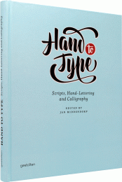
Hand to Type is a stunning compilation of hand-made and digital scripts that showcases the beauty of handwritten letterforms. The book features work by some of today’s most successful and original calligraphers and lettering artists. In addition to fonts and lettering using the Latin alphabet, it introduces artists who explore Cyrillic, Arabic, and Greek scripts.

The book’s rich visual examples are complemented by in-depth interviews with outstanding calligraphers and type designers conducted by editor Jan Middendorp. Hand to Type also offers a revealing glimpse into processes by which hand-made letters may be turned into digital files. Prominent guest authors introduce the workings of scripts with which many readers may be less familiar — from Arabic and Indian writing systems to the amazing scripts found in pre-war German schoolbooks and on Amsterdam pub windows.

Hand To Type features interviews with Ken Barber, Timothy Donaldson, Tony Di Spigna, Gemma O’Brien, Luca Barcellona, Niels Shoe Meulmann, Brody Neuenschwander, Gabriel Martínez Meave, and Reza Abedini.

Contributing designers include:

Francesca Biasetton, Alison Carmichael, Allan Daastrup, Louise Fili, Cláudio Gil, Gray 318, Cyrus Highsmith, Brian Jaramillo, Seb Lester, Letman, Gabriel Martínez Meave, Erik Marinovich, Marina Marjina, Laura Meseguer, Greg Papagrigoriou, Alejandro Paul, Stephen Rapp, Ricardo Rousselot, Paul Shaw, Wissam Shawkat, Dana Tanamachi, John Stevens, Underware, and Laura Worthington, among others.

With specialist chapters by:

Nadine Chahine, Rick Cusick, Ramiro Espinoza, Kimya Gandhi and Dan Reynolds, Patrick Griffin, Florian Hardwig, Shoko Mugikura, and Alexei Vanyashin.
Sarah Hyndman
ID: 12332
Видавництво: Laurence King Publishing

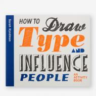
We are all type consumers and interact with type in our everyday lives. Typefaces in all shapes and sizes evoke an emotional response and trigger associated memories before we’ve even read the words.

How to Draw Type and Influence People shows how we use type to understand different messages. Each typeface is introduced and explained and then creative exercises show the reader how to draw each font and invite them to explore the associations evoked by the styles, to reveal why they have come about and how to create their own versions.

Ideal for all those who work with type daily, this book provides an accessible way into the world of typefaces, for the general reader, but also graphic designers who want to explore fonts in more detail and design their own letterforms.

About the Author:

Sarah Hyndman is a graphic designer, author and public speaker, known for her interest in the psychology of type. Her aim is to change the way we think and talk about typography by demonstrating that it is fun and accessible for everybody. Sarah leads tailored workshops and runs events, and in 2014 she delivered a TEDx talk. She collaborates with the Crossmodal Research Laboratory at the University of Oxford.

Lindsey Marshall, Lester Meachem
ID: 10113
Видавництво: Laurence King Publishing

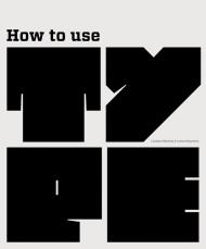
This book is a guide to the use of type in design for print and screen. It provides a creative, informative and practical introduction for those studying all pathways of graphic design.

The authors discuss who uses type, where and when type is employed, audience and appropriateness of type and communication. The book includes basic information about type and its terminology, using typefaces, designing and communicating with type, colour and movement, experimentation with type and production issues. Throughout, examples are drawn from design for both print and screen.

How to Use Type includes illustrated activities and case studies linked to key issues discussed in the text. This book offers an invaluable overview of an essential aspect of visual communication.

ID: 12231
Видавництво: Gingko Press

The sans-serif typeface Franklin Gothic was designed by Morris Fuller Benton in 1902 and continues to be widely used in newspapers, books, billboards and advertisements.

Named in honour of iconic American printer Benjamin Franklin, the impactful, bold typeface has been spun off into a variety of related faces throughout the past century.

In I LOVE TYPE 06 - FRANKLIN GOTHIC, internationally acclaimed designers including Akatre, Cypher13 and Studio Blanco show off their finest creations incorporating the grace and style of Franklin Gothic.

ID: 12230
Видавництво: Gingko Press

Gill Sans, a sans-serif typeface widely used today, was designed by Eric Gill in 1926; the first public usage of the typeface was that same year, when Gill used it on signage for a new bookshop opening in his hometown of Bristol. I LOVE TYPE 05 - GILL SANS explores the multitude of unexpected ways this popular typeface has been used, subverted and reinvented by a host of clever and inspired designers in recent years.

Carol Belanger Grafton
ID: 10135
Видавництво: Dover

Among the glories of extant medieval manuscripts are the splendid illuminated initials in which geometric, curvilinear, animal, religious and other motifs intertwine to form extraordinarily beautiful and decorative letters.

For this striking volume, Carol Belanger Grafton has selected 548 illuminated letters-alphabetically arranged-from 19th-century reprints of medieval manuscripts. Here are magnificently ornamented initials-some the length of an entire margin, another encompassing the page itself, others delicate miniatures. All are imaginatively and beautifully enhanced with royal and saintly figures, mythical creatures, knights in battle, exquisite florals and much more.

Encompassing all the letters of the alphabet, and including a selection of hand-colored chromolithographs, this practical archive of lovely copyright-free designs not only provides commercial artists and illustrators with a wealth of usable letters, it offers a splendid sampling of the ancient art of manuscript illuminations.

P22
ID: 2261
Видавництво: Rockport

2000 photos/illustrations

If you’re searching for a font that goes beyond ho-hum, this book is for you. Today’s computers provide a selection of fonts that serve reasonably well for workaday letters and publications, but have become utterly boring from overuse. If you want your project to attract the reader’s attention, you need an original font.

Indie Fonts provides a showcase collection of over 1600 diverse fonts from 19 18 of today’s hottest digital type foundries and features the best work of these designers. Indie Fonts will help readers find some of the highest quality fonts available today.

The type styles range from the best of Matthew Carter’s classic designs to the latest irreverence of ingoFonts. Designers searching for unique typefaces will find what they are looking for, whether historical revivals or futuristic techno faces.
P22
ID: 2262
Видавництво: Rockport

2000 photos/illustrations

If you seem like your hunger for new fonts is insatiable, then Indie Fonts 2 is the book for you. It is the second installment in Rockport’s Indie Fonts series and brings you even more fonts to choose from. Don’t settle for ordinary fonts when you can capture your reader’s attention with an original font that hasn’t been become overused and boring.

Indie Fonts 2 includes more than 1600 diverse fonts from 19 of today’s hottest digital type foundries and features the best work of these designers. This comprehensive collection helps designers do their jobs even better by providing some of the highest quality fonts available today.

The type styles range from the best of Matthew Carter’s classic designs to the latest irreverence of ingoFonts. Designers searching for unique typefaces will find what they are looking for, whether historical revivals or futuristic techno faces.


P22
ID: 2779
Видавництво: Rockport

2000 color photos/illustrations

If you're searching for a font that goes beyond ho-hum, this book is for you. Today's computers provide a selection of fonts that serve reasonably well for workaday letters and publications, but have become utterly boring from overuse. To attract a reader's attention, you need an original font.

This third volume of Indie Fonts provides a showcase collection of 1,600 new fonts from today's hottest digital type foundries, and features the best work of these designers. As with the first two volumes, Indie Fonts 3 will help readers find some of the highest quality fonts available today.

Type styles range from the best of Matthew Carter's classic designs to the latest irreverence of ingoFonts. Designers searching for unique typefaces will find what they are looking for, whether historical revivals or futuristic techno faces.

On the included CD, you'll also get a collection of 53 bonus fonts.

Anneloes van Gaalen
ID: 11503
Видавництво: Bis Publishers

Never Use More than Two Different Typefaces presents a humorous overview of the rules governing typography.

A joy for graphic designers and everyone who has anything to do with designing texts. Like no other, this is a world that is held together by rules, which designers, of course, often take great delight in breaking.In this series, "ridiculous" is a relative term, because what is nonsense for one can be an important guideline for another. In these books, it is not about laying down the law.

This is the fifth book in the Ridiculous Design Rules series by Anneloes van Gaalen.  This new publication is about ridiculous "or not?" rules in typography, a joy for graphic designers and everyone who has anything to do with designing texts. Like no other, this is a world that is held together by rules, which designers, of course, often take great delight in breaking.

In this series, ‘ridiculous’ is a relative term, because what is nonsense for one can be an important guideline for another. In these pleasing and educational books, it is not about laying down the law. For each of the 51 rules covered in each book, Van Gaalen refers to quotes by famous fellow designers, who either think there is something to the rule or have made a personal variation of it. Whether you agree with them or not, the Ridiculous Design books sharpen your own thoughts about the rules and the assumed truths of design, advertising, fashion, photography and the Internet.

Each rule is convincingly illustrated, with the illustrations either confirming or disproving the rule in question.

__________

Пролистать книгу  Never Use More Than Two Different Typefaces: And 50 Other Ridiculous Typography Rules

Anneloes van Gaalen
ID: 11504
Видавництво: Bis Publishers

A list of inspirational/delusional design jargon for the world to judge

The world of fashion and design is inundated with a seemingly endless list of rules. Think of “Less is More,” “Form Follows Function,” “Keep it Simple,” “Dress Your Age,” and the list goes on and on. They’re familiar sayings that some designers consider to be valuable words of wisdom, which serve as a guiding line and source of inspiration.
To others, these rules are mere restrictions: design dogmas and fashion formulae that need to be bended, twisted or broken altogether.

Rules tend to have a life of their own: over time their meaning changes or the rule is adopted by a whole new group of followers. Take, for instance, the classic “Form Follows Function.” It started out life as an architecture guideline but has crept its way into other creative fields. This evolution is reflected in this book by the chronologically placed quotes that accompany each rule and that are courtesy of designers, architects, fashion designers, typographers and other creatives.

All rules are also accompanied by an image that either negates or supports the rule. Our aim is not to list all the rules that you need to adhere to. Nor do we take sides in the whole rules debate. Granted, creativity knows no bounds and therefore it seems rather ridiculous to restrict that creativity by sticking to a couple of age-old rules. However, in some cases the rules seems more like the basic principles that every designer should love, honor and obey.

Whichever side of the fence you yourself are sitting on in the rules debate, you’re bound to find this book a source of inspiration, comfort, joy or just good old fun. Enjoy.

__________

Пролистать книгу  Never Use White Type on a Black Background: And 50 Other Ridiculous Design Rules

Roger Fawcett-Tang
ID: 1822
Видавництво: Laurence King Publishing

A visual guide to the best in contemporary typographic design, this book features examples and usages of modern typography from around the world. Covering a wide variety of applications, from design to print - magazines, books, brochures, posters, etc - to signage systems and screen-based typography, the book gives an insight into the current trends and directions of modern typography and provides a rich source of inspiration for design students and established designers alike. An introductory essay by David Jury discusses the role of change in typographic design in the last two centuries. The book is then divided into four showcase sections that illustrate key areas of typography today. Contributors include Antoine et Manuel, Eggars Diaper, Emigre, Hort, M/M, Meta Design, Norm, North, Projekt Triangle, RGB, Stefan Sagmeister, Stiletto NYC and Surface.

ID: 7466
Видавництво: Feierabend Unique Books

This new book features approx. 700 pages packed with brand-new fonts including experimental, playful typography as well as plain and sober designs.

The passion for the creation of well-designed fonts is visible on every single page in this book. Regardless of whether a font is seen as art or just as a functional means of communication – typography is a supreme discipline of graphic design.

показати по:
на сторінці